Hmm. I wish I could explain this. Again, I am just going with what feels right at the time. This was going to be Shame, but it felt more like Humiliation.
Interior Frequencies № 6: Humiliation, side perspective
The next one will be Conflicted.
New Work
Interior Frequencies № 6: Humiliation 9” x 12” | 23cm x 30cm. Kismet glass, colored cement
Hmm. I wish I could explain this. Again, I am just going with what feels right at the time. This was going to be Shame, but it felt more like Humiliation.
Interior Frequencies № 6: Humiliation, side perspective
The next one will be Conflicted.
Interior Frequencies № 2: Rage 9” x 12” | 23cm x 30cm. Kismet glass, colored cement
Previous Interior Frequencies posts
What color(s) does rage feel like to you? These reds and black are one version of rage. But there is a kind of white, blinding rage that I am still thinking about. With the palette that I have, I’m not sure yet if I can express that. But I may end up trying. Eventually.
Interior Frequencies № 2: Rage, side perspective
Now, I’m moving on to Self-Loathing.
Interior Frequencies № 1: Loss 9” x 12” | 23cm x 30cm. Kismet glass, colored cement.
All Interior Frequencies posts.
Interior Frequencies is a sub-series of my Frequency Series. I wanted to explore emotional states using this simple linear format and the Kismet palette. I’m using Kismet because it is well-suited to this linear approach and has a fairly good palette. Cutting it in half and placing it on its side offers a smalti-like reflective quality.
I am interested in the exercise of expressing challenging emotional states in such a minimal way. My goal is to just do this for myself, for the exercise of it, and not to produce something that I think is beautiful. This is quite a different thing for me and I am relishing operating outside my usual box.
Interior Frequencies will be a single work comprising of a maximum of 12 pieces. Or maybe 9. Or maybe 6. No less than 6. We’ll just see how things go.
Here is the first in the series, titled Loss. Next up is rage.
Interior Frequencies № 1: Loss, side perspective
I spent the last couple of weeks making these little decorative mirrors. It’s always fun to take a little deco break. The photos are not great, but good enough to show what I’ve been up to. The dark blob in the bottom left of the mirrors is my reflection. Mirror glass is ridiculous to photograph and I just did not want to spend the time on it. Since I’m only blogging it, I decided it was not critically important.

9” x 9” | 23cm x 23 cm. Mirror and Van Gogh glass.


9” x 9” | 23cm x 23 cm. Mirror and Van Gogh glass.


9” x 9” | 23cm x 23 cm. Mirror and Van Gogh glass.


9” x 9” | 23cm x 23 cm. Mirror glass.

From left to right: Each 9.5" x 11.5" | 24cm x 29cm. Kismet glass, colored cement. Trans Frequency № 2, Lesbian Frequency № 3, Agender Frequency, Pride Frequency № 2, Lesbian Frequency № 1.
Here are all five of the LGBTQ+-themed frequecies I’ve just finished up, all based on LGBTQ+ flag colors.
Trans Frequency № 2 (2020) 9.5” x 11.5” | 24cm x 29cm. Kismet glass, colored cement.
This one is the last of my LBGTQ+ themed frequencies. It is quite amazing how it is not easy to keep a line straight in mosaic. I’m pretty good with line but still found it challenging to keep the ends of the lines straight—that last piece would often end up being slightly off, and I would not see it until I was in the finishing stage.
Next, I’m going to take a little time to do a few small decorative mirrors, and then I am going to focus on a group of frequency pieces that will make up a single work, each one expressing a challenging interior emotion. I want to explore my own emotional states through line and color. The single work will be 9-12 mosaics.
Pride Frequency № 2 (2020) 9.5” x 11.5” | 24cm x 29cm. Kismet glass, colored cement.
This is the fourth in a group of five. The fifth will be another Trans Frequency.
Is there any perfect glass? I very much like the Kismet for this purpose. It is a good size and thickness, and it comes in a fairly good range of colors and shades. Some of the colors are quite vivid, like the red, yellow, and blue in this piece. The purple is pretty typical of the kind of purple in other lines of glass. Unfortunately, the orange was a bit muted and soft, so I went with this tangerine, which is a little brighter but not exactly orange. The green, as well, is not as bright as I would have liked, a little grayish, wouldn’t you say? Ah well, I’m sticking with the Kismet.
I’m still experimenting with the texture of the background. The challenge is to have the spaces between the lines be consistent with the rest of it. Not entirely consciously, they have gotten more textured as I have gone. So far, I do not have a favorite degree of texture, but I feel the need to settle on one before I start on the next, larger, Frequency sub-series that will take me into summer.
Agender Frequency (2020) 9.5” x 11.5” | 24cm x 29cm. Kismet glass, colored cement.
Just finished this one up. I’m still figuring out how to get a consistent background between the outer area and the small spaces between the lines. They seem to be getting more and more textured as I go.
The background is dark gray, you’re not imagining it. I had to go lighter than my usual black because of the black stripes on the ends. And I could not go too light with the gray background because of the gray stripes.
Did I mention that I have been volunteering at the Dennis R Neill Equality Center, here in Tulsa, for over a year now? They have an annual juried art exhibition that I have participated in a couple of times in the past years. I am making these, well, for fun, but also in hopes of having them in this year’s show.
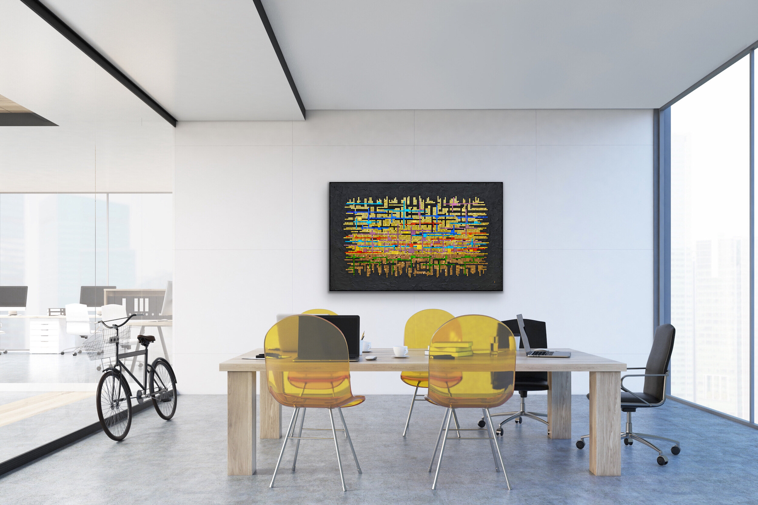
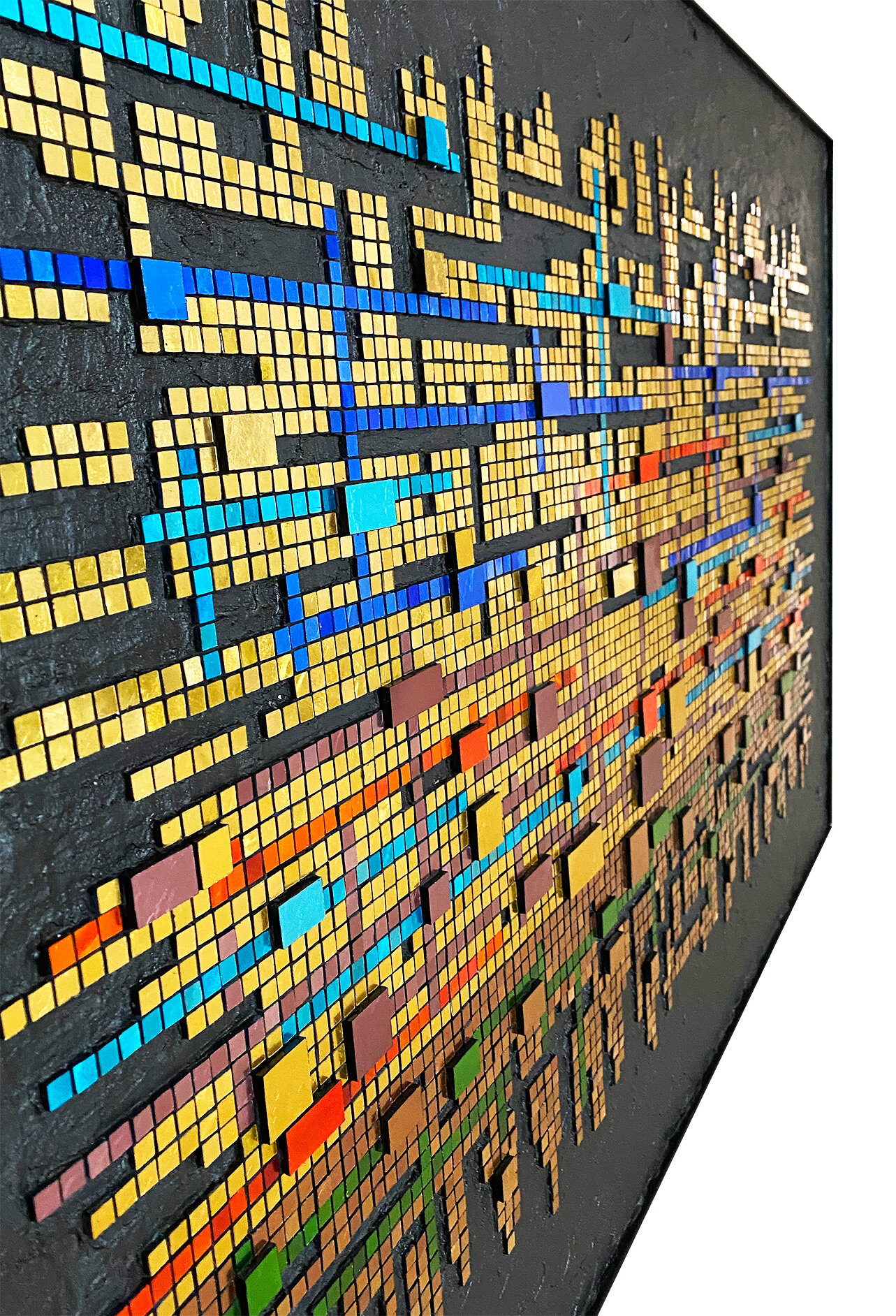
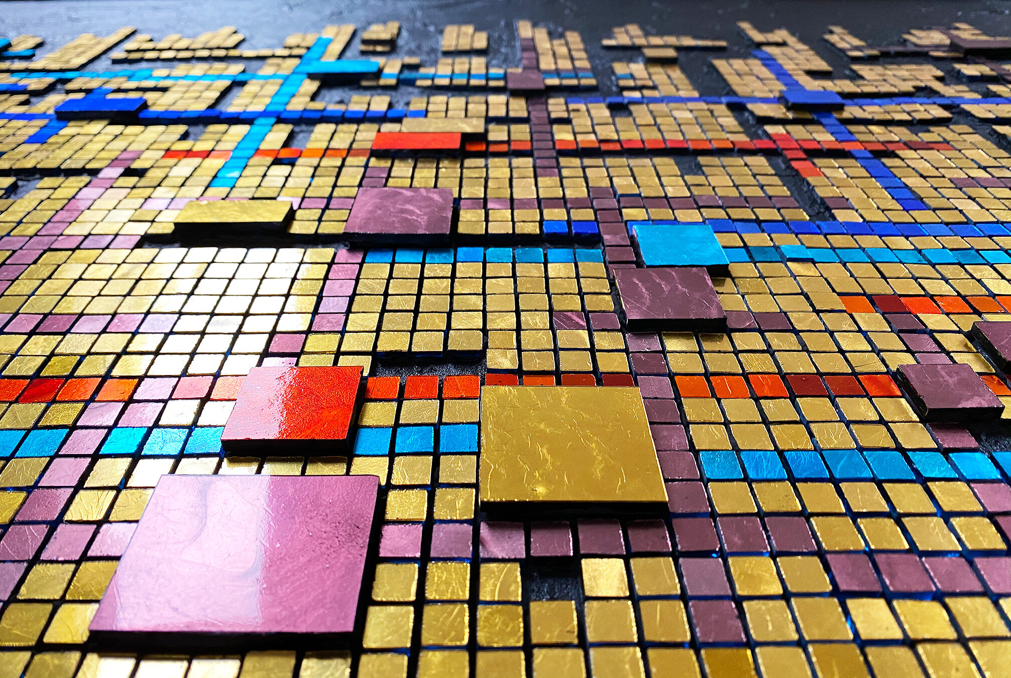
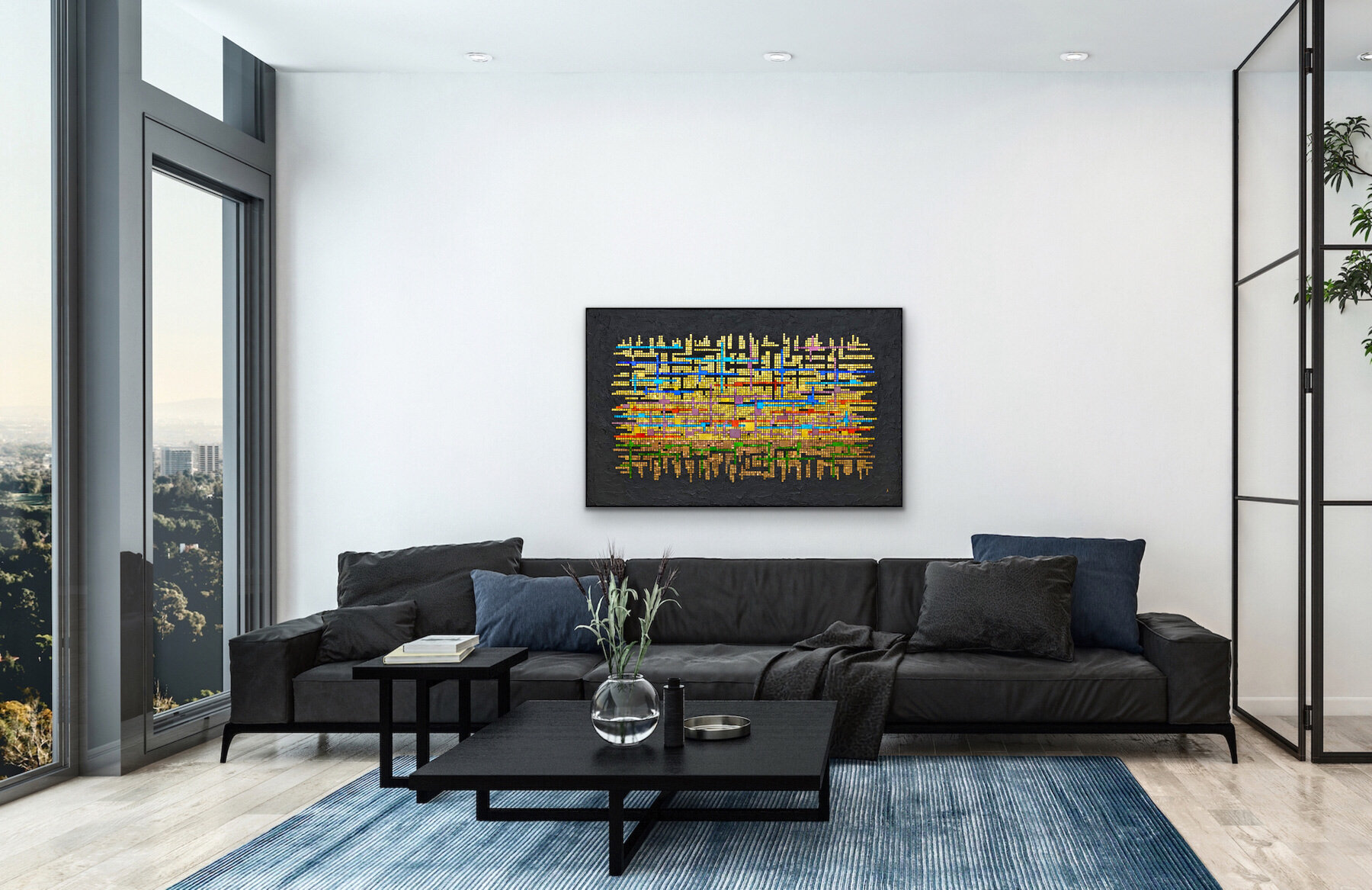
Theme and Variations: All Dreams (2020) 36” x 57” | 91cm x 145cm. Mosaic gold, colored cement.Inspired by a contemporary classical piano piece by Christopher Theofanidis, titled All Dreams Begin With The Horizon, 3rd movement.
Previous posts about Theme and Variations
Here are final photos of the large mosaic I just finished in January.
Lesbian Frequency № 3 (2020) 9.5” x 11.5” | 24cm x 29cm. Kismet glass, colored cement.
This version of the Lesbian flag—the right-most 5-stripe flag — was easier to represent with the Kismet color palette than my first Lesbian Frequency was, and I am happier with this one. So how did I get to № 3 all of sudden? Lesbian Frequency № 2 is similar smaller version of № 3 that I made for my daughter.
Image credit: Wikipedia
Lesbian Frequency № 3, alternate view
Lesbian Frequency № 1 (2020) 9.5” x 11.5” | 24cm x 29cm., unframed. Kismet glass, colored cement. Digitally created frame.
After doing this one using Kismet glass, I find that I do prefer it over the vitreous. This is my third Frequency piece. Next is another lesbian flag themed one, using different colors. It’s an older flag and is referred to as Lesbian Community Flag.
There is a vibrancy lost in the colors when comparing the Kismet glass colors to the actual flag colors. Below you can see the two flags. Of course, these digital flag images are more vibrant and saturated than the actual flags are. But you can still see quite a difference. The one on the below left is what my mosaic above is supposed to look like, but I think it’s pretty off. However, my mosaic is closer to the actual flag. Still, a bit disappointing. Although there is a brick red Kismet that I considered using for the first strip, I thought it was too dark relative to the other colors.
Image courtesy of Wikipedia.
Would I have found closer colors, especially in the pink/fuchsia/purple ranges in vitreous? Probably not. Nor in smalti. Ah well, I will carry on with the next one, based on the flag on the upper right.
Theme and Variations, detail
Previous Posts on Theme and Variations.
I finally finished this piece that I started back in August! I really indulged myself and just let this idea go as far as it wanted to go. This required me to ignore my usual sensibilities, such as they are, and just go for it. I have no idea what really empowered me to go take such a risk, considering all the gold and the sheer size of the work. Maybe it was over-compensation for all my years of compulsive fretting and perfectionism? No idea! But I went for it and this piece has been quite enjoyable.
Theme and Variations, prelim photo. 36” x 57” | 91cm x 145cm. Mosaic gold, black cement.
And to top it off, I indulged a curiosity about using a flat-that-was-not-at-all-flat black paint to try to achieve a consistent black background. The paint had to have been mistakenly labeled as flat because, as you can see, it is not flat. The result is either serendipitous or catastrophic. The beholder will decide.
I took quite a chance with the not-flat paint because, after applying a small amount, I was indeed curious. Of course, I knew that it would show everything, but there was an affect that I also liked. I thought, well, I am taking a risk with the entire thing anyway, so let’s just finish it out in the same vein. I thought that if I just couldn’t be satisfied with it, I could paint it over with a truly flat paint. We’ll see.
Now, how to photograph this gold beast, as a friend calls it. These photos were taken as it is still on my worktable and the lighting is quite uneven. It is very large and heavy, and with all the gold and with the not-flat background, I have little confidence that I will be able to get decent photos. But I will try before I tackle a strategy for professional photos.
Theme and Variations, detail
Previous posts: Bottle Break, Bottle Update
Marble and Gold Bottle 18.5” x 6” | 47cm x 15cm. Marble, acid green mosaic gold.
I don’t usually give my bottles anything more than a descriptive name, although I did try to come up with something for this one.
It’s hard to believe that I finally mosaicked this bottle that I acquired over 20 years ago. I really like this palette, although, in retrospect, I wish I would have used more of the dark brown.
I did enjoy this project, which has served as a break from a large wall art work which is still in the design phase. I hope to start it after July.
I’m still playing around with this frequency concept. My daughter really loved her Rainbow Frequency and very much wanted a Trans Frequency. I hesitated because I really don’t like the Trans flag colors, and I was not sure what degree of dark the background should be.
I finally decided to make it and intended to have a lighter gray background than how it turned out. I do think that a little bit lighter would have been better for between the light colored pieces. The background color is actually a very dark gray, even though it looks pretty black in the photo.
Trans Frequency 8” x 11” | 20cm x 28cm. Vitreous glass, colored mortar.
I made this little piece in early 2018 as a sort of precurser to a much larger work, Familial Wounds. I was getting a feel for the breadth and speed of the gradation. It is now framed and titled.
OUT! 7” x 5” | 18cm x 13cm. Smalti.
I’m still fussing with photos, but it’s basically finished. I will have to have a frame custom made as I can’t find a floater frame deep enough for this piece.
I Heard the Mountain Sing 30” x 12” Marble, amethyst specimens, pyrite, glass, porcelain, mosaic gold.. Digitally framed.
I showed this to a friend and fellow mosaic artist and she said something to the effect of “I know it’s about mountains, but it looks like flowing water to me.” So, what’s with the title?
I’ve already talked about how I found the big amethyst slab in a little shop in Zermatt, Switzerland, last fall. I had such a lovely time on that trip so, to me, that slab will always remind me of beautiful Zermatt.
But more than just the amethyst, I wanted to express the way that mountains make me feel. I absolutely love the mountains, the way that some people love the ocean or the forest. When I see the mountains, they take me out of myself, they give me a sense of rising up and out—of expansiveness.
I also sometimes feel this sense of expansiveness with certain music—I just want to open my arms wide and embrace all there is in the moment. It is a spiritual experience that connects me to something bigger than myself.
The mountains sing to me in this way and open me up. This is what the title is about and also what I wanted to express in this mosaic’s andamento.
I’ve tried several times to get a good full shot that shows more texture, but no luck yet. I was able to get the shot at the right with the mosaic on my work table.
Rainbow Frequency (2019) 7” x 9” | 18cm x 23cm. Vitreous glass
I made this fun little mosaic last weekend for my daughter’s 30th birthday. This may be the 2nd time in over 20 years that I have ever made a mosaic in a weekend, if indeed there has already been a first time. I like this concept and will be playing around with it some more.
Here are a couple of detail shots from my recent work, Familial Wounds.
Familial Wounds, detail
Familial Wounds, detail
Familial Wounds (2019) 27” x 36” | 69cm x 91cm. Italian, Mexican, and a bit of Chinese smalti, mosaic gold, Lyric unglazed porcelain. Digitally created frame.
This photo is a better quality than the one I posted yesterday (at right). It was taken outside in morning light. Although I adjusted it to warm up the natural coolness of the light, it still looks a bit cool. I think part of it is that it has a little more reflection going on, which does help bring out some of the texture.
I prefer the photo in studio lighting, probably because this is closest to what I see when I look at it. But the above photo is sharper and shows more detail.
Lighting can be quite vexing for an amateur such as myself.
Familial Wounds, studio lighting
About Familial Wounds
I think of familial wounds as being the psycho-emotional wounds that occur in our upbringing, especially through neglect and abuse. Another dimension to these wounds is that they are often ancestral, going back some number of generations. Until one is able to recognize an unhealthy family dynamic, well… it’s just your family and you have no frame of reference from which to have any judgement on it. It’s just how things are. Ignorance obscures your vision. Until an unhealthy family dynamic is recognized, it continues to be perpetuated. At the moment when there is recognition that things are not healthy—not good—a choice can be made.
By some magical confluence of happenings, I was able to recognize my own family’s very unhealthy and destructive dynamic, which began my escape from that dynamic, that worldview. While the word escape is fitting, it is also somewhat lacking because, although I escaped it, it has never left me.
My choice to follow a very different path and develop a very different worldview—a different way of seeing the world and my relationship to it—was the right choice, but it was not easy. I became an outsider in my own family, and as time went on and I continued on my path, it became more and more difficult to maintain a relationship with my parents and siblings. They could only interpret my behavior and choices through the lens of their worldview, the worldview that I was rejecting.
My family did not see an unhealthy dynamic, nor could my parents see the unhealthy dynamic in their own childhoods. So, through ignorance, it was perpetuated. The wounds live on, and are passed on, like DNA. Some wounds are like open wounds, being aggravated by all the things outside of us. Some wounds are just embedded in our tissue, recognized and healed, but they leave their mark. They change us, and in that sense they never leave.
This mosaic came out of my own experience and ruminations on familial wounds. As I was working on it, I began realizing that although I have succeeded in escaping that damaging worldview, and I have succeeded in developing what I believe is a healthy and good worldview, I can feel that old dynamic as viscerally as if I were still a part of it. I am not a part of it, but it is part of me.
So, the dimensional rings in the mosaic represent recent, open, and/or festering wounds. The embedded rings represent wounds that have healed and only their imprint remains. The gold lines represent energy: this could be seen as our body’s natural healing energy, as divine energy—grace, or just consciousness. To me, they are all of those. Of course, the color is meant to suggest tissue, raw emotional tissue. The gradation from dark to light represents hope. The dark swoops from top and bottom—defined by absence of material and connected to the outside border—can be interpreted as darkness, or the perils of the outside world. At one point, I thought of them as the daggers of life. The mosaic as a whole speaks to the healing process—we can recognize our wounds, make different choices, and heal. However, the wounds leave their mark, a testament to change and growth that helps define who we become.
Though the initial concept was of emotional wounds, it evolved toward what is for me the more potent issue of familial wounds. And I can’t say that I had even thought of it in those terms before. The work helped me more fully understand that it is familial wounds that have left their mark on me, and led me to the life I live. Bless those beautiful wounds!
Familial Wounds (2019) 27” x 36” | 61cm x 91cm. Smalti, mosaic gold, porcelain. (Frame is a digital representation of the frame it will have.)
I’m calling this a preview because this is not a final photo. I have not finished out the back or framed it, and it needs a final cleaning. I took the phot in my studio and the lighting is uneven. It is rather large and I will need to try to get better photos outside. Unfortunately, our weather has been pretty drippy and dreary of late and it is raining as I write this. It is, however, supposed to be sunny for the next couple of days.
I started this mosaic last March (it was formerly titled Self Portrait № 2) but got distracted with a commission and then a couple of voluntary mosaic detours. I got back to work on this in September and have worked earnestly to complete it since then. It has been quite a process and a journey as well.
This mosaic became more and more personal and tormenting to me as I progressed. I suppose that makes sense. It was rather odd to me that the work became more and more strenuous until, in the final weeks, I was overwhelmed with how technically difficult it was: the sheer labor of it was walloping me.
It was technically difficult from the beginning. Creating the curves against empty space, and also the embedded rings defined by empty space, while maintaining the horizontal and vertical grid-like field, was extremely challenging. But it was only as the work became more personal, and shifted in concept from wounds to familial wounds, that it became more and more physically challenging.
At the same time, I have been trying to work more loosely and leave my perfectionism behind, in hopes of exploring artistic vision over technical mastery. I chose not to use a grinder and relied on hand tools only. There is nothing wrong with a grinder, but I find it encourages my obsessive perfectionism. And obsessive perfectionism is really miserable.
I’ll write more about it as I post final photos.