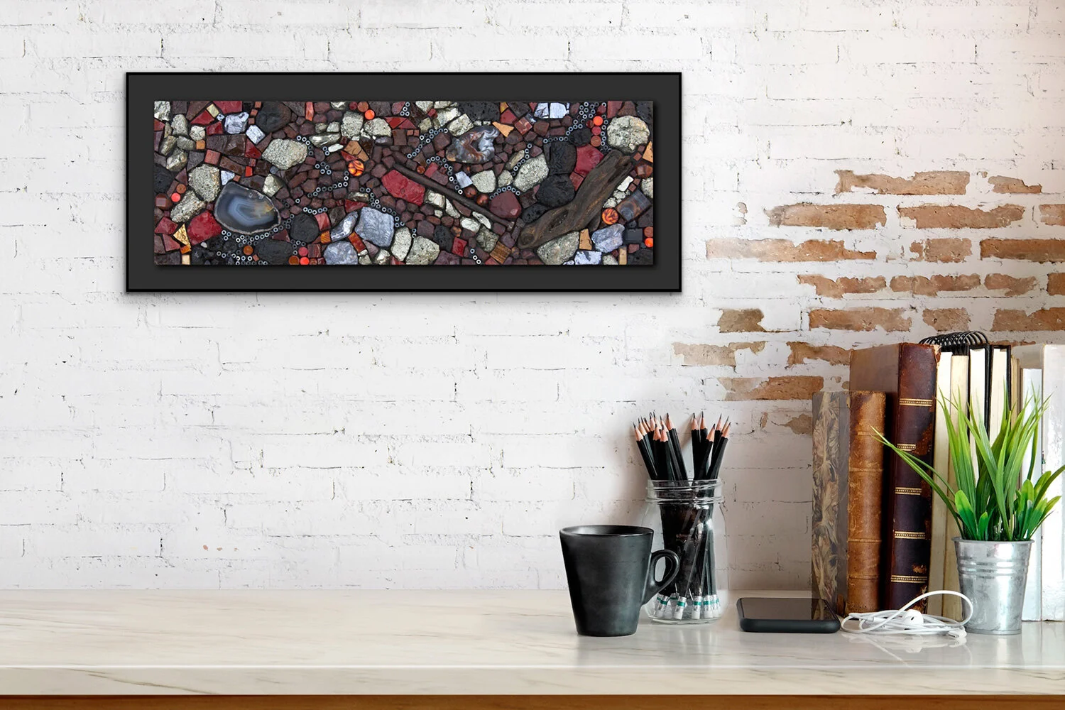
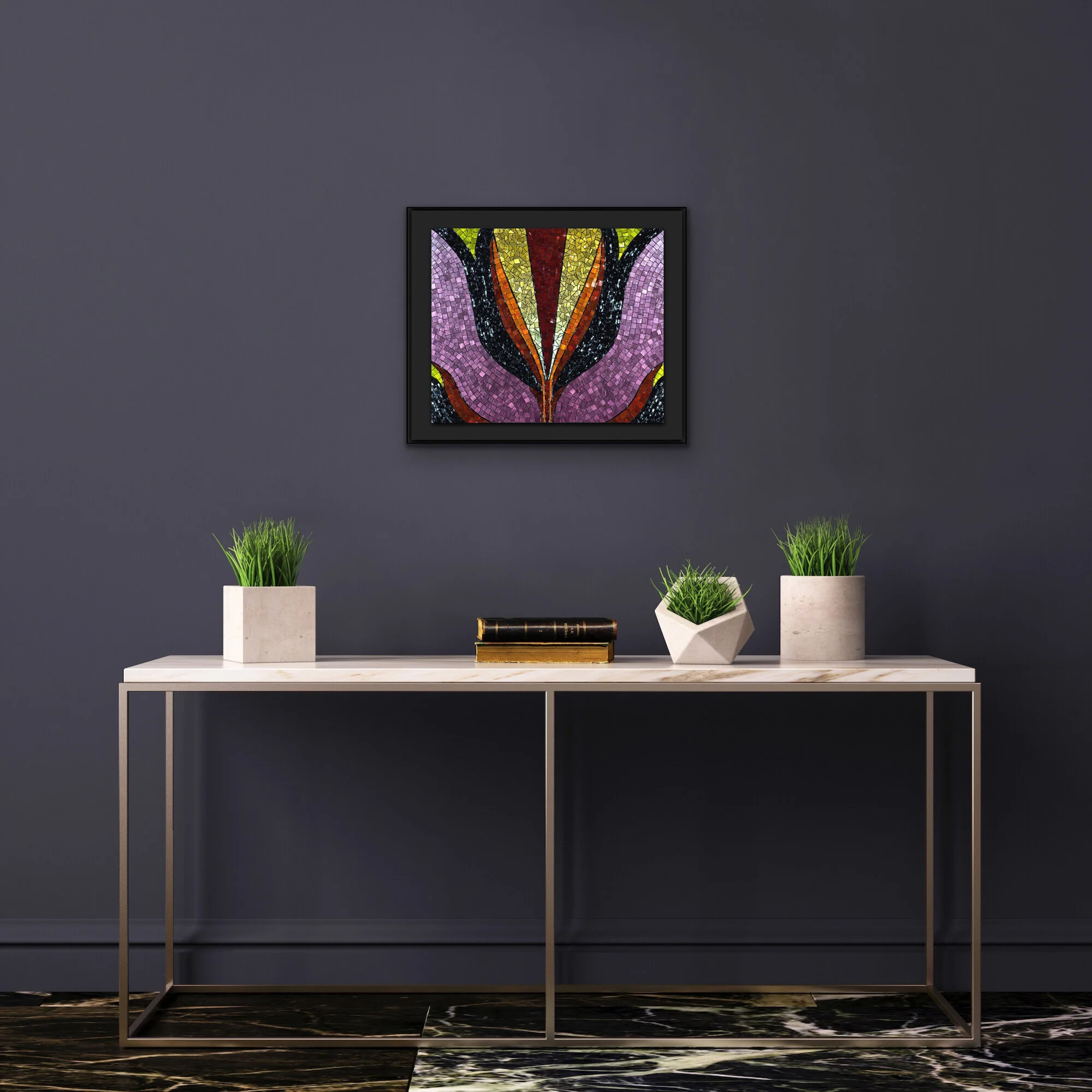
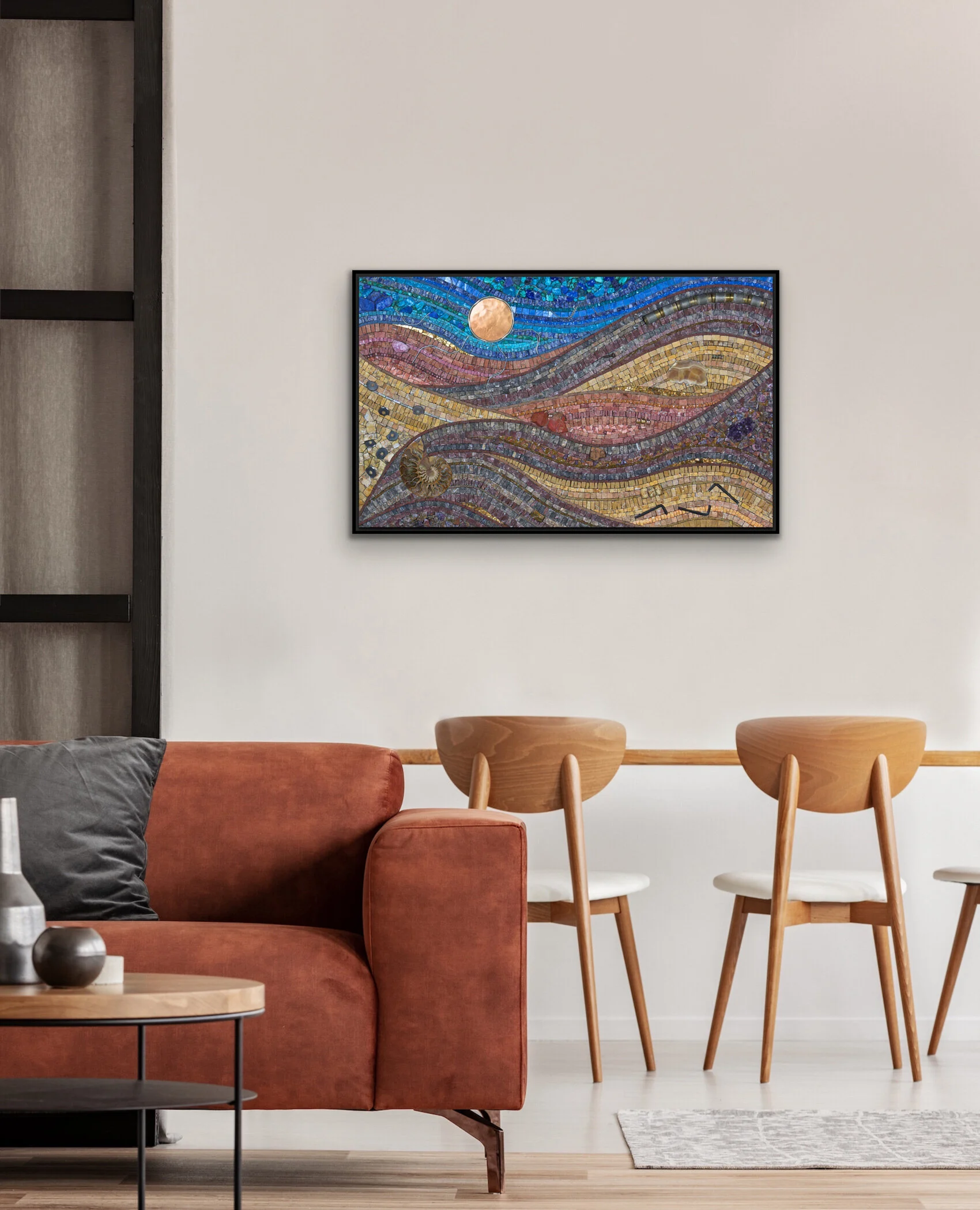
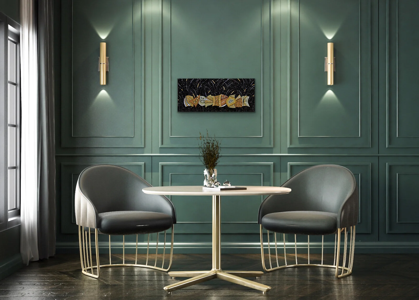
Final Feature Friday: Beneath
Beneath, in situ using artroomsapp.
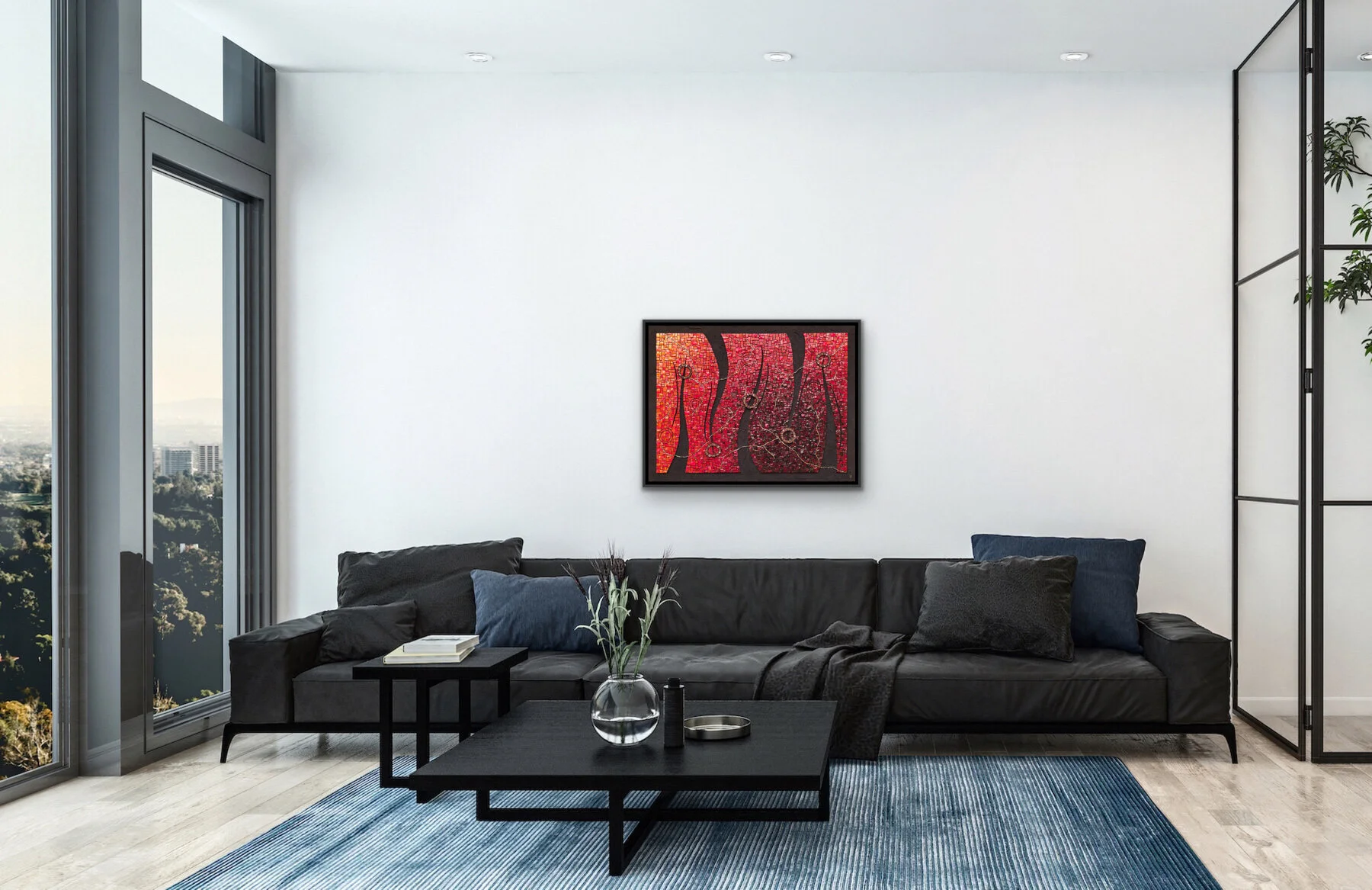
In 2010, I had a very large commission in which I had some really awesome leftover materials—I habitually overestimate. So I made this mosaic with some of those materials.
I really liked the way that a component of the commission turned out and repeated and expanded it in this mosaic, Beneath. What I call veins, or the thin, dark tree-like element which you can see below, were made with a very similar composition of materials as Beneath. The inspiration was the mining history of the area.
Daytime and Dreamtime (2011) Commission for Northeastern Oklahoma Agricultural and Mechanical College (NEO) in Miami, Oklahoma, facilitated by Oklahoma Art in Public Places (OAIPP). Two diptychs. Each diptych 106" h x 36" w | 264 cm x 91 cm. Marble, smalti, porcelain, mosaic gold, glass, minerals, stone.
Beneath (2011) 6" x 14" | 15cm x 36cm. Smalti, pyrite, galena, tektite, lava rock, ruby, black tourmaline, jasper, obsidian, red tiger eye, tiger iron, shell, agate, hematite, millefiore, glass, mosaic gold, porcelain, geode, driftwood, nail. In a pivate collection.

This will be my last Feature Friday post. I’ve been at it since early January and, frankly, I am out of work to feature. I’ve only been featuring work that could be nicely staged using the Artrooms app, which is more suited to larger works. A lot of my smaller pieces just did not work well.
I’m relatively new to Instagram so I may start over there.
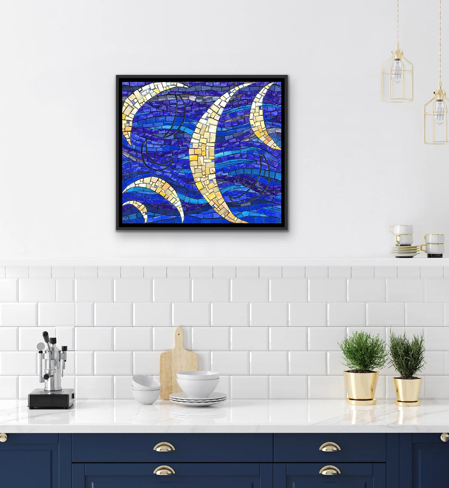
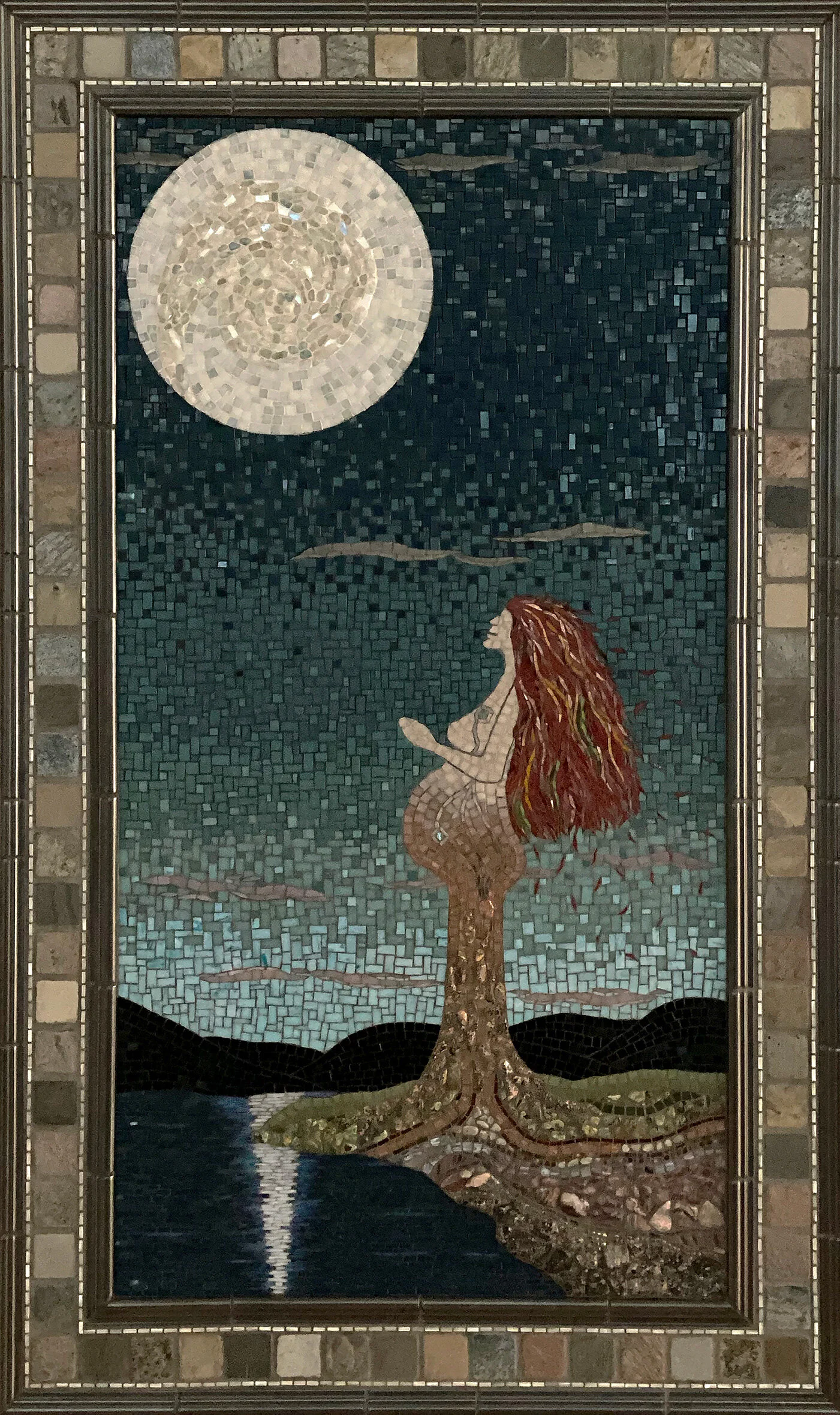
Feature Friday: Remembering Istanbul
Remembering Istanbul, in situ using Artroomsapp
In 2010, I visited Istanbul for about a week and participated in a mosaic intensive with Sonia King. This mosaic was the project I started while there. I finished it at home shortly after returning.
The background moons, defined by an absence of material, were very tricky. Trying to maintain the flow through them was quite difficult, and required a lot of cutting of angles and odd shapes. The cuts had to be pretty precise to clearly define the moons.
Remembering Istanbul (2010) 11" x 12" | 28cm x 30cm. Smalti, porcelain, travertine, vitreous, mosaic gold.
Remembering Istanbul, detail
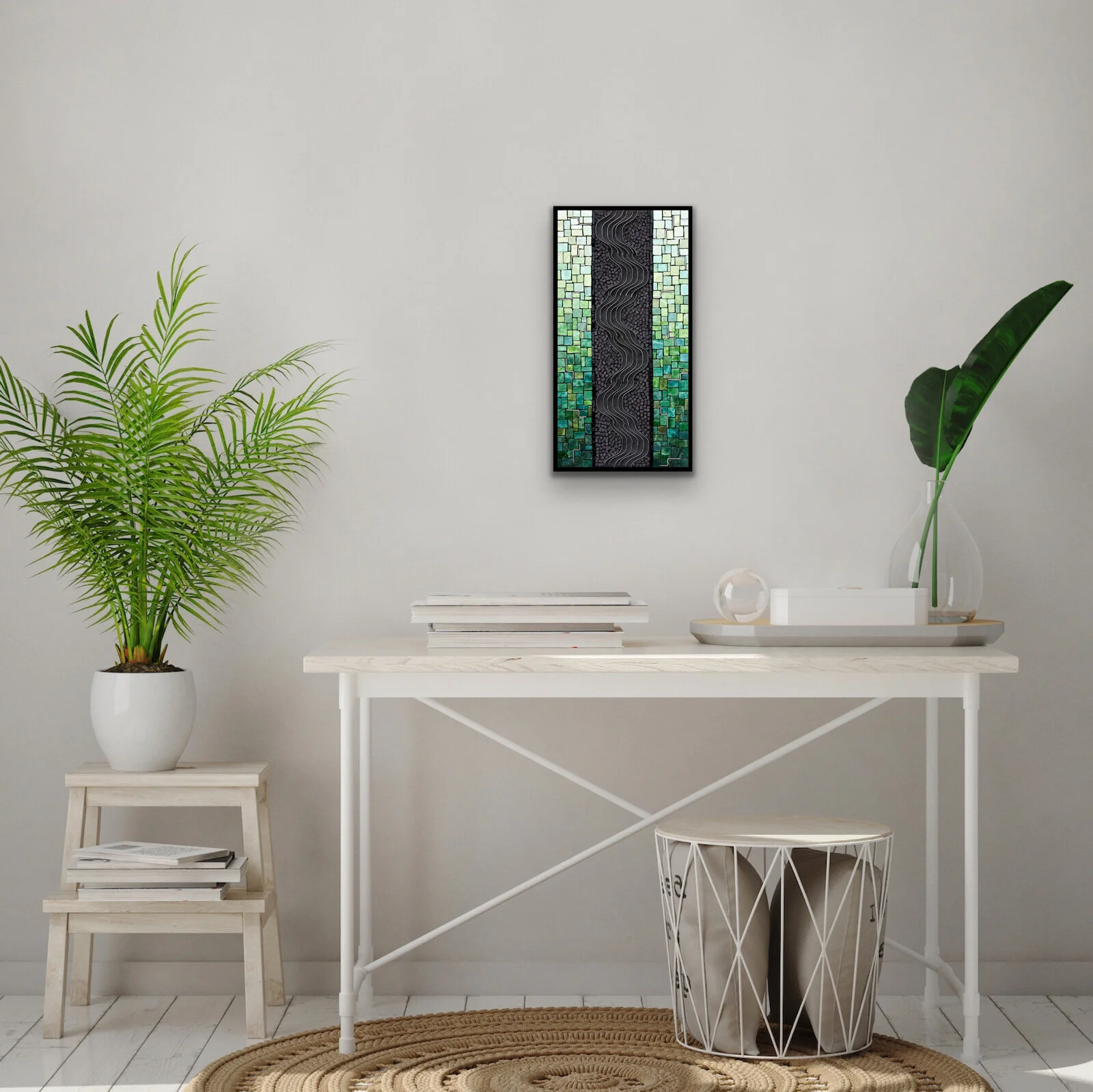
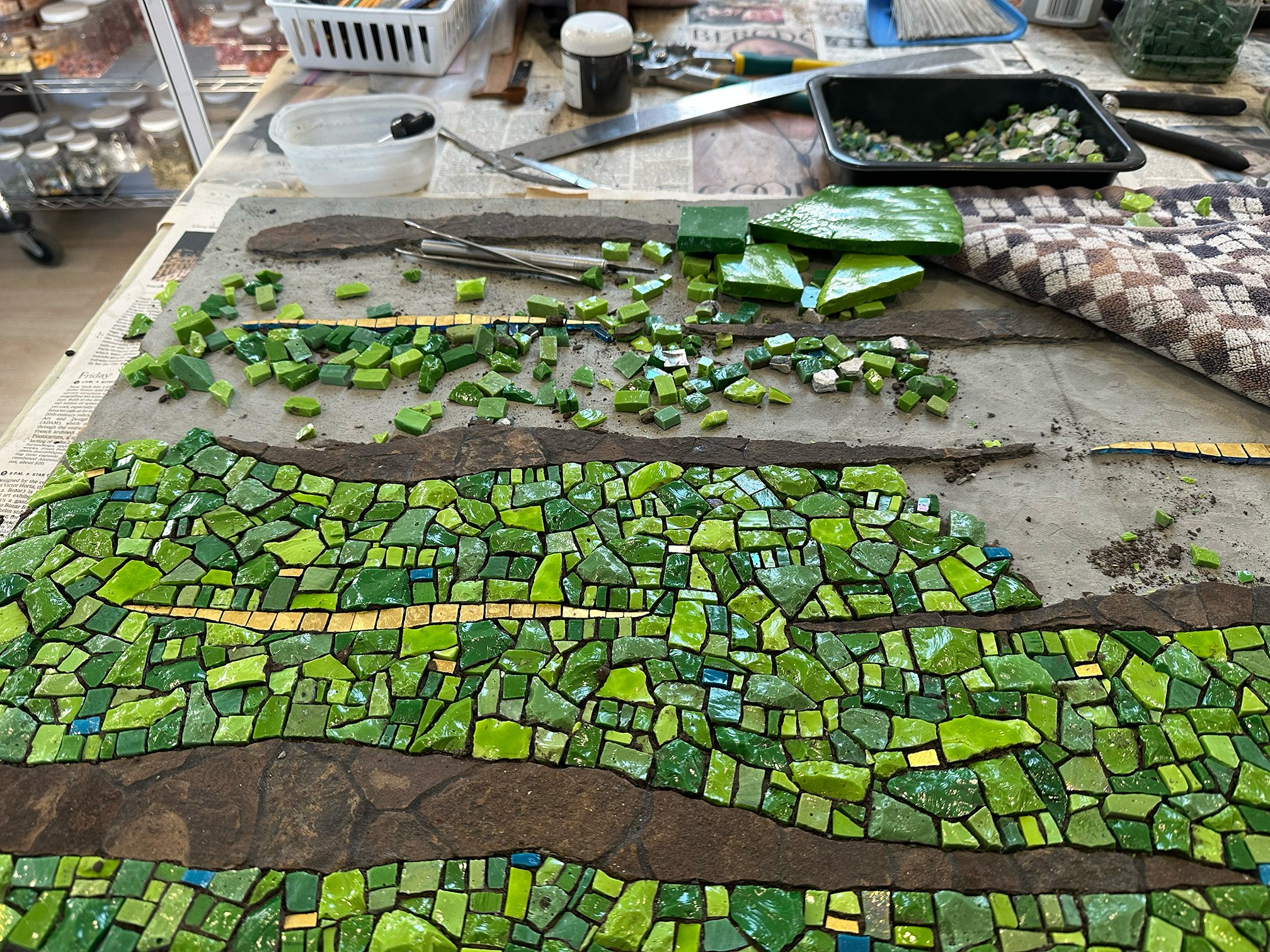
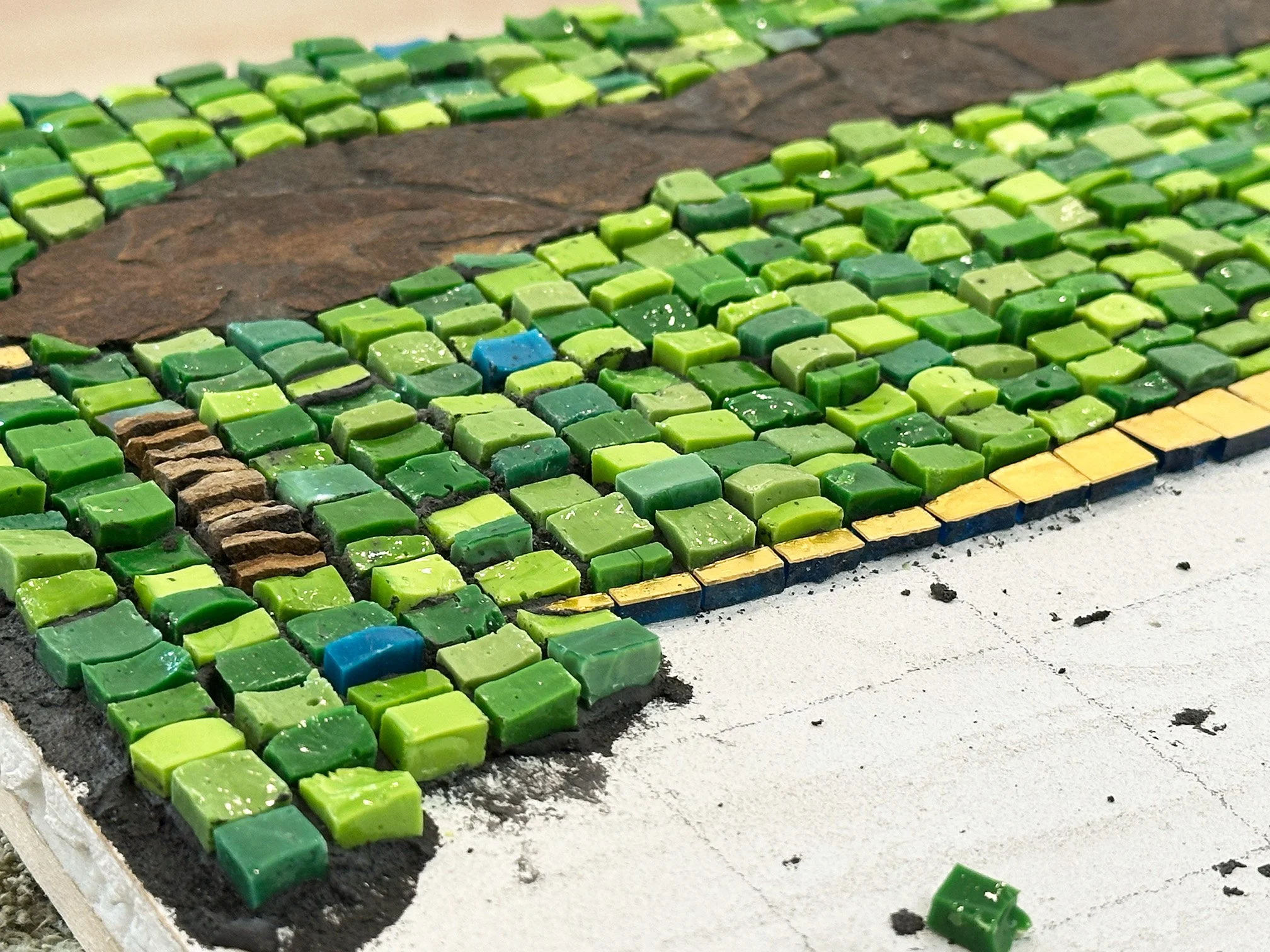
Feature Friday: Impromptu in Green
Impromptu in Green, in situ using Artrooms.
This mosaic was my first one using framing spring clips. I did two others with the same gradation theme and they are all three in a series titled Impromptu. It is on my to-do list to do at least one more in this series, but my gosh! So many ideas, so little time!
I call them impromptus because the design follows from a playing with the spring clips to form some kind of arrangement. For example, I chose green for this mosaic because the arrangement of spring clips made me think of a stream in the woods.
Impromptu in Green (2008) 15" x 8" | 38cm x 20cm. Smalti, porcelain, glass, hardware. In a private collection.
Impromptu in Green, detail
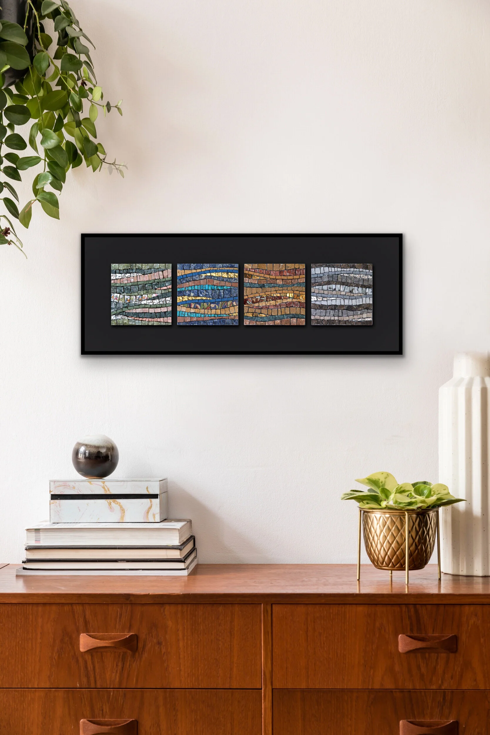
Feature Friday: No Such Thing As Time
No Such Thing As Time, in situ
This mosaic just might be my favorite of all the ones I’ve made. And I’m not sure why.
As you may know, I’ve been exploring a looser, more relaxed execution technique the last few weeks. And, as you may also know, I’ve been flirting with trying to do this since about 2012. This work is one in which I was trying to do that. I can see some hints of a looser technique, but unless you are very familiar with my work as a whole, it probably is not obvious.
No Such Thing As Time (2012) 8" x 22" | 20cm x 56cm. Marble, porcelain, mosaic gold, broken china, sodalite, turquoise, malachite, onyx. A 'four seasons-inspired' group. Each panel 4" x 4" | 10cm x 10cm.
So why is this my favorite? For one thing, it started with just the right-most piece. I was not thinking of doing a four seasons-inspired group when I started. I love neutrals and that explains the palette. I was happy with that first one, and somehow it became the group that it is now. It was spontaneous. I also did not have in mind to have them flow into each other, but that came along spontaneously as well.
I think I like this so much because of its spontaneity, and because, even though they are not compulsively precise, I could be happy with them. Perfectionism is a component of my compulsion for precision, so it was a big deal for me to be able to both accept less precision and like the outcome.
No Such Thing As Time, textural view
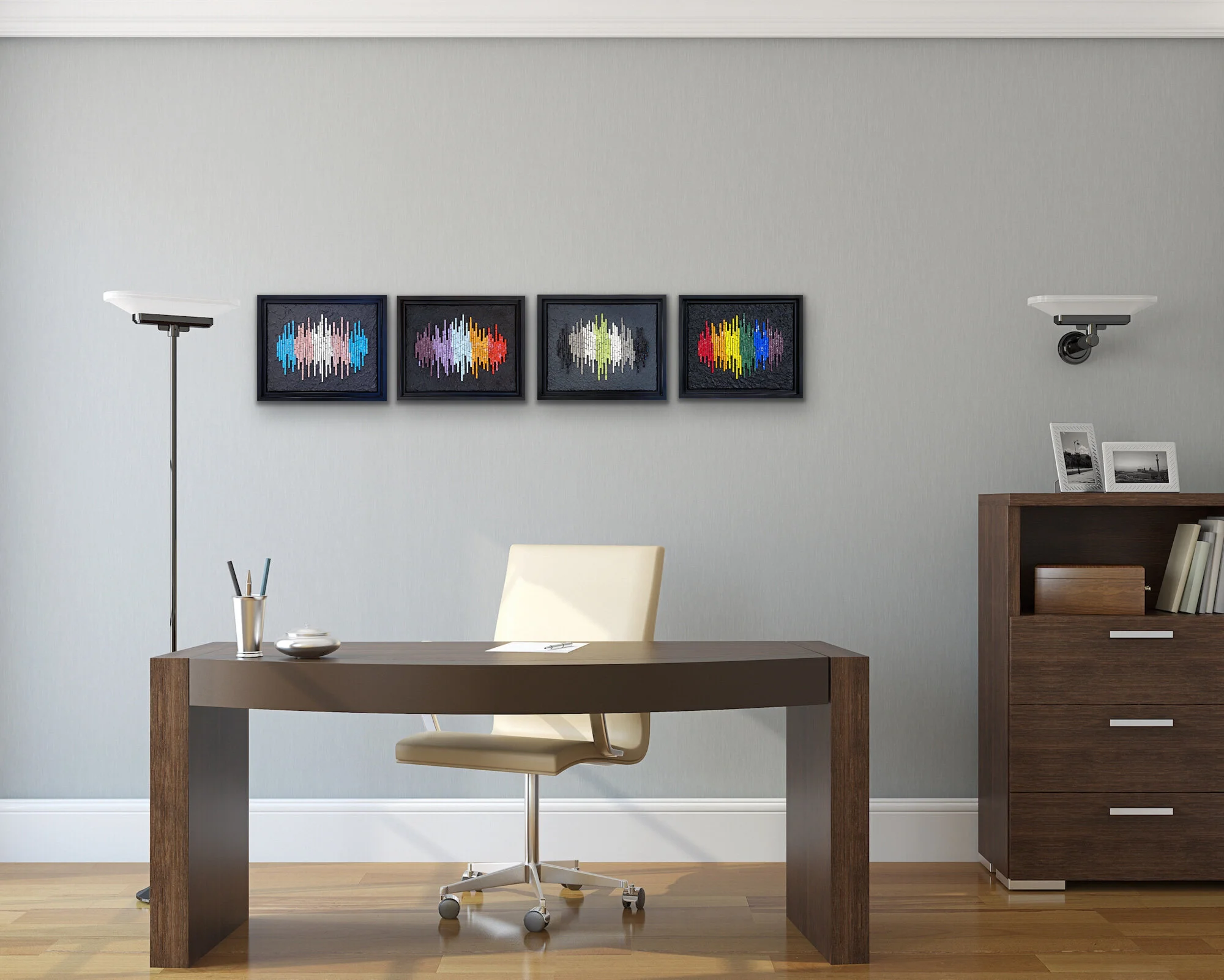
Feature Friday: Trans, Lesbian, Agender, Pride Frequencies
(2020) Trans Frequency № 2, Lesbian Frequency № 3, Agender Frequency, Pride Frequency № 2. Each 9.5” x 11.5” | 24cm x 29cm. Kismet glass, colored cement.
Last year, I got this idea to express the Pride flag colors as a frequency. No idea where the idea came from, but I thought it was interesting and made Pride Frequency № 1 and then Trans Frequency № 1 (see below). I used vitreous glass, cut in strips and laid on its side.
(2019) Pride Frequency № 1. 7” x 9” | 18cm x 23cm. Vitreous glass, colored cement.
(2019) Trans Frequency № 1. 8” x 11” | 20cm x 28cm. Vitreous glass, colored cement.
After making these, I wanted to make a few more but I did not want to use vitreous. I wanted to find a better way of executing them because there were some issues with these first two.
I was not completely happy with the variations in the thickness of the pieces, primarily the result of being from different manufacturers or batches. Also, it is difficult to get a level bottom when cutting into strips and trimming off the miter. And I just wanted a straighter line.
So, I thought about using Kismet glass. I had used some on a previous project and felt that it was much better suited for this concept.
(2020) Lesbian Frequency № 3. 9.5” x 11.5” | 24cm x 29cm. Kismet glass, colored cement.
(2020) Trans Frequency № 3. 9.5” x 11.5” | 24cm x 29cm. Kismet glass, colored cement.
(2020) Agender Frequency 9.5” x 11.5” | 24cm x 29cm. Kismet glass, colored cement.
Pride Frequency № 2. 9.5” x 11.5” | 24cm x 29cm. Kismet glass, colored cement.
After making the LGBTQ-themed pieces, I wanted to further explore the frequency concept and decided to do so with emotional states. Hence, my Interior Frequencies.
Interior Frequencies (2020) 31” x 68” | 79cm x 173cm. Each 9” x 12” | 23cm x 30 cm. Kismet glass, colored cement. Left to right: Depression, Invisible, Guilt, Hopeless, Conflicted, Self-loathing, Shame, Dread, Rage, Loss, Humiliation, Overwhelmed.
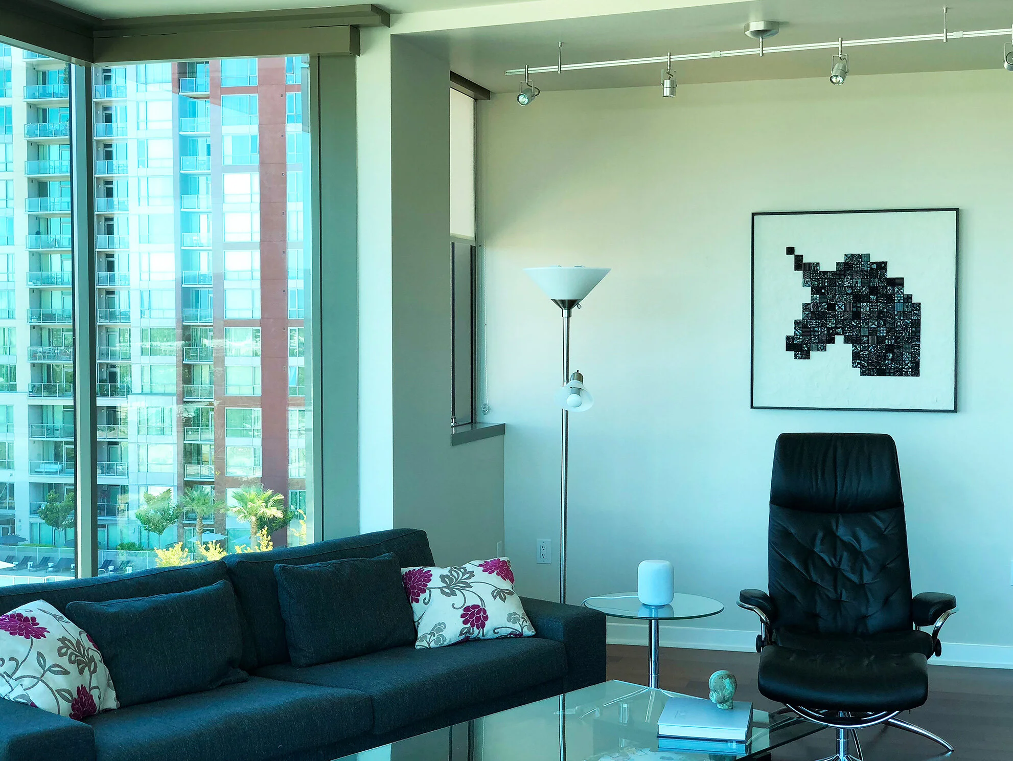
Feature Friday: Windows
Windows, in situ
Do you ever feel like there are just too many ideas to play around with? I got into this idea of multi-planed mosaics, hence my Levels Series. I wanted to do more with it, and still do, but I keep going other directions.
This mosaic, Windows, is the last piece I did in that series. Actually, I did do one more but it has been banished.
Windows (2013) 17.5” x 9.5” | 45cm x 24cm. Marble, smalti, mosaic gold.
Feature Friday: Impromptu in Red
Impromptu in Red: Bad Action Blade Wheel, in situ
Impromptu in Red: Bad Action Blade Wheel (2015) 17.5" x 11.5" | 44 cm x 29 cm. Smalti, porcelain, vitreous, framing spring clips, hardware, jasper. Available.
This arrangement of framing spring clips reminded me of some kind of nasty saw blade or James Bond-ish specialty weapon.
It made me think of the Tibetan Buddhist My Bad Action Blade Wheel practice. I blogged about it when I finished up this piece in 2015, and you can read about it here.
Feature Friday: Subtleties
Subtleties, in situ
Here’s an oldie from 2008.
Hmm, I just can’t think of much to say about it.
Subtleties (2008) 19" x 31" | 48cm x 79cm. Marble, Mosaic gold, porcelain, quartz crystal, mother of pearl, moonstone, glass, Swarovski crystal, pearls.
Feature Friday: In The Beginning
In The Beginning, in situ
In my earlier years of making mosaics, I would often start a project before I had it fully developed in the design phase. I was much more impulsive, yes, but there was also an enthusiasm. Impulsive: not so good; enthusiasm: very good. Funny how that works. At this stage in my mosaic-making, I pay much more attention to the design phase. I still have enthusiasm, but it’s not as free and exciting. A trade-off?
All my not well-thought out projects have taught me over the years the value of the design phase. This piece, In The Beginning, was one of those projects. I’ve blogged about others—Past Life being the star of the not thought-out projects. The violet gold that I used on this was the same violet gold that I scraped off of what became Piercing The Veil. When I started this, I think I only had the shape where the violet gold is. As was my thinking at the time: I’ll figure it out as I go.
In The Beginning (2012) 19” x 22” | 48cm x 56cm. Mosaic gold in violet, red, orange, acid green, shades of yellow, vitreous, contorno.
I got stuck on it and set it aside for a while because I did not figure it out as I went. Some time later, I managed to work off of the initial shape. I was shocked, as I was finishing it with the black vitreous, at the male-female symbolism. Where did that come from!?! This was completely subconscious and certainly not a result of intentional design. I admit to feeling a bit embarrassed.
In The Beginning, detail
This was the first time I used vitreous, cut and laid on its side, en masse, and I found it very effective.
Feature Friday: Past Life
Past Life, in situ
Okay, I never thought I would make peace enough with this mosaic to have it on my site, much less use it for a Feature Friday. There is quite a story to this one. Over 20 years in the making! I did so many things wrong on this when I started it and I wanted to just get rid of the thing instead of storing it away for almost 18 years. But the sheer size of it and the fact that I had already glued on that border treatment made it difficult to just throw away.
Originally titled Fullness, I finally decided to finish it in 2018. You can read more about the history and completion of this project here.
Past Life (1998-2018) 60" x 36" | 91cm x 152 cm. Vitreous, slate, jasper, agate, moonstone, snow quartz, prehnite, mother of pearl, celestite, rhyolite, rhodonite, pyrite, copper, ceramic, mosaic gold, other glass.
Past Life, alternate lighting
Past Life, detail
Past Live, detail from side perspective
Past Life, Detail
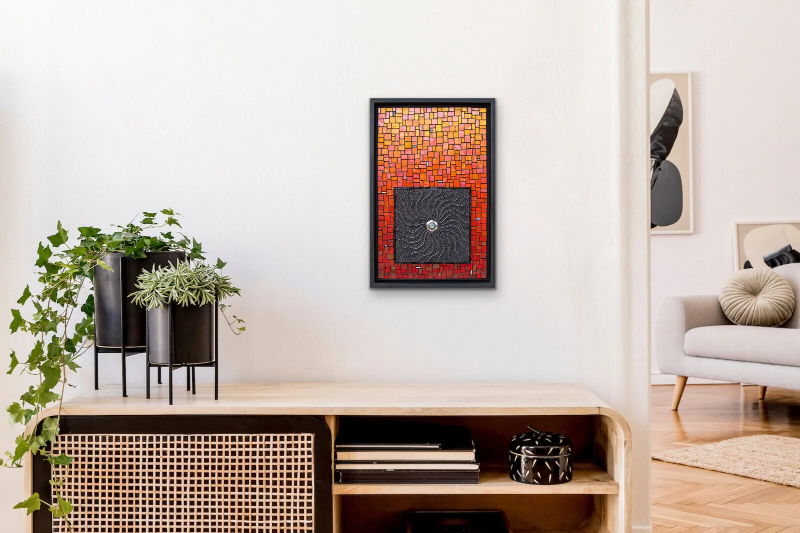
Feature Friday: Piercing The Veil
Piercing The Veil, in situ
This mosaic started out as just the center icicle-like shape and a substrate about the width of the top of the icicle. At least half of the shape had been mosaicked in violet gold before I realized my andamento was all wrong. This was another example of me rushing in to get started on an idea that was not yet fully developed. I scarped off all the violet gold and then put the substrate in a closet.
A few years later, I decided to do something with the substrate and the icicle shape. I attached the long, thin rectangle of a substrate onto a larger Wedi panel. Piercing The Veil is the second incarnation of the icicle.
Piercing The Veil (2012) 42" x 32" | 107cm x 81cm. Mosaic gold, marble, travertine, porcelain, ceramic, mother of pearl, quartz, shell, pearls, 24kt gold seed beads, Swarovski crystal. Available.
Feature Friday: Prelude
Prelude, in situ
In another Artroomsapp.com room, this is Prelude, the fourth in my Music To My Eyes series.
Prelude (2014) 17.5" x 13.5" | 44cm x 34cm. Mosaic gold in shades of orange and violet, porcelain, glass. Inspired by Rachmaninov's Prelude in G Major, Op. 32, No. 5. In a private collection.
The background is done in black Cinca, cut into strips and laid on its side. I really like the way it gives an undulating effect, which I think nicely represents the primary theme of the Rachmaninov prelude that inspired this work. With the orange gold, I was trying to express a secondary musical theme which is very lively and bubbly.
Prelude, detail
Feature Friday: Trashlands
Trashlands: A Meditation on the Earth, Trash, and the Footprint of Artmaking, in situ
This mosaic was inspired by this quote from John Constable:
“I never saw an ugly thing in my life: for let the form of an object be what it may, - light, shade, and perspective will always make it beautiful.”
It made me start thinking about whether trash could be beautiful. Throughout my mosaic-making years, I have always been interested repurposing things, and I am conscious of the environmental impact of art-making. I’m reluctant to throw things away that are not biodegradable, which has lead me to keep things like used grinder bits and nipper blades, and the spring clips that come with the metal floater frames.
Trashlands: A Meditation on the Earth, Trash, and the Footprint of Artmaking (2012) 18" x 30" | 46cm x 76cm. Marble, travertine, smalti, mosaic gold, jasper, lepidolite, amethyst, ammonite fossil, agate, rhodonite, pink sapphire, turquoise, sodalite, lapis, onyx, glass, hardware, used nipper blades and grinder bits, spring clips. Available.
It seemed natural to incorporate these things into this mosaic and I was mostly happy with how it turned out. I even used an old jar lid for the copper sun. I fretted over that for a few days—to do it or not to do it—and finally relented. Then I regretted it for a few days and pondered how I might remove it without destroying the beautiful round copper gold sun. I finally came to terms with it.
Trashlands, detail. In the lower left is a pink sapphire that artist Sophie Drouin gave me.
Trashlands, detail
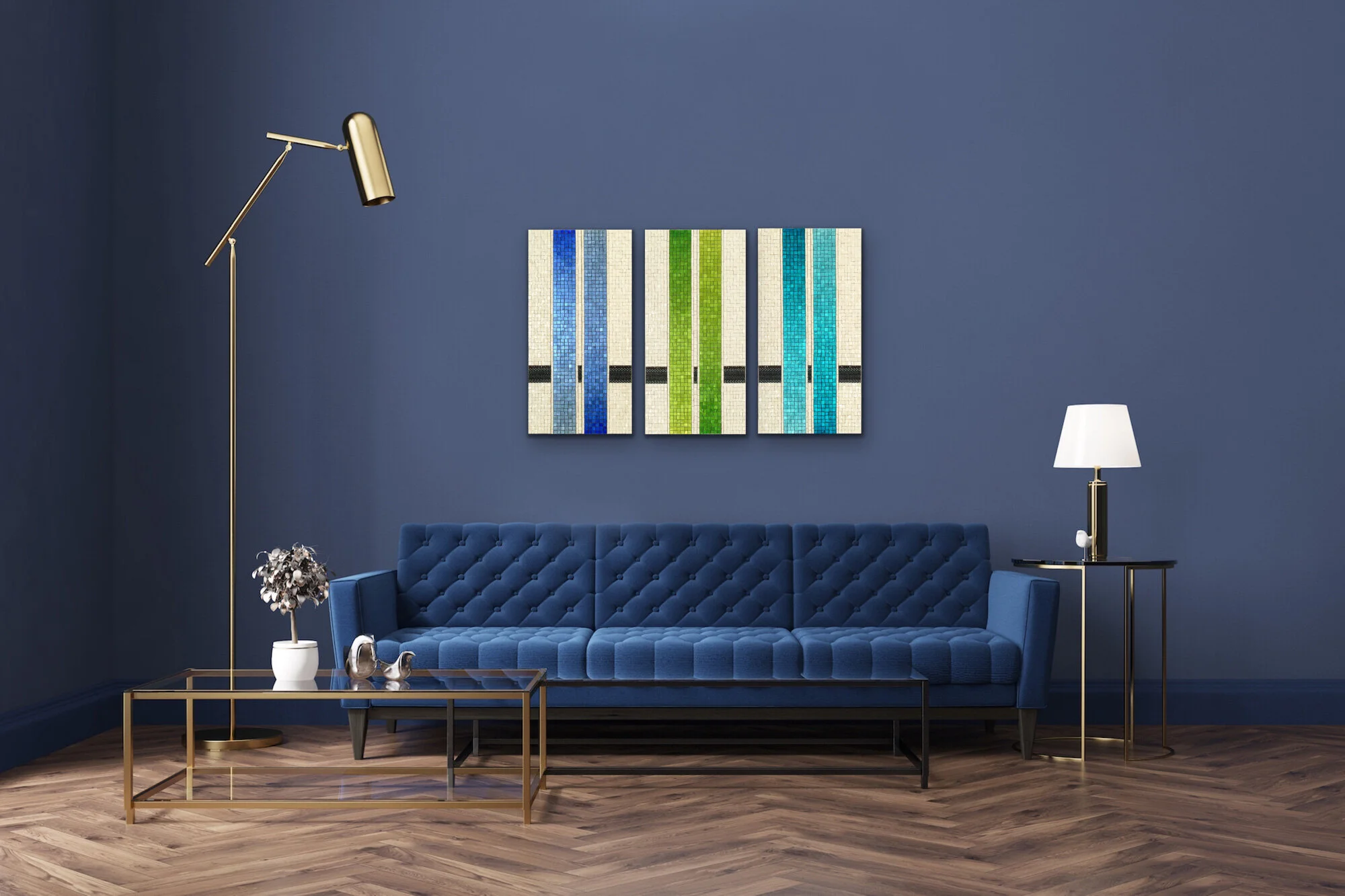
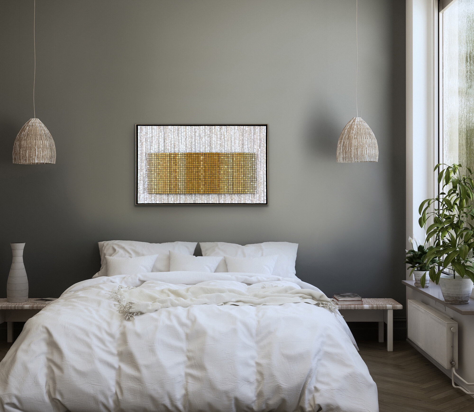
Feature Friday: Etude
Etude, in situ
The first in my Music To My Eyes series, Etude looks quite elegant on this blue wall above a velvet blue sofa, don’t you think? It’s quite fun to put my mosaics in rooms and see how they work. The size of the panels is a little off as they look a little bigger than they actually are. With the artroooms app, it is difficult to size and align multiple images. Although the app does ask for dimensions, it seems inconsistent in how it uses them when placing the art on a wall. These panels are 12” | 30cm wide, but on the wall they look more like maybe 14”?
Etude (2007) 24" x 40" | 97cm x 102cm (each panel 24" x 12" | 97 cm x 61 cm).Mosaic gold in blue, green, and turquoise, smalti, glass beads, faceted garnet. In a private collection.
This mosaic gave me my first experience working with colored gold. I did not realize that there would be light to dark shades in a single kilo when I bought it in Venice. When I started playing around with it, I wanted to use the gradation for effect. However, sorting a kilo of gold and separating into light, light-medium, medium, dark medium, and dark is not easy. Being metallic, it is so light-sensitive and just looking at it at a different angle affects its appearance.
Etude, side perspective
Etude, bead detail
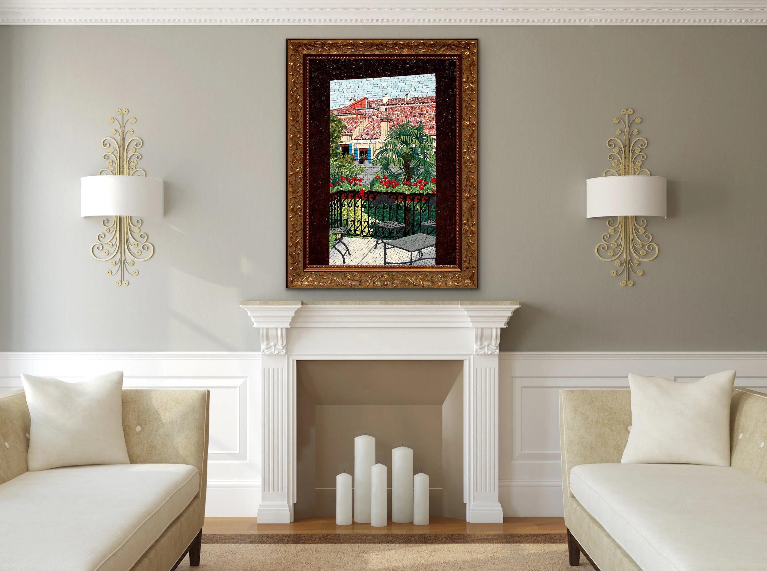
Feature Friday: L'entrata
L’entrata , in situ
In June of 2006, I attended an Orsoni 2-week Master Class in Venice. This was a big move for me. Up to that point, I had been learning on my own and mostly focusing on things more decorative. I had attempted some wall art pieces, but was not really thinking of myself as an artist, or even a mosaicist: I was more of a hobbyist.
My master class experience was pivotal in pointing me in the direction of making art and moving from hobbyist to artist. Even now, 24 years after I first dipped my toes in the mosaic world, I don’t strongly identify as an artist. The label just does not feel comfortable to me. I more solidly identify as a mosaicist, I suppose. Most accurate would be someone who loves to make things.
Inspiration photo
L’entrata (2007) 42" x 32" | 107cm x 81cm. Smalti. In a private collection.
Anyway, after returning from the Orsoni class, I decided to make L’entrata, which was inspired by the above left photo that I took from my table in the classroom, which at that time was upstairs. I was so inspired to work more with smalti and took on this rather ambitious representational work. I used only Orsoni smalti and did my best with the palette and skill I had at the time.
I loved working on this despite the huge technical chore I was attempting. As I recall, it took about 5 months for me to finish. I had originally tried to do the door frame with some of the dimension in the photo, but I lacked both the skill and palette to figure it out. So I ripped out the door frame and replaced it with all dark brown.
Feature Friday: Stabby
Stabby, in situ
Stabby is shown here in her permanent home and not in an Artrooms staged room. I made this mosaic for my daughter in 2018. This was a very satisfying project even though I was not wowed with the idea when my daughter first asked me to mosaic a pixilated unicorn head.
I blogged about this mosaic as I was making it here.
Stabby (2018) 37” x 37” | 91cm x 91cm. Smalti, vitreous, contorni, Kismet, glass rods, art glass, other glass, Swarovski crystals. In a private collection.
Feature Friday: Familial Wounds
Familial Wounds, in situ
Created in 2019, this mosaic is more symbolic than a lot of my work. Well, it may be more accurate to say that I am more aware of its symbolism than I may be in a lot of my other work. The making of this work became more and more personal as it progressed, which was both good and bad.
Bad in that it became so stressful by the end that I messed up my jaw and had months of resulting pain that an acupuncturist finally connected to my jaw. Too much clenching. Good in that it served as a months-long meditation about my own family history, which helped me put things in a broader and clearer perspective.
Familial Wounds (2019) 29” x 38” | 74cm x 97cm. Smalti, mosaic gold, porcelain, colored cement. In a private collection.
Here is a description of the work:
It was the concept of psycho-emotional wounds from which this mosaic initially emerged. As it progressed, I began to meditate more about my own interior wounds, which refined the meaning of this work to that of familial wounds, in particular. I thought of generations past, on both my mother’s and father’s side, and how wounds, in the form of unhealthy behavior patterns, had been passed down through the ancestral lines. Some of our wounds are of this kind of ancestral lineage. Other wounds we acquire as we live and grow and navigate our current lives, and they may be the start of new unhealthy generational patterns as we unconsciously pass them on to our children.
The mosaic suggests two levels of wounding. The dimensional wounds are active wounds, ones that agitate us in present time. These wounds have not yet healed and scarred over, and they still influence, may even dictate, our current behavior. The less apparent wounds are in the background, etched into our interior landscape. They may be scars—the remnants of fully healed wounds—or they may be dormant, awaiting certain circumstances to come to the surface.
Our wounds live deep in our blood-red tissues. Even when healed, the scars remain. They are part of who we are, not just things that happened to us. They shape and define us, for good and for ill. No matter how much we may suffer, however, there is always hope to be found in the light of awareness and understanding, indicated by the gradation toward the upper left of the mosaic. And, healing is always in progress by our bodies’ own mending energies, and by divine grace, both of which are expressed in the gold, lightning-like veins.
Familial Wounds, side perspective detail
Feature Friday: Night Life
Nightlife, in situ
My idea with this work was that of a group of young people, all dressed up for a night on the town, feeling so full of themselves and invincible and free, like young people are wont to do. Most of us have been there, if we were lucky. Thank goodness that it is usually a short-lived period. But, what a feeling!
Nightlife (2009) 10" x 23" | 25cm x 58cm. Smalti, mosaic gold, vitreous glass, contorno, black onyx, garnet, glass, swarovski crystal. In a private collection.
Nightlife, detail
Feature Friday: Pulse
Pulse, in situ
This mosaic, Pulse, was the first in what became my Lines series. I was inspired by Brit Hammer’s “stripes” mosaics and wanted to take the idea of working in lines and make it my own.
Pulse (2008) 11.25" x 30" | 26cm x 76cm. Marble, granite, smalti, piastrina, glass, hematite, mother of pearl, quartz, ceramic, porcelain, pearls, mosaic gold, Swarovski crystal. In a private collection.
I started this work at the end of 2007 and it carried over into 2008. We had a terrible ice storm that year that caused wide-spread power outages. We had no electricity for a week. My husband went to work, along with our two kids who I was home-schooling at the time. I stayed home with our dogs and tried to keep working on this mosaic.
The temperature inside the house got down into the 50s which made it difficult to work. Also, it was rather dark for mosaicking. I moved downstairs into the kitchen to work, which had a little more exterior light coming in, and was also warmer due to the fireplace.
Pulse, detail
In this work, I was expressing that my heart beats in the shades of gray, not in the extremes of black and white. I can muck around in the gray shades around all manner of life issues for hours on end.
I was inspired by these lines from a Rumi poem:
“Out beyond ideas of wrongdoing and rightdoing there is a field. I'll meet you there. When the soul lies down in that grass, the world is too full to talk about.”― Rumi, from A Great Wagon
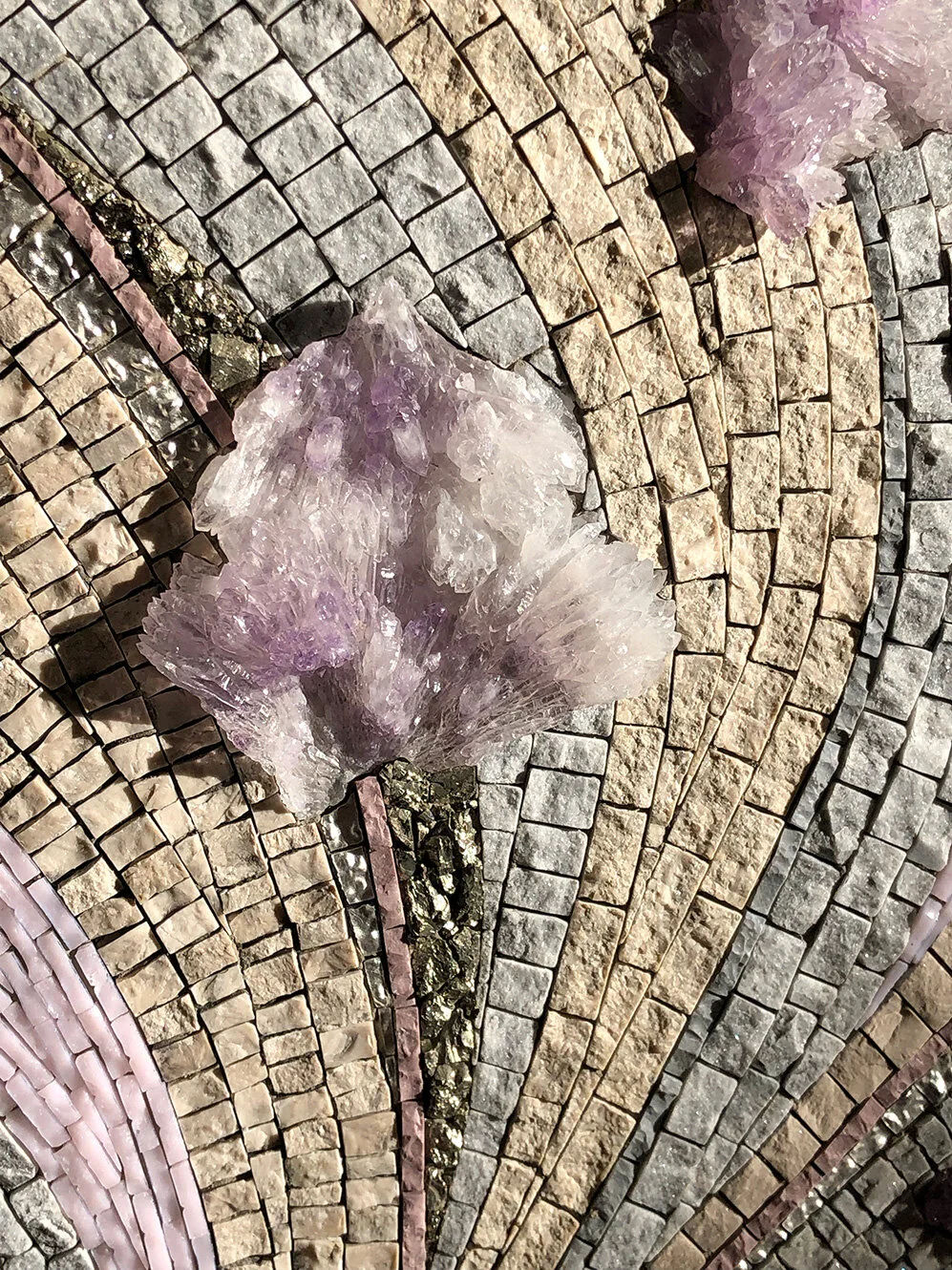
Feature Friday: I Heard The Mountain Sing
I Heard The Mountain Sing, in situ
I Heard The Mountain Sing 30” x 12” Marble, amethyst specimens, pyrite, glass, porcelain, mosaic gold.
Today’s feature was inspired by a trip to Zermatt, Switzerland, and the large bottom amethyst specimen that I found in a little shop there.
I was also happy to be able to use a few other amethyst specimens that I have had for many years. I found the two at the top of the mosaic (detail below) in Myrtle Beach, SC, about 15 years ago. I’ve never seen any like them since.
The photos at left and below were taken in morning light from my studio skylights, which is warmer than the one used for the in situ image at top.
You can read more about this mosaic here.
I Heard The Mountain Sing, detail
“Works of art make rules; rules do not make works of art.”


Archive
- March 2026
- November 2025
- September 2025
- July 2025
- November 2024
- October 2024
- September 2024
- August 2024
- May 2024
- February 2022
- October 2021
- August 2021
- July 2021
- April 2021
- November 2020
- October 2020
- September 2020
- August 2020
- July 2020
- June 2020
- May 2020
- April 2020
- March 2020
- February 2020
- January 2020
- November 2019
- October 2019
- September 2019
- August 2019
- July 2019
- June 2019
- May 2019
- April 2019
- March 2019
- February 2019
- November 2018
- September 2018
- August 2018
- July 2018
- June 2018
- May 2018
- April 2018
- March 2018
- February 2018
- January 2018
- December 2017
- November 2017
- October 2017
- September 2017
- August 2017
- July 2017
- June 2017
- May 2017
- April 2017
- March 2017
- February 2017
- January 2017
- December 2016
- November 2016
- October 2016
- June 2016
- May 2016
- April 2016
- February 2016
- January 2016
- December 2015
- November 2015
- June 2015
- May 2015
- April 2015
- March 2015
- February 2015
- January 2015
- November 2014
- October 2014