What Is A Decorative Mosaic?
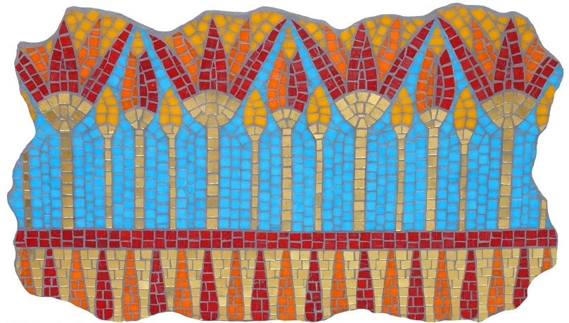
(2005) Lotus Panel. 13" x 21" Mosaic gold, vitreous glass
“Mosaic would qualify as decorative if its primary purpose is to beautify or decorate, as opposed to express a deeper meaning, communicate a point of view, or make a personal statement.”
So let's talk a bit about decorative mosaics.
The mosaic above is a decorative wall panel. It was inspired by a necklace found in King Tut's tomb (image at right, photo by Araldo de Luca). While the necklace itself is not purely decorative, my rendition of it is.
I was attracted to the repetitious and almost geometrical composition of the lotus flowers and buds, as well as the lovely composition of the fully opened flowers. I chose the color palette to go with a particular room. No deep meaning here, just wanted to create a decor item for the house.
If you're not sure if a mosaic is decorative or not, explore the intention with which you made it. A still life, for example, may not be expressing a deep meaning, but it is probably expressing a point of view. Did you make the still life of flowers merely to decorate a wall or to match the furniture? Or were you trying to communicate your experience of those flowers?
Likewise, a pet or human portrait—while it may not be a philosophical statement, is most likely an attempt to communicate aspects of its subject.
The above image shows two necklaces: A stunning mosaic pendant by Margo Anton, and a non-mosaic piece that I bought at a museum gift shop in Mesa, AZ.
Since Margo was one of the first to submit for my book, I am pretty comfortable saying that the necklace she made is a decorative mosaic. Her intention was to make something beautiful that someone would find joy in wearing. I can personally attest to the success of her intention.
It's pretty clear that the other necklace's intention is to make a statement. While it is not mosaic, it can hopefully be a helpful example.
So, is all mosaic jewelry decorative? No. As the creator, your intention answers the question. After that, it truly is in the eye of the beholder as to with what level of art it will be embraced.
Lighting, lighting—Why Must We Keep Fighting?
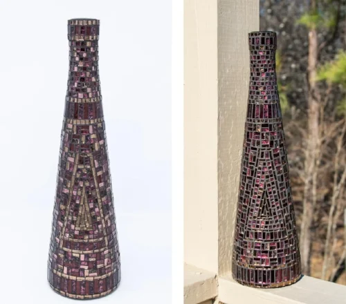
Bronze, Red, and Purple Bottle. 14" x 4.25" | 36 cm x 11 cm. Mirror and Van Gogh glass.
Not satisfied with my pic from yesterday, I'm still trying to bring out the purple. The awesome glass that I used is a bit dichroic, sparkly burgundy from one side, and sparkly purple from another.
The exterior shot on the right brings out a bit more purple and a bit more sparkle overall, but the lighting is pretty harsh. However, I like the way it brings out more of the detail.
I've forgotten how to cut out an object from a photo in Photoshop, which is hard to be believe since I have done it extensively in the past. However, Photoshop has changed, and while it has been changing, my brain has been busy forgetting.
A Facebook friend gave me some instructions that I will put to the test this afternoon. If I succeed, I hope I will have the sense to make notes for the next time.
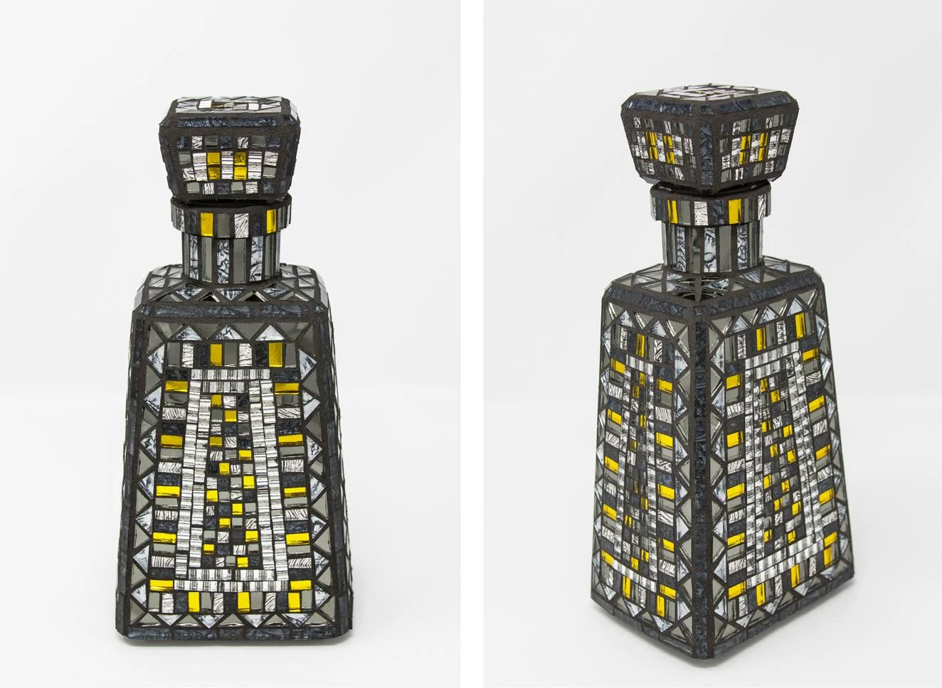
Bottle #3
Gray and Yellow Bottle (2017) 9.5" x 4.5" x 3.5" | 24 cm x 11 cm x 9 cm. Mirror and Van Gogh glass.
Well, another week, another bottle! These 1800® Tequila bottles are a joy to mosaic. The flat, rectangular-ish sides are nice to work with. And did you know that the corners are beveled?
I'm not sure about the glass stoppers. The last time I was looking at 1800® Tequila in a liquor store, the bottles they had did not have glass stoppers. I hope that they are still making some bottles with the glass stoppers because they are quite nice. I would like to do a couple more of these bottles. I think that I've seen smaller ones than this one, and I just might have to drink some more margaritas.
Anyway, here is the latest product of my decorative detour. The palette is very unusual for me, but I have made peace with it. I agree with my daughter's assessment that it is a handsome bottle. It is actually quite neutral and I like that.
My decorative indulgence may extend into the summer. I've got a few more bottles lined up, and I may go ahead and mosaic a few frames. Years ago, someone gave me four medium-sized frames that were in almost-new condition. I really should just go ahead and take care of those while I am in a deco frame of mind. I see mirrors in my near future.
About the photos: I took these photos in my cool new Portable Photo Studio. To try and avoid the small bit of reflection through the small picture-taking window—such a problem for these mirror tiles—I tried shooting slightly down on the bottle. It was very helpful in dealing with that reflection, but the bottle looks slightly distorted—a bit top-heavy, perhaps?—especially the side view. What do you think?
Portable Photo Studio
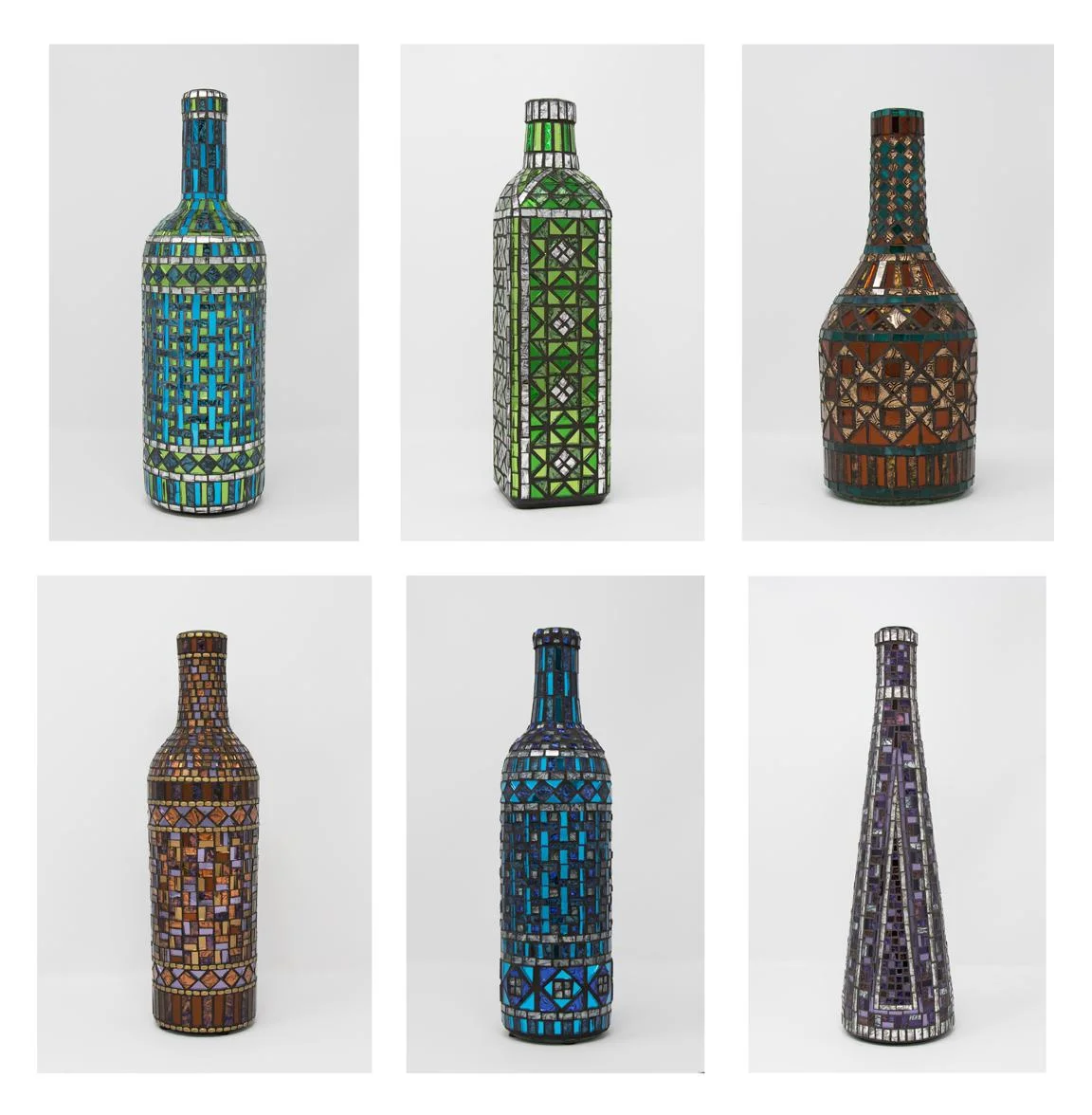
All of the above bottles, except for the purple and silver one in the lower right, were made years ago and I did not have good photos of them. Now, as I am considering a storefront for decorative items, note cards, and books, I need good photos for these bottles, as well as the ones that I plan to make in the next few weeks.
These are very difficult to photograph due to the highly reflective glass surface, and especially due to the mirror glass. The idea of trying to get good photos made me want to just pack them up and take them into a professional. The cost of doing that, however, made me try harder to find a way to take the pics myself.
AmazonBasics Portable Photo Studio. (This image is from the Amazon site.)
This led me to look into light boxes/light tents, and I found the AmazonBasics Portable Photo Studio, pictured at left. After reading up on it, I decided to order one and try it out.
The day after receiving it, I used it to photograph the purple and silver bottle which I had just finished. This went well and I was able to photograph those other five bottles the same day.
Overall, I am pleased with the results and I think it would be very helpful in photographing just about anything that will fit inside it—and it is a generous size.
I had to do a bit of work on the photos in Photoshop, as there was still an issue with my reflection on a few of the mirror tess. A tripod would have helped a little, but its reflection would still have shown. Fortunately, I have just enough Photoshop skill to mostly take care of this issue. These pics may not be professional quality, but I think they look pretty good.
So, at this point, my review can be summed up as: I love this thing! It should help me take good pics of small to medium-sized wall art, as well, although I have not tried that yet. If you are challenged to get the lighting right and produce better photos of your work, you may want to try something like this.
Beginner's Mind: Summary
Beginner's Mind #1 - #4. Each 10" x 8" | 25 cm x 20 cm. Smalti, vitreous, porcelain, mosaic gold, marble, other glass
Here's my assessment of the beginner-potential for each of these pieces. The students can choose to make one of these designs (#1 would have to be simplified) or come up with something completely their own. Simplicity is key.
#1 - Design too complex; cutting too precise. However, it illustrates different andamenti, nice texture, and could be simplified.
#2 - Suitable for beginner. A beginner's would actually be better, I think, as it would be more loose and the lines would have more movement. (I tried to make the lines a little crooked, but mostly failed.) Nice variety of materials, plenty of straight cutting, no angles. Could easily be made more challenging.
#3 - Suitable for an ambitious beginner. A little more demanding than #2 and #4, but still easier than it looks. The design/style is very forgiving and could allow for looser cuts. The surface texture is very dynamic. The porcelain outline of the half-circle and the 3 extended lines could be left out as they are not necessary.
#4 - The most beginner-ish of the group. Easy to work in squares and let the widths of the material guide the interiors. Could easily up the challenge by making the geometric interiors more intricate. Really interesting geometric texture.
Beginner's Mind #4
Beginner's Mind #4. 10" x 8" | 25 cm x 20 cm. Smalti, porcelain, mosaic gold, vitreous, other glass
Beginner's Mind #4, detail
Beginner's Mind #4, detail
My favorite of all four exercises, I believe that this is the most successful attempt to get close to a beginner's perspective. My cutting is loose and I worked rather freely. I started this going a different direction than where I ended up.
Of course, I can't work like a beginner; that ship has sailed. But I was able to allow myself to let things go, to not focus on precise technique, to experiment — especially with this one, and to let go of the outcome.
I tried to make a space to learn and to enjoy. I've never quite done anything like this one before, having the blues and yellows meet in this extreme zig-zag manner — and I think it works very well. I'm so pleased with myself to have tried something different, very different.
Now, could a beginner really do something like this? I think so. Certainly, on a bit smaller scale. I was actually surprised by how fast it went and how forgiving it was.
The blues are very nice mixed this way. I failed to capture it, but the blue glitter tile that I used has some pink/red sparks that show in certain light; the iridescent blue, as well, sometimes reflects pinks/purples, which I did capture some of on the full image.
What an interesting couple of weeks or so. Starting out too complex and controlled, I made my way to a place which reflects the spirit of working like a beginner — or, at least, like a student. This was also an enjoyable exercise which has helped me appreciate my skill level, and the fact that there is plenty more to learn, and unlearn.
I'm feeling prepared and excited for my class, and I'm happy to have four different examples for inspiration and instruction. I've also completely nailed down the materials, of which there is a good variety.
SAMA Conference Registration Scholarships+
I'm very pleased to announce that I will be awarding two 2015 American Mosaic Summit Full Registration Scholarships this week!! That's right, you've got this week to let me know why its important for you to get to Philadelphia in March to attend this conference.
For more information, view the application here.
Note: Additional funding for the scholarship recipients, to assist with transportation, lodging, and other expenses, is currently underway, thanks to the generous efforts of Krystie Rose Millich, aka TileMosaicGirl. Visit Fund SAMA Conf. Schol. Addl Costs.

Red Play
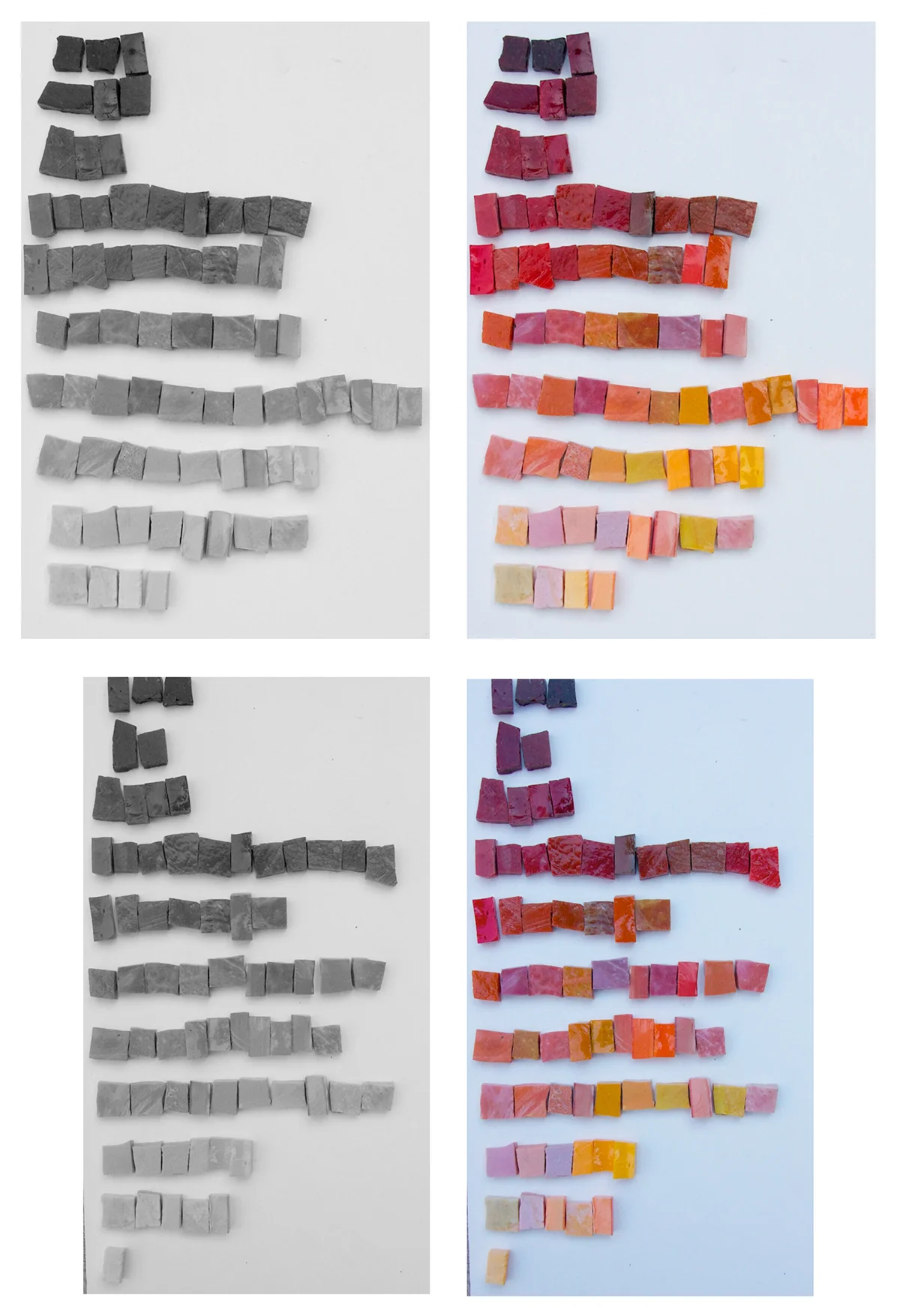
In preparation to resume work on Fragile Heart, I played with all the shades that I may be calling upon. Some people have a very good eye for value, but I'm not sure that I am one of them. The color is distracting to me, but this is a skill that improves with practice.
Below is the result of my morning exercise. The top two images show where I started, and the bottom two show where I ended up after several modifications. Its pretty tricky with reflection, as well as with the mottled shades of the Mexican smalti, but I do see improvement, all thanks to the black-and-white feature in my photo editor.

I could go on endlessly making adjustments, but I think I'll stop now and hope for the best.
About Gold
My fascination with mosaic gold began shortly after my trip to Venice for an Orsoni Master Class in 2006. While there, I purchased kilos of colored golds, and a nice selection of whites to yellows. In 2007, I began working with them and I have not stopped.
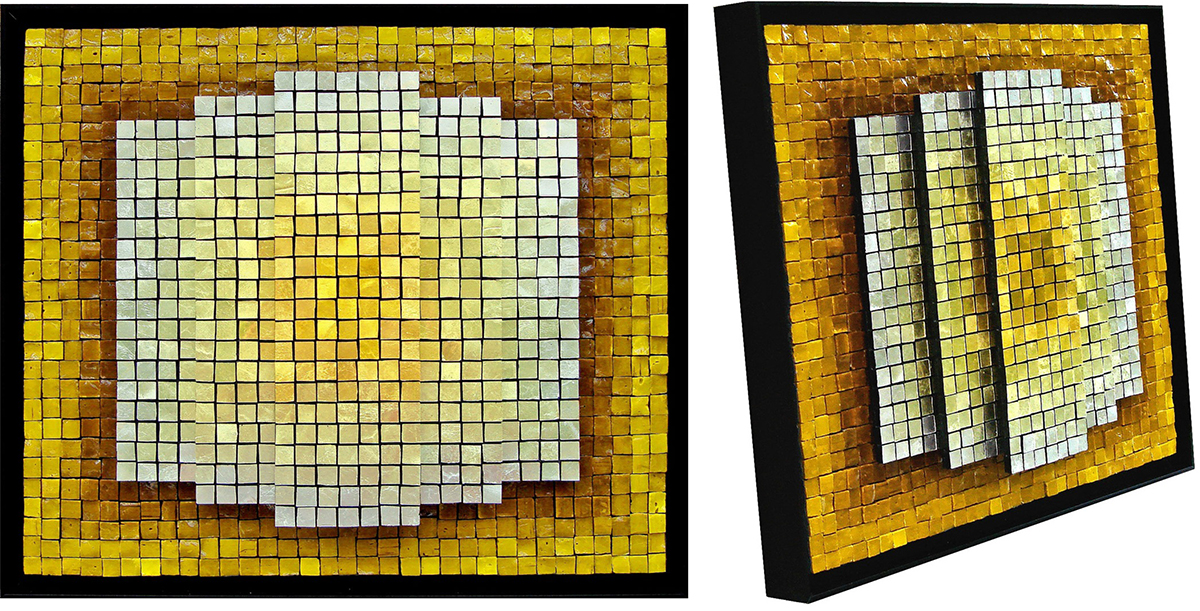
I love the way that the many shades of Orsoni white through yellow golds are so responsive to light. As I walk around a mosaic with several shades, they seem to change in depth — and of course reflectivity — as though they are alive. The deeper yellow shades actually change to rich burnt umbers when viewing from a side angle, as you can see below in one of my early explorations.

© 2014 Jacqueline Iskander. Gold Rising (2007). 13" x 15" | 33cm x 38cm. Smalti, 12 shades of mosaic gold.
I remember Maestro Lucio Orsoni being amused by the common reference of gold smalti: "It isn't smalti; it is nothing like smalti," he said. Of course, it is nothing like smalti. Although the term seems to be more commonly used all the time, I remain a holdout and call it mosaic gold.
For an informative article about golds, check out Going for Gold — 10 things you should know about gold smalts from Mused, a very nice mosaic blog that I follow.
“Works of art make rules; rules do not make works of art.”


Archive
- March 2026
- November 2025
- September 2025
- July 2025
- November 2024
- October 2024
- September 2024
- August 2024
- May 2024
- February 2022
- October 2021
- August 2021
- July 2021
- April 2021
- November 2020
- October 2020
- September 2020
- August 2020
- July 2020
- June 2020
- May 2020
- April 2020
- March 2020
- February 2020
- January 2020
- November 2019
- October 2019
- September 2019
- August 2019
- July 2019
- June 2019
- May 2019
- April 2019
- March 2019
- February 2019
- November 2018
- September 2018
- August 2018
- July 2018
- June 2018
- May 2018
- April 2018
- March 2018
- February 2018
- January 2018
- December 2017
- November 2017
- October 2017
- September 2017
- August 2017
- July 2017
- June 2017
- May 2017
- April 2017
- March 2017
- February 2017
- January 2017
- December 2016
- November 2016
- October 2016
- June 2016
- May 2016
- April 2016
- February 2016
- January 2016
- December 2015
- November 2015
- June 2015
- May 2015
- April 2015
- March 2015
- February 2015
- January 2015
- November 2014
- October 2014