Work in progress:
I’m enjoying working loosely on this one.
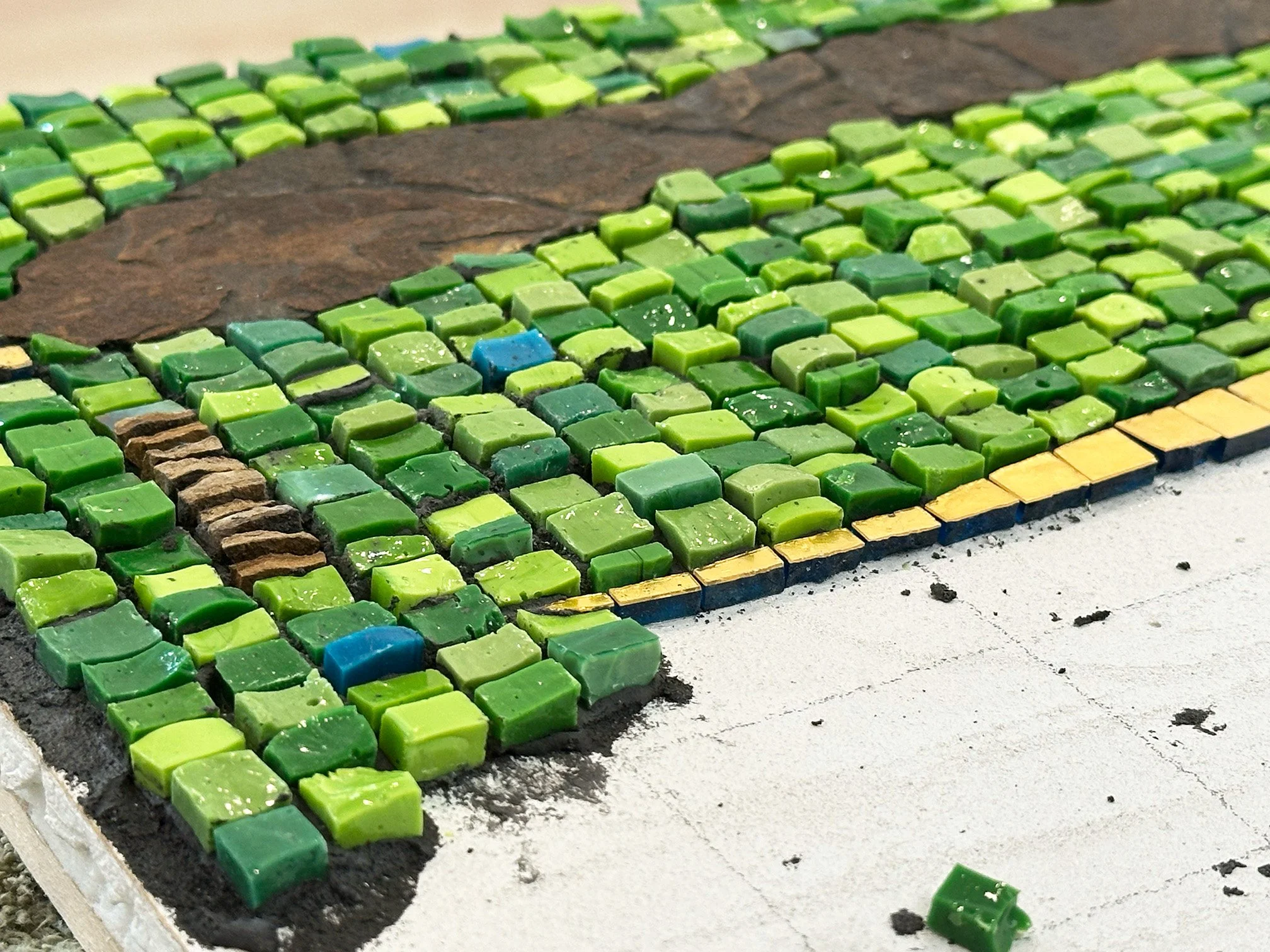
D Major (The Sound of Green) 20” x 30” Shale, smalti, mosaic gold
WIP
Work in progress:
I’m enjoying working loosely on this one.
D Major (The Sound of Green) 20” x 30” Shale, smalti, mosaic gold
I wrote last week about how I have been in quite a creative slump, but that I was determined to finish a little, fun piece that I started at the end of last year. Well, I am out of determination. It just was not working for me. Have you ever just lost interest in a project? Silly question, right? I really hate to add another unfinished mosaic to my list but it, at least, has company.
I’m going to mosaic a pair of bottles, also started back in November before I lost interest in them. I now understand that my lack of interest was not only mosaic oriented, but more of a general malaise that spilled over into my creative drive, resulting in an existential foray into questions about life and purpose. My mind just loves that kind of stuff, and that is for both good and ill, I believe.
Time to move on! Here is a pair of interestingly-shaped tequila bottles. I don’t remember the brand. My husband brought home one bottle a few years ago. I thought the shape just called out for a mate, so I found another one. I drew the pattern on last November and then proceeded to abandon them on a work table for all these months.
I’ll be using Orsoni #10 gold for the lines, and an off-white marble for the rest (at least I think I have decided on an off-white marble). I have not decided on the andamento for the marble yet, whether I want it to be the same throughout—like vertical—or whether I will do something contrasting between the sections that will be created by the lines of gold. I’ll start with the gold and then decide. The shape of the bottles does present some challenge no matter what I decide for the marble.
So, to work!
This pretty boy is coming along. The tail feathers on the rooster used for inspiration are so pretty in shades of blue and teal, with iridized highlights. I was actually excited to tackle the feathers and was absurdly confident. So I decided to use this kind of feather/leaf andamento with relatively thin strips, so I could try for shading and color gradations, mixed with iridescent highlights.
After the first two feathers—the topmost ones, not including the darker interior of them— I was asking myself that old familiar question: What the heck was I thinking? But, no matter, it was just a momentary panic. I recovered quickly and embraced the just keep going mantra.
At this point, I’m happy with it and am sure it will be so worth the effort. I think he’s going to be gorgeous!
Gaglio Rooster, in progress 17” x 17” | 43cm x 43cm. Smalti.
Previous Posts
I got off to a slow start on this fella, but I’m into it now. I started with the comb and have now gone back and reworked a bit of it twice. It’s better. Now, I’m not sure about that very small, red, wing-like area, but I’ll wait and see if I can live with it.
Ah, smalti! Sometimes, I absolutely hate working with it. It is so messy and hard to cut. But then, I look at that color and gorgeous reflective quality and… well, it is worth it!
When it’s finished, I will use a wash of charcoal colorant and water on it to tone down the gray thin set. I prefer this to coloring the thin set, if I can get away with it, because that black thin set is so darn messy.
Study in Moderation № 7, in progress. 8” x 6” | 20cm x 15cm. Marble, smalti, turquoise, mosaic gold.
I switched gears from the spring clip-driven little studies. They were fun but I began to find them limiting. I’m sure I could have come up with some more arrangements, but I needed to do something different. These substrates are pretty small and I felt like I did not have too many options when everything was driven by the spring clips.
So, I’m trying something more free-form. This one is about two-thirds finished. I did not draw anything out and I am finding this to be a totally different experience than the spring clip pieces. Still working at a more relaxed, less-controlled execution.

Study in Moderation № 3, in progress. 6” x 8” | 17cm x 20cm. Smalti, framing spring clips
Gorgeous Mexica smalti! Can you believe that this range of shade and color is all from one color? I think it’s # 213-Coral and Cream. Let’s see if I can do it justice with the stone background.
Study in Moderation № 2, in progress. 8” x 6” | 20cm x 15cm.
This is my second attempt to achieve the ever elusive something different, something looser.
I sheared the smalti to give it a less polished surface quality. Shearing also makes precision cuts trickier so that is hopefully to my advantage.
Now I will work out my background andamento, striving for something more casual than is my habit.
Echos In Time № 2, in progress. 8” x 6” | 23cm x 18cm.
This is my second attempt at that elusive something different. This morning, I added two more spring clips, thatt I thought would make it more balanced, so I have the two more areas to fill. I’ve not glued the pieces yet.
The shape made me think of a tree or a plant of some sort, but it also kind of looks like a person-like being dancing, don’t you thing? Horizontally, it looks a little like a strange, Seuss-like bird. But I went with the tree inspiration and chose the green. The background will be primarily one of my favorite marbles: emperador brown.
I’ll decide the orientation when I work out the background andamento, but it’s feeling portrait.
Study in Moderation № 1, in progress 6” x 8” | 15cm x 20cm. Marble, smalti, framing spring clips
Well, this one is a mixed bag. This is not what I intended or desired. This is not loose. Not at all. Partly, this andamento inhibits me from working loosley. Clearly, I chose the wrong andamento. And partly, my nature inhibits me from working loosely. Both of these things I believe I can and will do something about.
It may not look like it, but I was more relaxed about my cuts. This tells me that when I fuss more about my cuts, it really may not buy me very much. Still, I am surprised at how acceptable the cuts are with me having a more relaxed attitude about it. No grinder, no fussing.
Still, I am disappointed with this. I wanted to do something different than what I normally would do, and this is not different. But I shall persist. I will finish this one and try again.
Study in Moderation № 1, in progress
Last week, I was working on another concept for a series of small pieces. I had planned on calling the series Echoes, which was appropriate for the concept. Well, the concept just did not work. Weird. I was very excited about it, but as I started on the design, it just was not working for me.
I immediately shifted to this idea of working with framing spring clips for a series of small pieces. The original concept, though unsuccessful, led to this concept. I’ve been trying to come up with a title but could not, so I am sticking with Echoes for now. Update 7-22-2020: This series is titled Study in Moderation.
After finishing the spring clip and smalti motif (at left), I next needed to decide my andamento. What I did was to take the image at left and import it into my Procreate app.
Then using the app, I cleaned up the background and created a layer to play with a couple of ideas. I settled on a rather classic approach, the result of which you see above. It is just a sketch, a guide. I’m going for something like it but without being too precise.
When I made the piece at right, I had intended to use a looser technique but realized, about 1/4 way through, that I had habitually slipped into a very controlled and precise execution.
I was disappointed but finished it in the controlled and precise manner in which I started it rather than start over.
Although I am happy with this little mosaic, I think it could have been much more interesting had I used a looser and less controlled execution. Or maybe just different. I want to explore different.
A Little Love Story 6.5” x 8.5” | 17cm x 22cm. Marble, travertine, smalti, coral, turquoise mosaic gold.
Although I’ve started with the smalti inside the spring clips being fairly precise, I felt it necessary because the spaces are very small and difficult to work within. I will see if I can be happy with loosening that up in the next piece. But the stone background is where I will really practice less control. Let’s see if I can do it!
Next in line are a few additions to my Frequency Series. These are small, enjoyable pieces just working with combining colors. So far, I have only concentrated on LGBTQ flag color combos, but I have in mind to do a few non-LGBTQ themes as well.
Lesbian Frequency, in progress. 8” x 10” | 20cm x 25cm. Kismet, colored cement.
This one, Lesbian Frequency, uses Kismet glass in colors as close as I could find to the Lesbian flag, or one of them, as there are a few variations. I may do one of those variations next. The first two frequencies, Pride and Trans, were made with vitreous glass. The Kismet is a little thicker, but quite uniform, and the cut surface is more akin to smalti, providing a nicer reflective quality.
The pieces are all cut and I’m ready to go!
I’m moving along rather slowly but in a more relaxed way than I am used to. All the creative energy was up front in the design phase. Now, I just have to follow the design, trimming and shaping each piece of gold into the closest I can get to a square or squarish rectangle.
Theme and Variations 36” x 57”. Mosaic gold.
Even with the grid, keeping the lines straight requires constant attention. The variation in the sizes and exact shapes of the pieces makes it easy to get wavy lines, which I am having more trouble with vertically than horizontally. I wonder why that is? I’m not shooting for perfection here, but I do need it to be a grid. I’ve had to make a few corrections as I go, and as the lines develop in length enough for me to both go wavy and see that I’ve gone wavy. There will no doubt be needed corrections when I finish the main work and before I get into the finishing work.
initially thought that this mosaic would take me through the end of the year, and I believe that to still be the case. In fact, I may not actually complete the finishing work until into 2020. Slow and steady.
Some of the main players in my current production are ready to rumble. This palette is way more colorful than I like. I prefer a minimal palette with little contrast, or a single color family, and I did try to impose my preference on this work in the design phase. But I lost that battle and all this color prevailed.
Mosaic gold: green, turquoise, orange, blue, violet, 010/013 yellow, 015/016/017 copper
The gold pieces in this photo are all cut from 3” square plates. The smallest squares are the size of four of the smaller standard-cut gold. These larger pieces will be elevated by approximately the thickness of the gold, which runs around 1/8”. I’ve adhered a support to the back of each of these 80 pieces, painted the edges, and they are ready to go.
The design for this mosaic is foreign to me, but it was very enjoyable to work on. We sometimes call such unexpected works a departure. I’m not sure about that, but I do feel that it is a risk that I am not sure will result in success—a risk because of the expense of all the gold, and because it will be a very large and heavy monstrosity to deal with should it fail.
Still, it’s like taking a particular direction along a forked path in the woods, not knowing or caring where it leads because it just feels like the walk will be worth it.
I’m almost ready to start this very large mosaic which will be titled All Dreams. It is the 5th in my Music To My Eyes series, which is inspired by classical piano music in particular forms. These mosaics rely on mosaic gold in a grid format, or opus, in expressing some aspect(s) of the form/music.
All Dreams is inspired by a contemporary classical piano piece by Christopher Theofanidis, titled All Dreams Begin With The Horizon, 3rd movement. The form is basically a Theme and Variations. Although the other pieces in the series are named by the musical form, I think that Theme and Variations is just so technical sounding, so I’m going to call it All Dreams, for now anyway. Still thinking on that…
In 2010, I created this 36” x 57” substrate (at right) from 36” square, 1/2” Wedi panels in two layers. At that time, I could not get the full 60” x 36” panels here in Tulsa, so I built one. I needed four such panels for a large commission.
As it turned out, this substrate was about the same weight as a Hardibacker panel which cost much less in both $$ and labor. The weight was a concern because I would be using a lot of stone. I went with the Hardibacker and stored this Wedi substrate away. The finished panels ended up weighing about 100 lbs. each.
A few years ago, I had a metal frame made, with an EZ-bar hanger attached on the back, and installed the substrate into the frame. This gave me a landscape-oriented substrate ready and waiting to be mosaicked.
It is pretty heavy without any mosaic on it. The Wedi substrate itself is about 30 lbs., if I remember correctly. Since framing it, I have been contemplating what I could do with this while keeping the additional weight as minimal as possible.
Over time, an idea began to percolate and I started some design work last spring. Just a bit more tweaking and I hope to start the mosaic work next week. As you can see in the photo, I have the gold all lined up, minus two orange plates that should arrive any day now. There is a 28” x 49” grid of 3/8” squares centered on the substrate. The design calls for both mosaicked and non-mosaicked areas, which I hope will help with the final weight.
It looks like I’ve got plenty to keep me busy!
This wavy bottle (click on image to zoom) is now 5/8 finished, not counting the very top edge, or spout. I have not quite figured out how to handle that yet, but I will think of something.
The gold is called Acid Green, and I bought it back in 2006 when I was in Venice for the Orsoni 2-week Master Class. I’m using a lot more of it than I thought I would when I started, and it’s not because of waste. 3d objects can be deceptive. I’m also surprised at how much marble it is requiring. But I like the way it is turning out.
I’ve got a little trip coming up to San Jose, CA, to visit my daughter for about a week. I will finish this project when I get back.
Currently untitled. 18.5” x 6” | 47cm x 15cm. Marble, mosaic gold, on glass bottle.
With a busy June and July coming up, I’m taking a break between fine art pieces but still like to work in my studio when I can. I thought about doing some decorative work, and then I remembered a bottle that I had bought from an estate sale over 20 years ago. I thought I might have even gotten rid of it, but I found it at the back of one of my closets.
It is an unusual shape and only slightly wonky—most bottles are imperfect—and has a bit of a lean on one side. Still, it is a tall and distinctive bottle and I thought I could do something with it. It’s bulging shape did not lend itself to my usual geometric technique, and I’ve been wanting to do something 3d with marble for some time.
I came up with this design after contemplating the shape of the bottle and asking myself how I could best exploit the shape without making the project extremely difficult.
You can see the bottle at right (click on it to zoom). It measures 18.5” | 47cm tall and is about 6” | 15cm at its widest. I’ve marked the bottle vertically in eighths, and in this pic I’m just ready to start mosaicking the lines with brown marble.
The dark brown marble is Emperador, and I don’t know what the beige is. I purchased the marble from Home Depot a few years ago as a mix for wall applications. I absolutely love Emperador marble! It has beautiful variations and veining, but can be tricky to cut. I’m accompanying the earthy marbles with acid green gold in crazy paving.
We’ll see how it turns out.

In my previous post, I linked to my in progress videos. In video, Part 2, I talked about breaking some rules. Now, in my 3rd video, I both clarify and elaborate about three unofficial mosaic rules that I am breaking.
If you’re interested in hearing about how I understand and process these rules, watch I Heard the Mountain Sing, Part 3 (Breaking Rules)
I Heard the Mountain Sing, in progress. 30” x 12” | 76cm x 30cm. Marble, amethyst specimens, pyrite, glass, porcelain.
Believe it or not, I found that gorgeous large amethyst cyrstal slab in Zermat, Switzerland, for a very reasonable price and only about $50 to ship. The slab measures approximately 5 1/2” x 9” | 14cm x 23cm. It is close to 2 1/2” | 6cm thick, which required that I build up the substrate around it.
If you want to learn more about how I am making this, check out my Work In Progress videos for this project.
Just a brief video on finishing the edges.
In this video, I talk about various aspects of the smalti execution and finishing.