
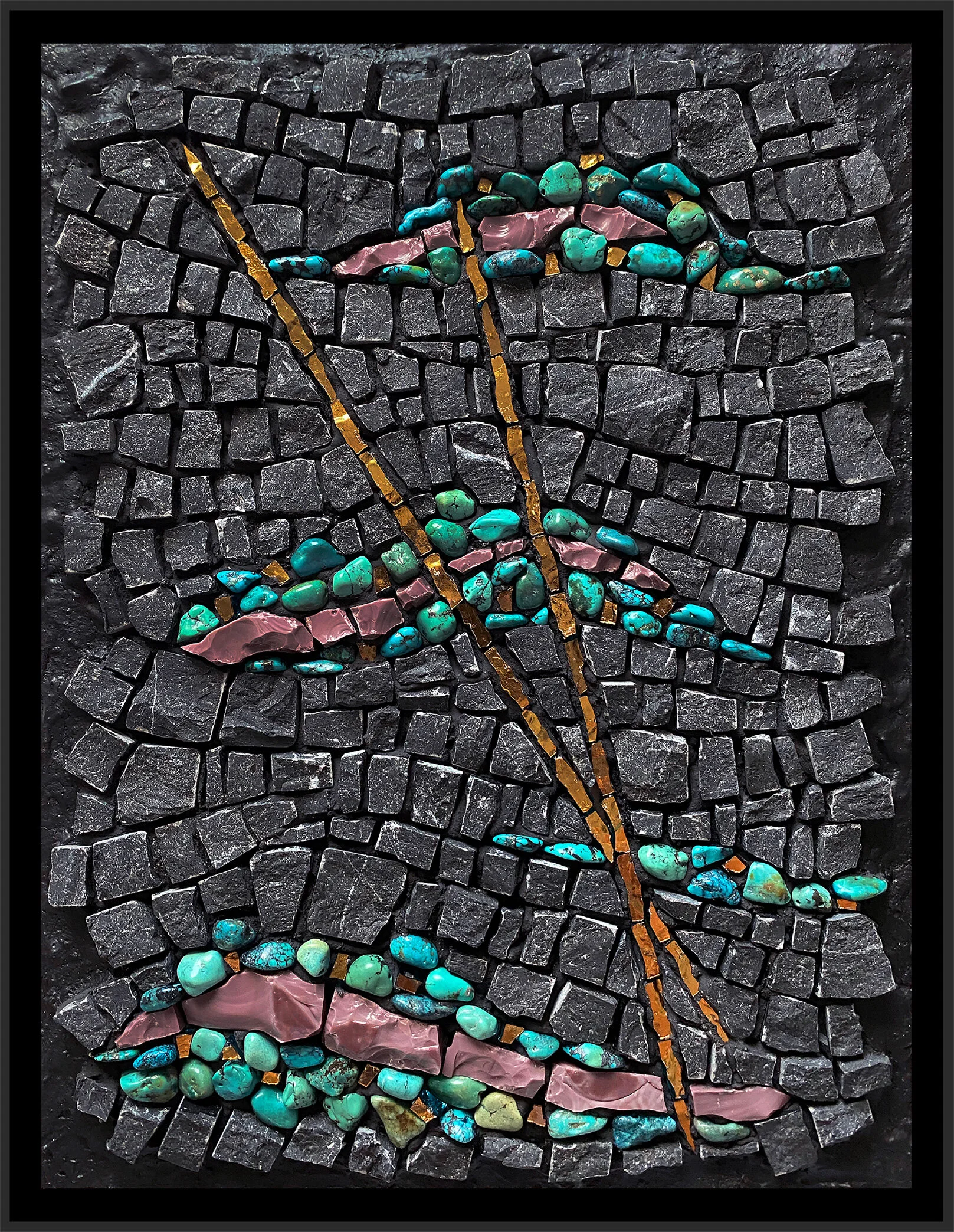
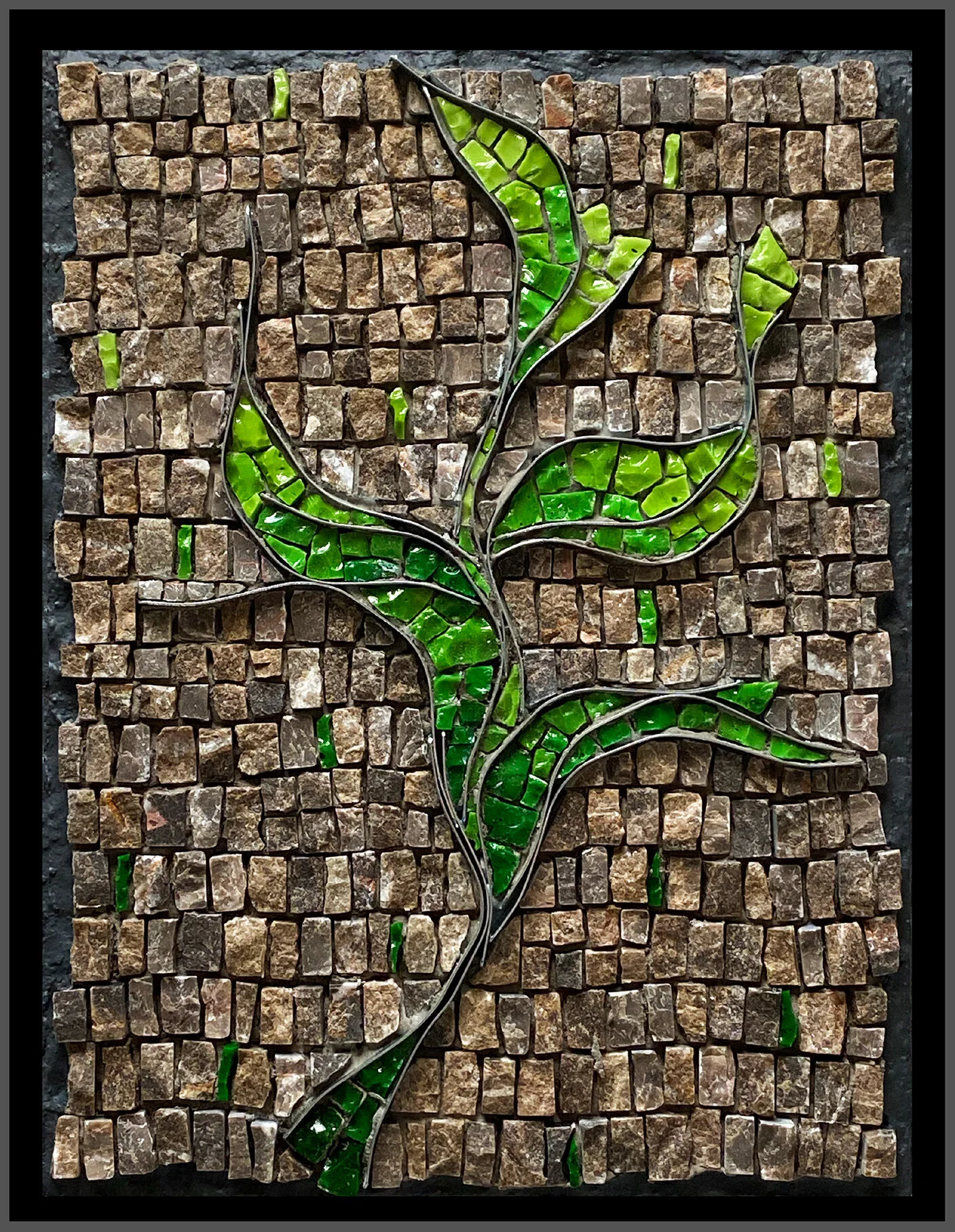
Progress on The Sound of Green (D Minor)
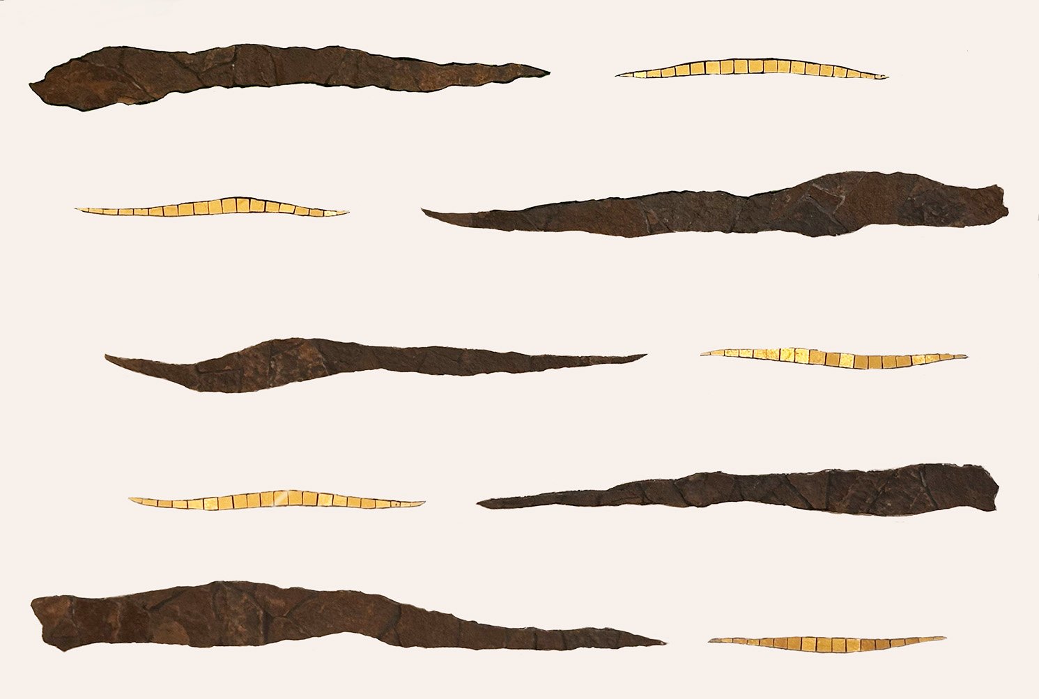
The Sound of Green (D Minor), main elements 20” x 30” | 52cm x 76cm. Shale, mosaic gold
It’s been some time since I had much to say, but I’m still here. I don’t work in my studio nearly as much as I used to, so progress is slow. Since my 2022 surgery, the structure of my life has changed in a lot of small ways and that has impacted my relationship with my mosaic work.
I can’t really single out a particular thing to explain this restructuring, other than that I allowed a space for it to happen. And I really like having that space. It is filled with kids, grandkids, cooking, focus on health and, of course, mosaic. All is good.
This mosaic, The Sound of Green (D Minor), was inspired by my musician son who had just moved to Baltimore to attend The Peabody Institute to earn his Doctor of Music. He feels a strong connection to forests and woods and I wrote some time ago about this as an inspiration for this mosaic in this blog post.
I had a vision for the main elements in local shale and gold, which you can see in the image above. Unfortunately, that was all I had a vision for. At the same time, I was struggling with motivation for mosaic. I was working through the uncertainty of my life being in flux. So the mosaic went abandoned for a few years.
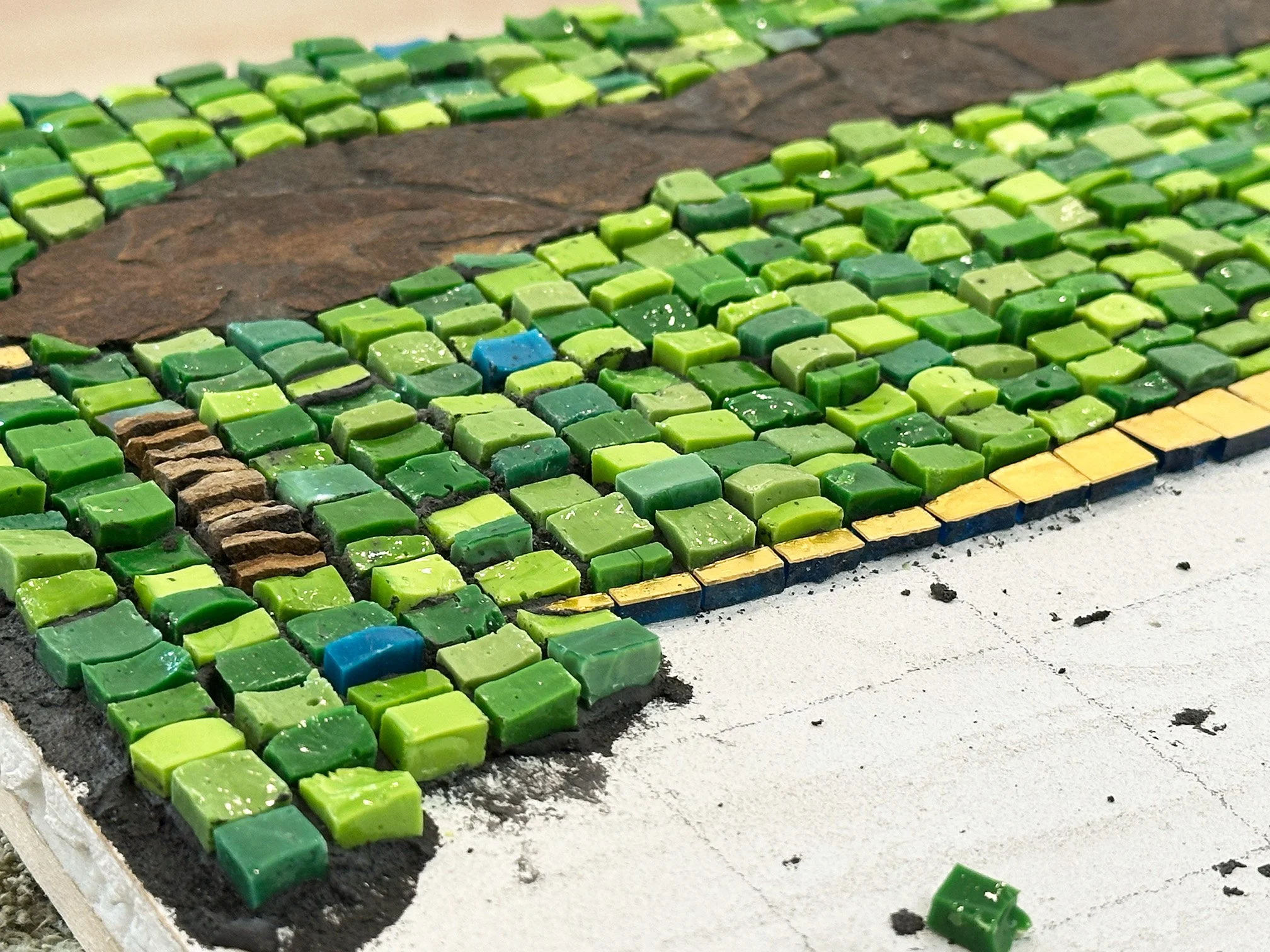
In time, I wanted to get back to my studio despite my lack of motivation. I decided to just work away on something, just to see if I could get into some flow. So I went to work on D Minor in very loose width-wise cuts of A cut (normal) smalti in a variety of greens and in a vertical andamento (see below image). Easy peasy, right?
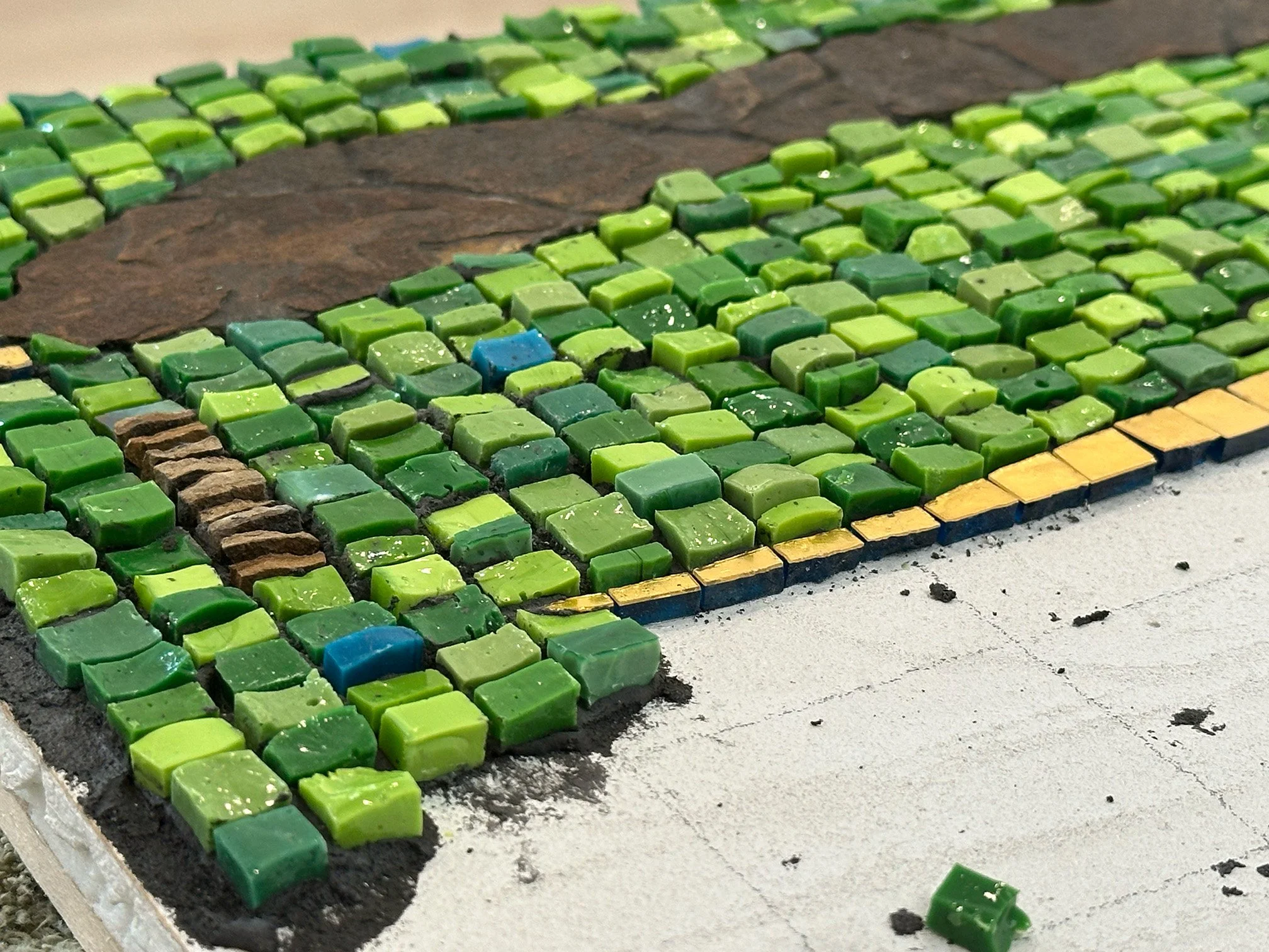
D Minor, previous life
I did enjoy working like this for a few months. Unfortunately, after executing about 2/3 of the background, I did not like it. It was all wrong and it just did not work. The vertical andamento with the little pieces did not at all serve the organic stone work of the main elements. And I felt that there was too much contrast between the darkest and the lightest greens. It almost came off looking checkerboard-y. Not being sure what to do about that, I got busy with the two fugues which I totally enjoyed creating.
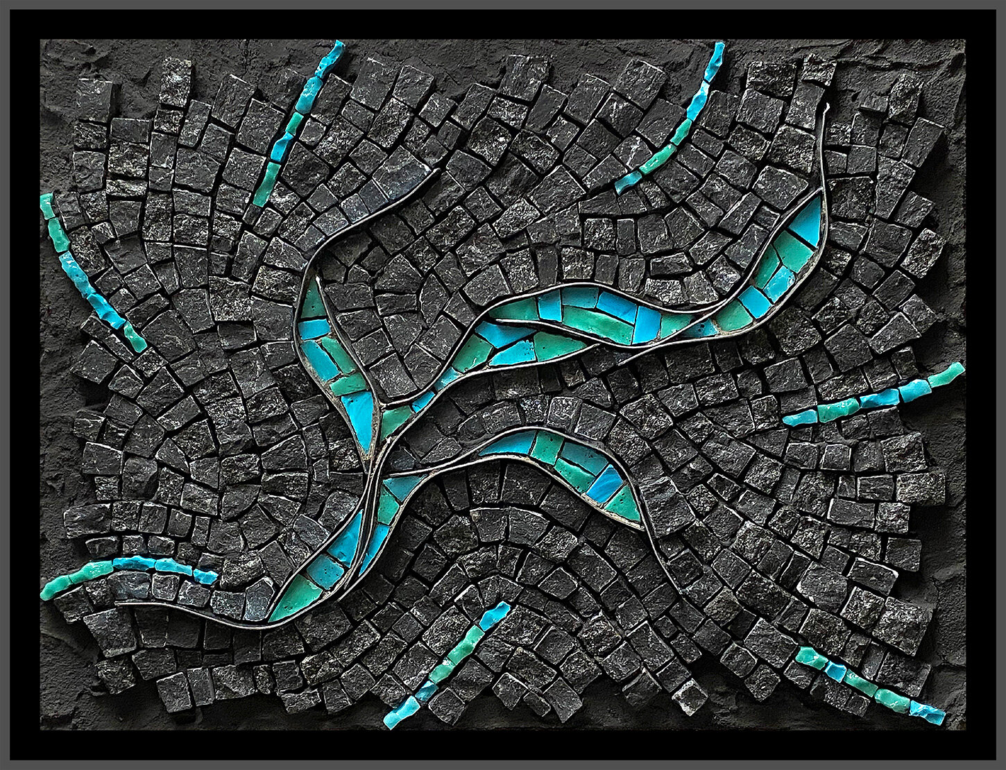
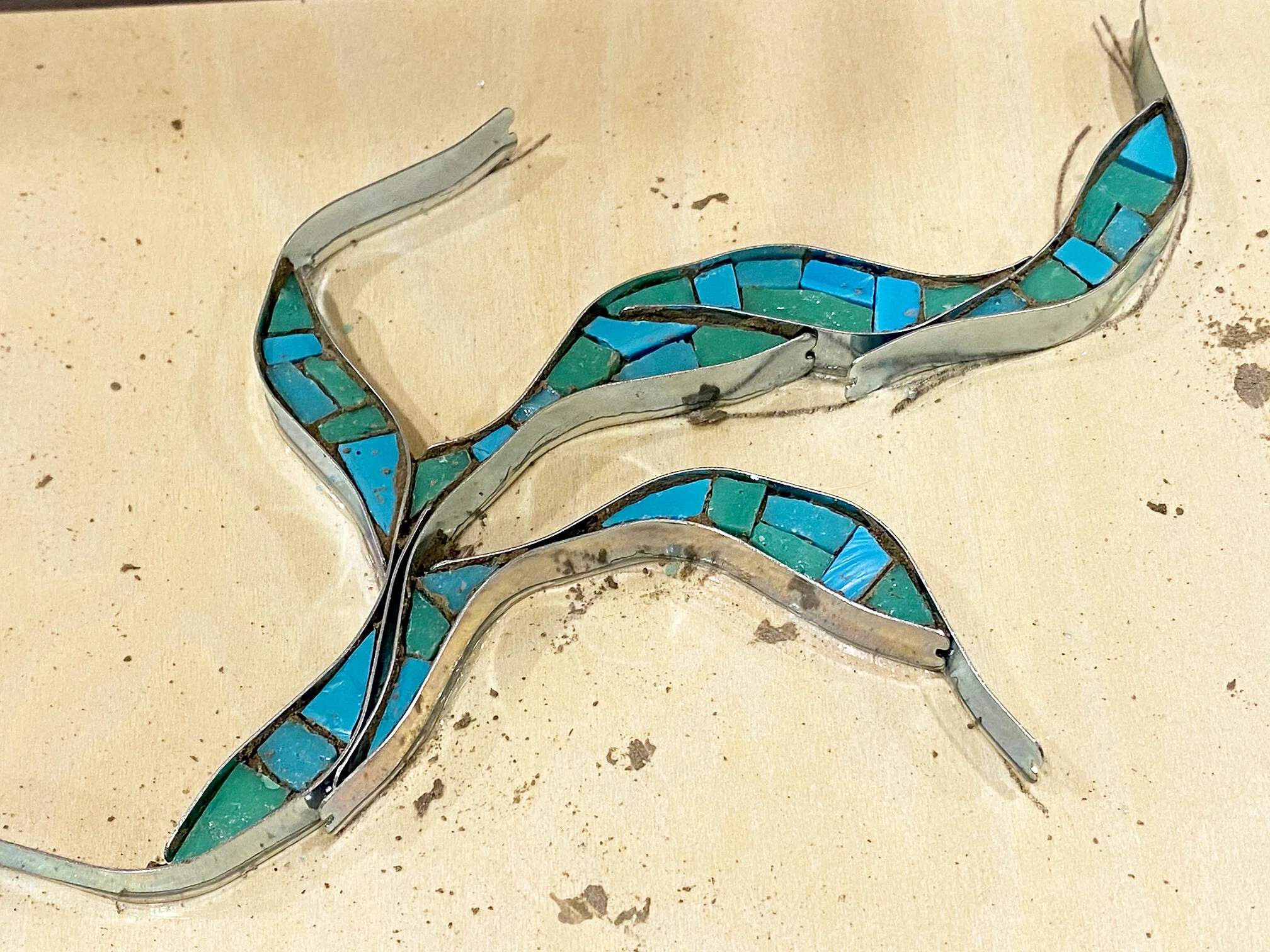
So, now it’s 2026 and I would not let myself move on until I made a decision about D Minor. I finally decided to give up on it as it was just not going to work. One Saturday, I entered my studio with the sole intention of stuffing the mosaic in a trash bag. But, alas, I could not give up on it. I really liked the main elements and the inspiration of my son’s Sound of Green. Additionally, it was a good-sized Kerdi substrate on which I had installed a wooden back support for framing/hanging.
What if I try to scape off all that thinest-adhered green smalti? An absolutely absurd idea! Kerdi board does not take well to this kind of demolition, being even a bit worse than Wedi, in my opinion. But really, what did I have to lose? Many grueling and messy hours later, the deed was done with minimal damage to the main elements and maximal damage to the substrate surface. After more hours repairing everything, D Minor had a new life; it still had a chance to be realized.
Okay, so I needed a more organic, even robust, approach. After considering a couple of andamento ideas, I stumbled upon a mostly crazy paving andamento with a lot of large, sheared chunks of smalti B (Ravenna) cuts, along with some A cuts and even some of the small pieces that were scraped off—a reincarnation of sorts. I also eliminated the darkest and the lightest greens from the palette, and am including some Mexican smalti in green and green iridescent as well.
I just love these luscious chunks of sheared B (Ravenna) cut greens and I am enjoying this project. Shearing is terribly messy and often difficult to control the thickess, but I do think that this adamento better serves the mosaic. Will it be successful? We’ll see.
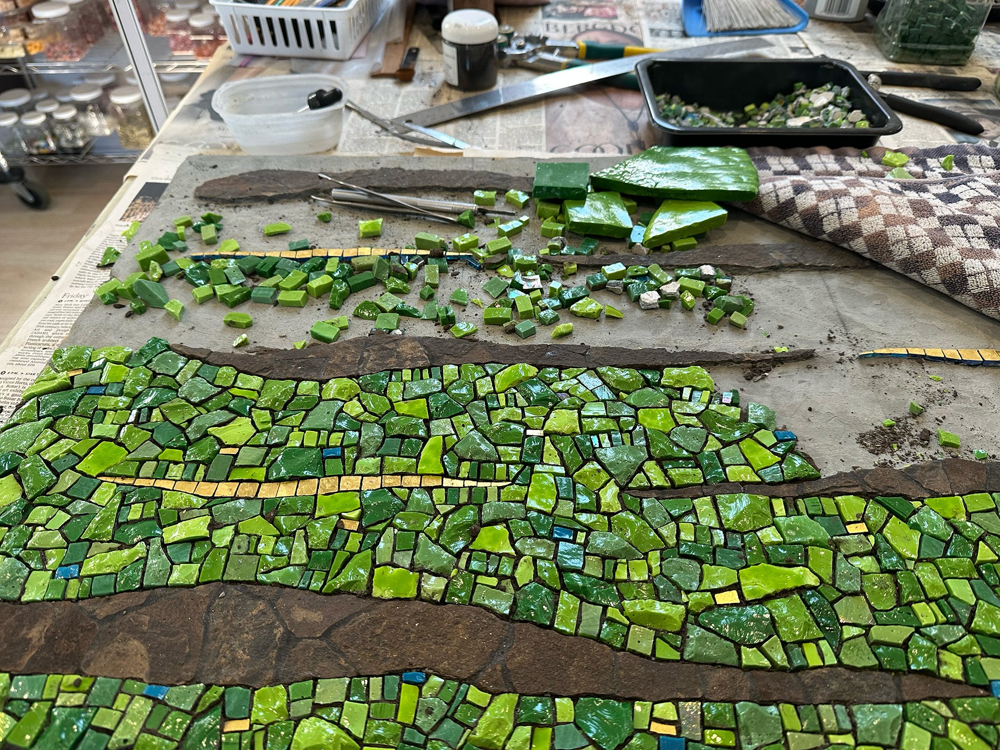
The Sound of Green, in progress 20” x 30”. Shale, smalti, mosaic gold
Eden's Promise
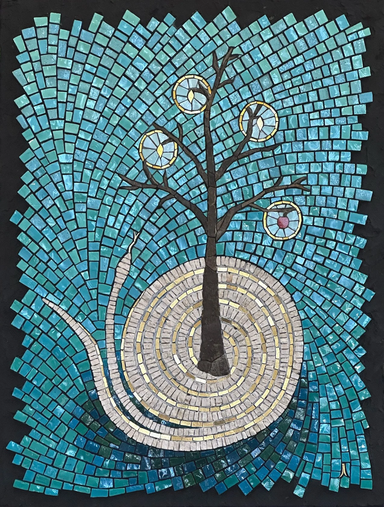
This is a piece I started about 3 or 4 years ago. It needed a little rethinking, which I managed to conjure up a few months ago. The background andamento was a nice challenge for me, as well as the soft gradation in the middle section.

Eden’s Promise (2024) 19.5” x 15” Smalti, marble and travertine, shale, mosaic gold

Eden’s Promise, with reflection

OSU № 4 and № 5 of 5
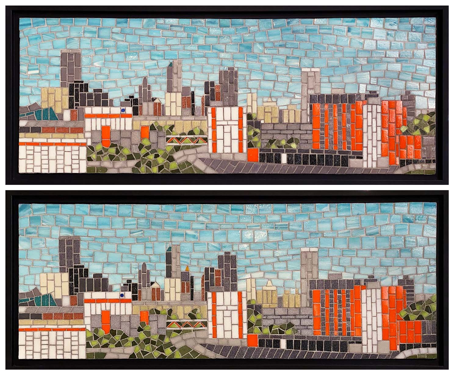
OSU № 4 and № 5 of 5. 9” x 24” | 23cm x 61cm, unframed. Vitreous glass.
Good to have this project finished! I completely forgot to take pics of № 2 and № 3, but they do all look basically the same.
I intentionally made very minor changes amongst the five in the background buildings so each one would be different. Also, the sky is a little different on each one with variations in the amount of movement. I worked the sky free form, without a pattern, and I think I enjoyed that part the most of the whole project.
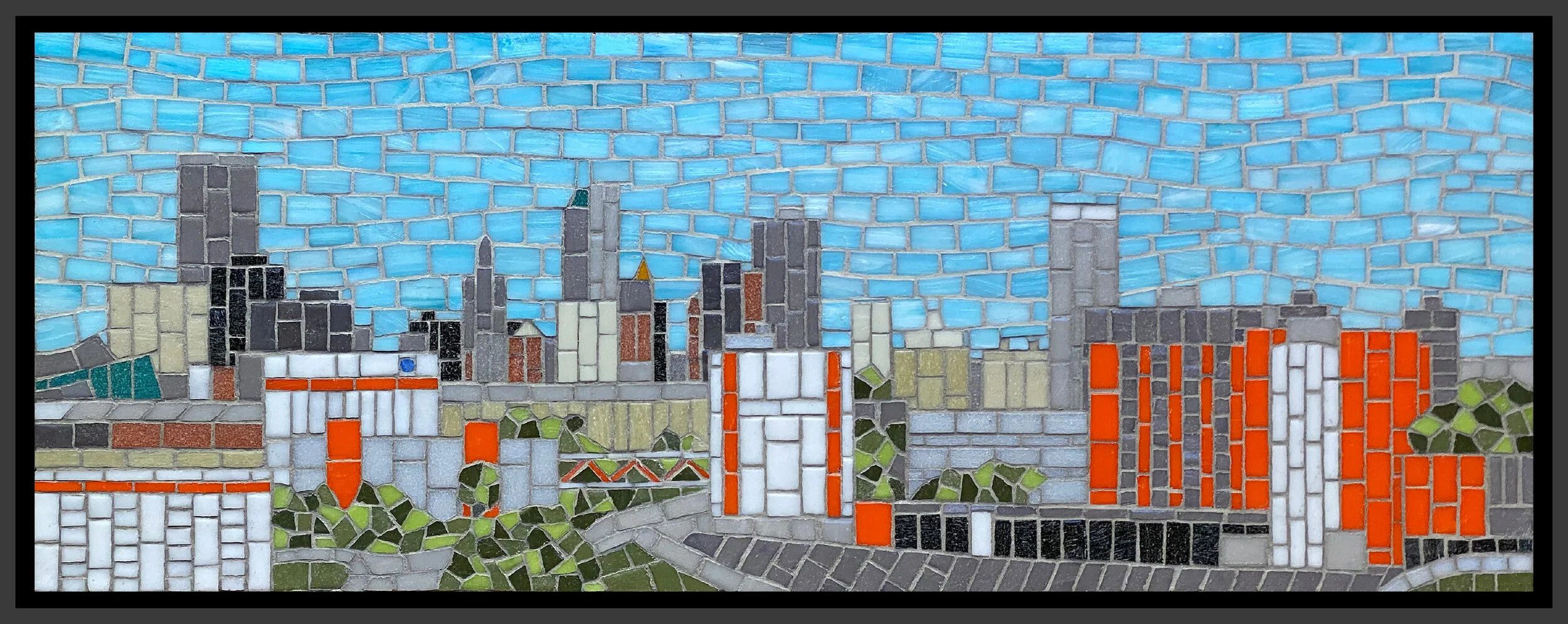
OSU Commission, № 1 of 5
So, that potential commission that I blogged about did come through after all. It was a bit of a lengthy, touch-and-go kind of process, and I actually thought it had gone and was not going to happen. But then, after another month, I heard from them and they were ready to move on it.
Oklahoma State University is developing a medical complex in downtown Tulsa. It is not complete yet, but they wanted mosaics of the skyline with the actual and future OSU buildings. It was not easy to get the right view as the complex is rather spread out. They wanted five “table top” pieces, which they defined as being as much as 24” wide. Eventually, they were able to get a couple of good Google Earth images from which I could work.
Below is the image that I used to create the to-scale drawing that follows. The Google Earth image was very small, however, and it was tricky to translate some of the buildings and/or features. In a 9” x 24” mosaic, on their time frame and within their budget, I could not get very detailed. We needed to bring out the OSU buildings and visually tie them together, even though the complex is not finished. So I honed in on the OSU orange and used it, along with more detail, to help make the OSU buildings visually prominent. So all the front buildings with the bright orange are the OSU buildings. The background buildings that look a paler orange are actually more of a terra cotta color, which you can see in the finished first mosaic.
Google Earth image
My rendering of the Goggle Earth image, created using the Procreate app. This rendering included some future construction
Initially, they wanted all five—gifts for donors—by Christmas, but I was not comfortable committing to that. So they asked for three of them by Christmas. Confident that I could do that, and with an approved budget, we signed a contract, effective Oct. 1.
I started the first one (below) before Oct. 1, as I had material on hand and really wanted to get a good idea of how much time I needed, how much detail I could manage, and generally work out any issues. I am now starting the second one.
Tulsa/OSU Skyline 9“ x 24” | 23cm x 61cm. Vitreous glass. Digitally framed.
The vitreous glass is a mix of French Opio and Italian Bisazza, and also Trend. Yes, that Bisazza is old, as well as the Opio, neither of which are available now, although Bisazza is basically Trend now, if I have that right. I priced the work for them using either vitreous or smalti and they chose the vitreous. It is less expensive, I had a good amount in inventory, and I thought it more practical for this project, considering the time issue. I knew I would be using a lot of straight cuts and thought vitreous would be a little easier—translate to faster—than smalti. Still, vitreous has its own issues, like dealing with those darned mitered edges. And the Opio is the hardest vitreous I have every worked with!
The only issue that I encountered was the grout. I was hoping to use a single color for the sky as for the non-sky, but after grouting it all in a mix of half gray thin set and half white, I thought the sky grout lines were a little too dark. However, I did not want to go any lighter for the non-sky part. I felt like it was important for the grout lines to show to help give definition for the buildings and the mid-gray works well for the buildings, whether light or dark. So I reworked the sky grout using 2-1 parts of white to gray thin set and was much happier with it.
Their initial idea was for the five smaller panels, and then a very large one to be installed in one of the buildings. I don’t think the idea for the large mosaic has been settled upon yet.
End-of-Malaise Bottle?
Since last November, I’ve been totally lacking in mosaic motivation. I attempted a couple of projects only to leave them lingering on my work table, destined to be abandoned. At first, I was a little concerned, but I decided to just go with it and see what happened. If, after some unidentified period of time, I still lacked mosaic mojo, so be it. I’ve just been living life without mosaicking for almost a year, and it has been a very productive time, just not mosaically.
Then, a few of weeks ago, I invested a good chunk of my weekend on a possible commission design. The potential client had been trying to work out a project for months. Each time I thought I would not hear from them anymore, I would hear from them. So, once again, they contacted me and I really did want to help them resolve things, moving ahead with or without me.
I prepared a design with which I could give good cost and time estimates and sent it to them. I highly suspected it was beyond their budget as well as time frame, but I gave it my best shot. Not having heard back from them, I am once again guessing that they have moved on without me.
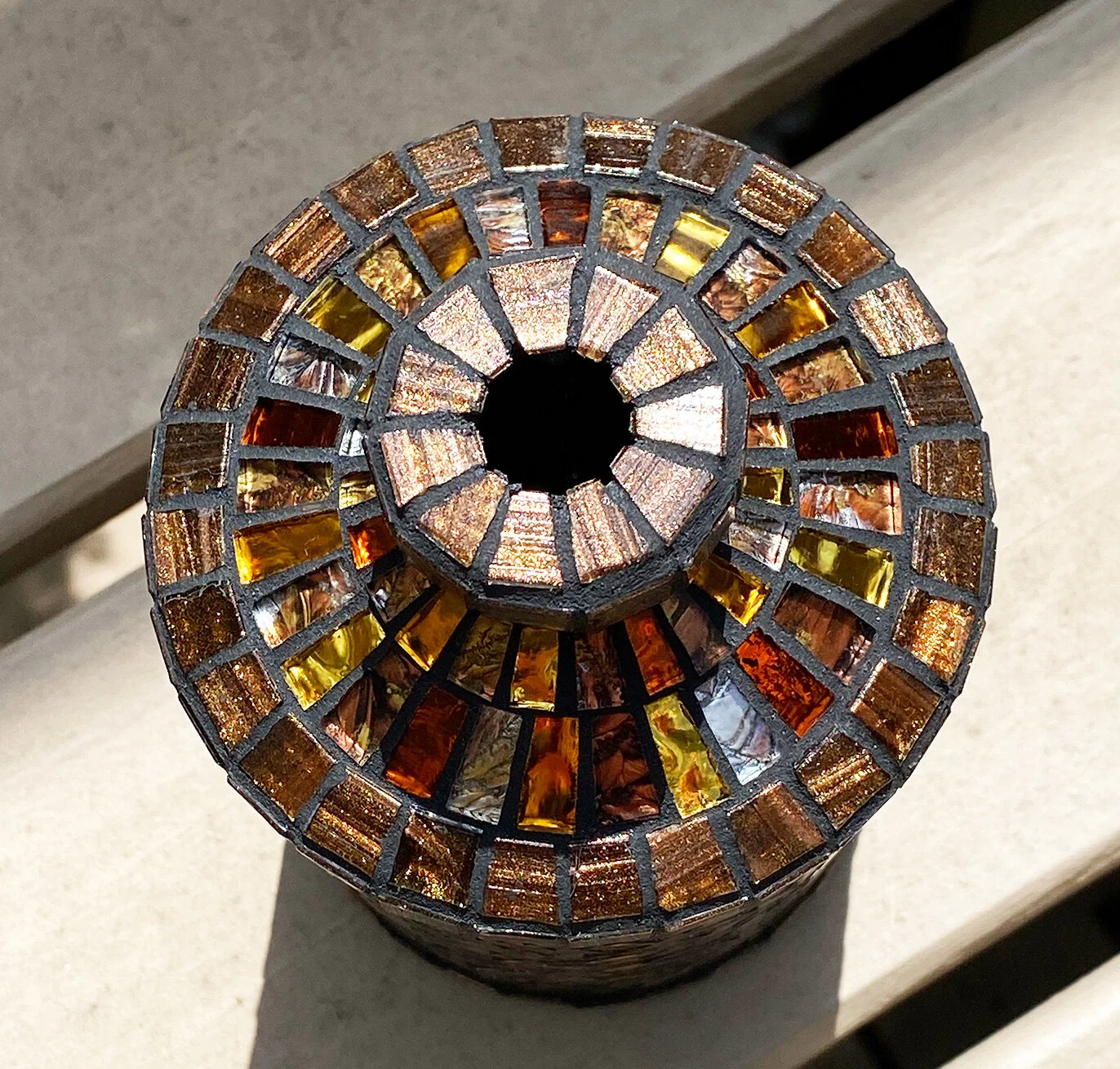
Spending the time on that design was very good for me, however, and I think it helped to prod me back to mosaic. Well, time will tell about that. Anyway, I decided to mosaic a bottle while I was developing an art piece idea. And here is the bottle.
Amber, Copper, and Gold Bottle 8.5” x 4” | 22cm x 10cm. Vitreous, mirror and Van Gogh glass on Hendrick’s gin bottle.
The main shape of the bottle was easy to work with. The 1/4” squares were cut to size by Mosaics By Maria. The top, however, proved to be a little more demanding. I ended up having to wedge most of the top pieces. It’s not my favorite palette, but I the materials left over from something else.
It did actually feel good to have a project again, and I think I am ready to move on to the art piece. Perhaps my mosaic doldrums have come to an end? Let’s find out!
Been Slumpin'

Dream of Asturias 12” x 10” | 30cm x 25cm. Smalti, Kismet glass, stone and metal specimens from the northern coast of Spain, Oklahoma shale. Inspired by the photographs of Luis Laso Casas.
As you can see, my last blog post was in November when I finished the rooster commission. That commission is the last mosaic I completed. I’ve not been able to find the motivation to work much since then. Sure, I started something in December, only to leave it sit, and sit, and sit on my work table. I’ve been in quite a slump.
In the last month, I’ve made a bit of progress on it (above) and am determined to finish it. And I will. But I’ve never experienced such a prolonged lack of motivation to mosaic. I’ve questioned whether it is time for me to let it go and move on. To what, I don’t know.
But I am not ready to let it go. I sense there is more mosaic in me. Curious, though, as to why I might be experiencing this. As distressing as it is to lack motivation, inspiration, and a need to create, I think this is actually a good thing.
I do believe that Covid has a lot to do with it. The isolation of the last year has left me feeling unplugged, which I suppose makes sense for the state of isolation. Being unplugged, I have lost any sense of competition—or trying to prove myself—which I can now see was a contributing aspect of my creative motivation. I can see it now only due to its lack.
There has been a sense of what’s the use? And I have found that to be a very important question. Indeed, what is the use? Maybe there is no use if I’m solely motivated by a need to prove myself. I went through a few months where my mantra was I just don’t care. Again, distressing, but at the same time, liberating.
Some days, I felt like it should just be enough to get through the day—to do some laundry, go to the store, cook dinner, play some piano or chess, exercise a bit, sit outside in the sun with our dog Lucy. Why can’t that be enough? Do I need to be Jacqueline Iskander mosaic artist to be happy? To be fulfilled? To feel worthy?
No. I found I was fairly content. I just needed to give myself some time to move through this. First, I gave myself until the end of January to reassess things. Then until the end of February. Well, here we are moving through April and I’m feeling the need to do something about this stalemate.
I’m trying to finish that little piece I started back in December, and it is a bit of an effort. It is a departure for me and I’ve struggled to keep with it. It was just meant to be fun, and that seems to have taken the fun out of it for me. Again, back to what’s the use? Why can’t fun just be enough? Especially with creativity. Because of that need to prove something? To produce serious art? To prove that I am an artist?
So, the inner struggle to understand who I might be if I am not trying to prove something continues. I have a few ideas for future work, but they are all just bouncing around in my head and nothing yet bubbling up to the surface. I’m trying to be okay with this and give it more time. Trying to resist thoughts like: If I quit, what would I do with all this stuff? What would I do with the rest of my life? And I find myself in a place I’ve found myself a few times before in my life, that of breaking free of an identity.
Thank you Covid!
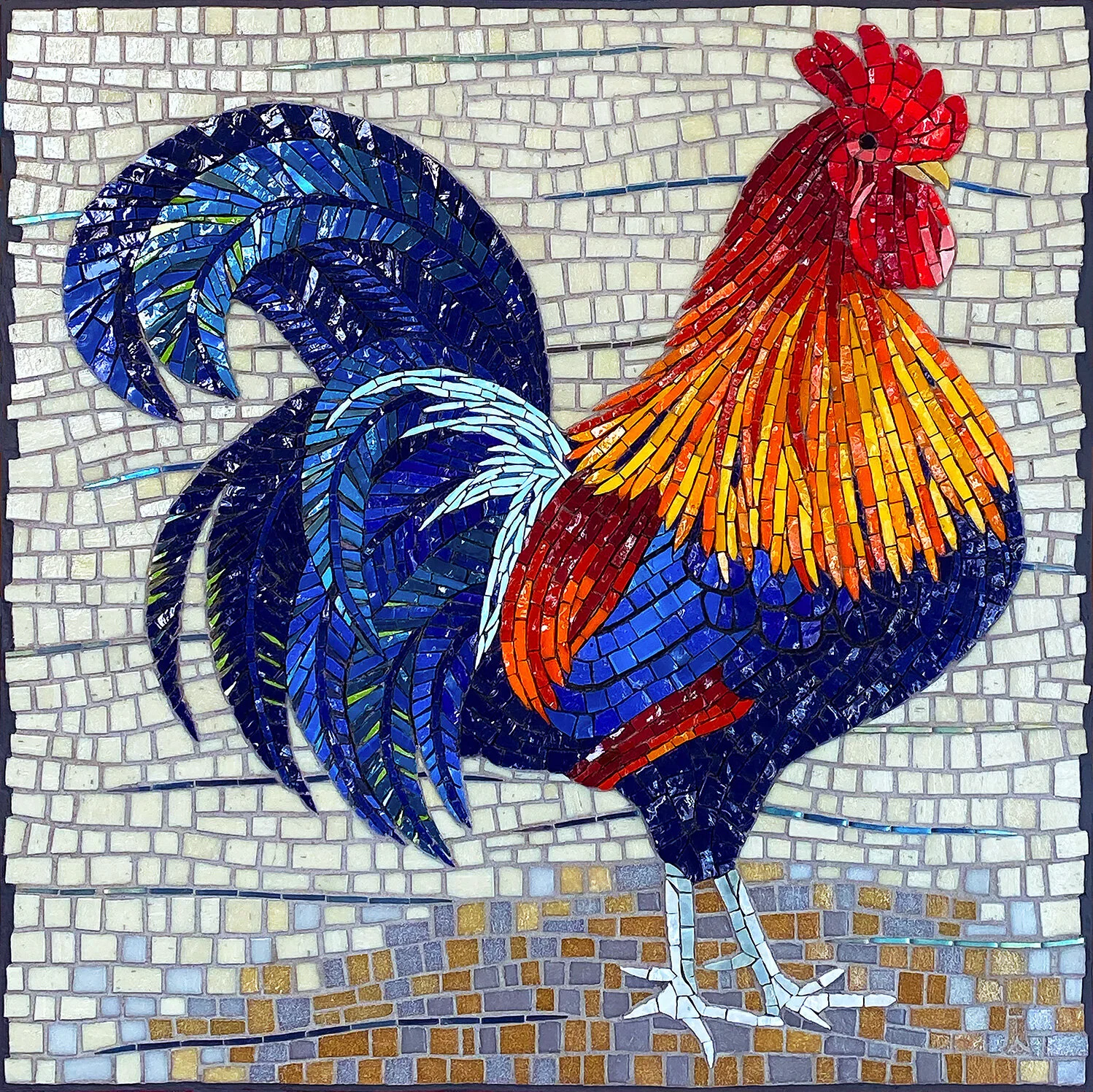
Rooster Commission Finished
Gaglio Rooster Commission 17” x 17” | 43cm x 43cm. Smalti, vitreous, iridescent glass.
This rooster is heavily inspired by a photo provided by the client. They did not want the rooster to be in a natural environment and requested something more plain.
I really enjoyed this project as I don’t usually work with so much color. However, working those tail feathers in that andamento was a challenge.
At left is a photo taken from a perspective slightly below and looking a bit upward. I was trying to capture more iridescence. Tricky. But I like the way you can see a little dimensionality in the rooster feet. The vitreous is thinner than the smalti so he does pop a bit from the background.
As for the edges, the clients were not sure if they wanted to frame it and wanted the edges to be done in a way as to be acceptable without a frame. I did not want to take the vitreous all the way to the edge because that kind of edge is vulnerable to chipping and tiles coming loose over time. I handled it in a manner that I thought was interesting on its own but that could also be covered up with a frame.
The background colors were chosen to coordinate with the countertop, at right.

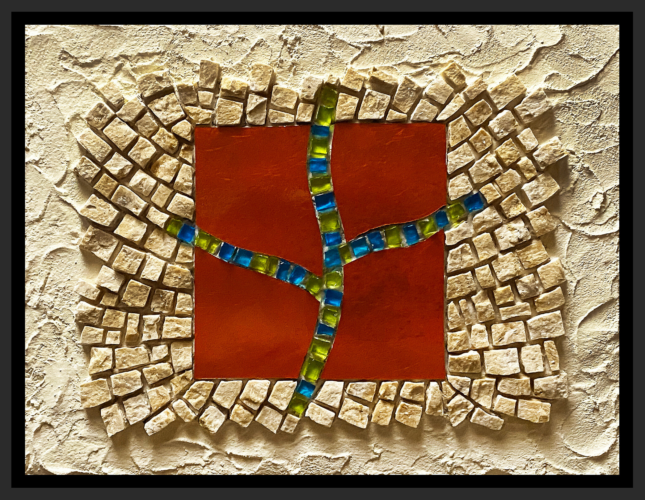
Study in Moderation № 10
This is the final piece for this study. I had intended to do two more but I’ll explain in my next post. I’ll also opine about this project and how I think it went.
That is a very dark orange mosaic gold plate that I used.
Study in Moderation № 10 (2020) 7” x 9” | 18cm x 23cm. Marble, mosaic gold, smalti transparenti.
Study in Moderation № 10, alternate lighting
Study in Moderation № 10, detail
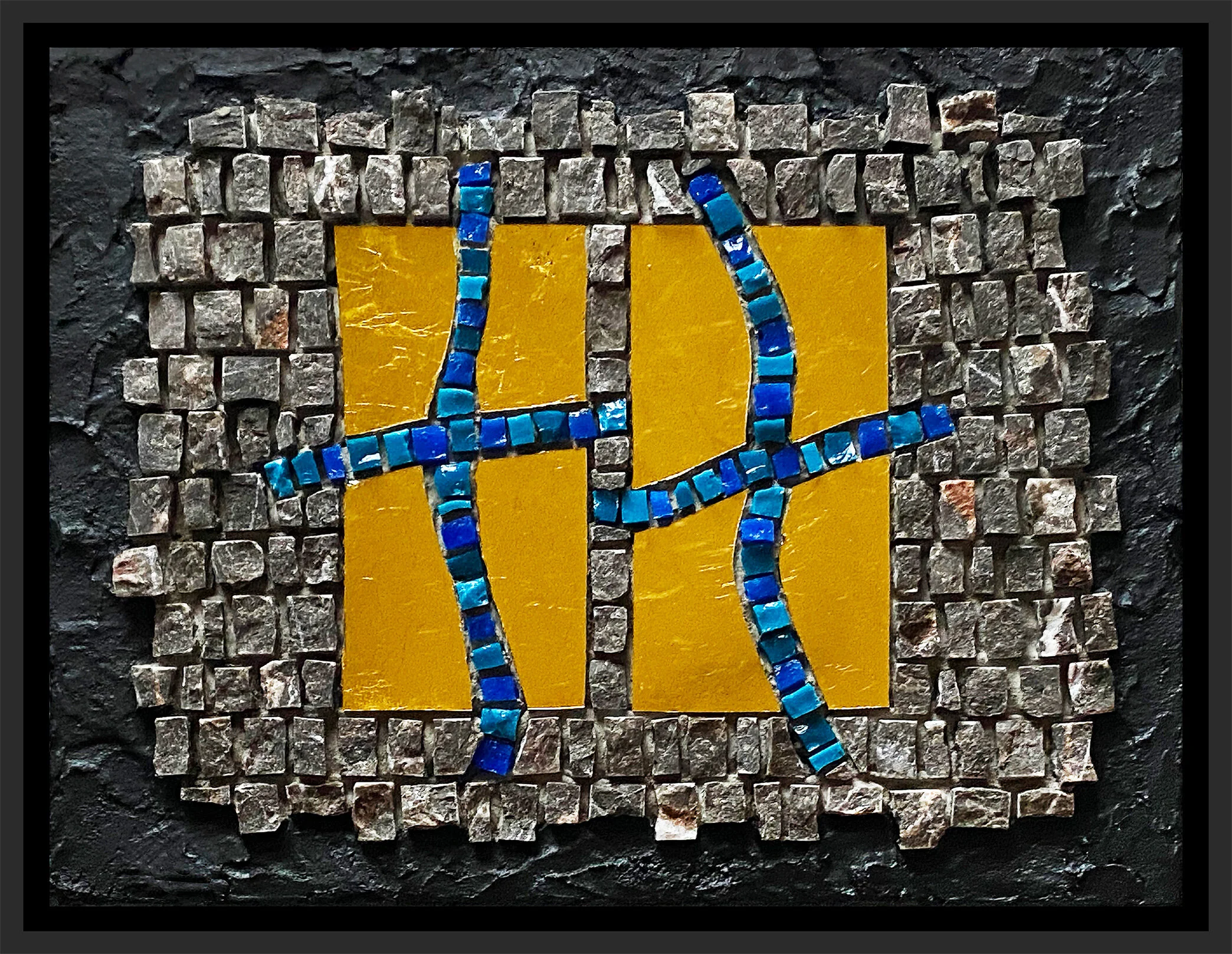
Study in Moderation № 9
I have a few gold plates leftover from my Theme and Variations: All Dreams that I finished earlier in the year, and they rather stumbled me upon this idea. I’m thinking that I will follow this theme for the remaining three studies.
Study in Moderation № 9 (2020) 7” x 9” | 18cm x 23cm. Marble, mosaic gold, smalti.
Study in Moderation № 9, alternate lighting
Study in Moderation № 9, detail
Study in Moderation № 8
I think I’m getting the hang of it!
Study in Moderation № 8 (2020) 9” x 7” | 23cm x 18cm. Marble, mosaic gold, decorative ceramic, shell. Digitally framed.
Study in Moderation № 8, alternate lighting
Currently, I’m planning on making four more and then moving on to something a little more serious. But these have been fun and very worthwhile. It will be interesting to see how I might incorporate this more relaxed execution into my next large work later in the year.
Study in Moderation № 8, detail
Study in Moderation № 7
Finally, I was able to get a more relaxed execution with a flowing andamento. I like the way this one turned out.
Study in Moderation № 7 (2020) 9” x 7” | 23cm x 18cm. Marble, smalti, turquoise, mosaic gold.
Alternate lighting
I would not normally combine purple and turquoise, but I found it very striking with the black marble.
I’m framing all of these little studies in black metal floater frames. I like having a frame on my pieces primarily for handling. These frames are not very expensive and the are not permanently attached to the work.
Study in Moderation № 7, detail
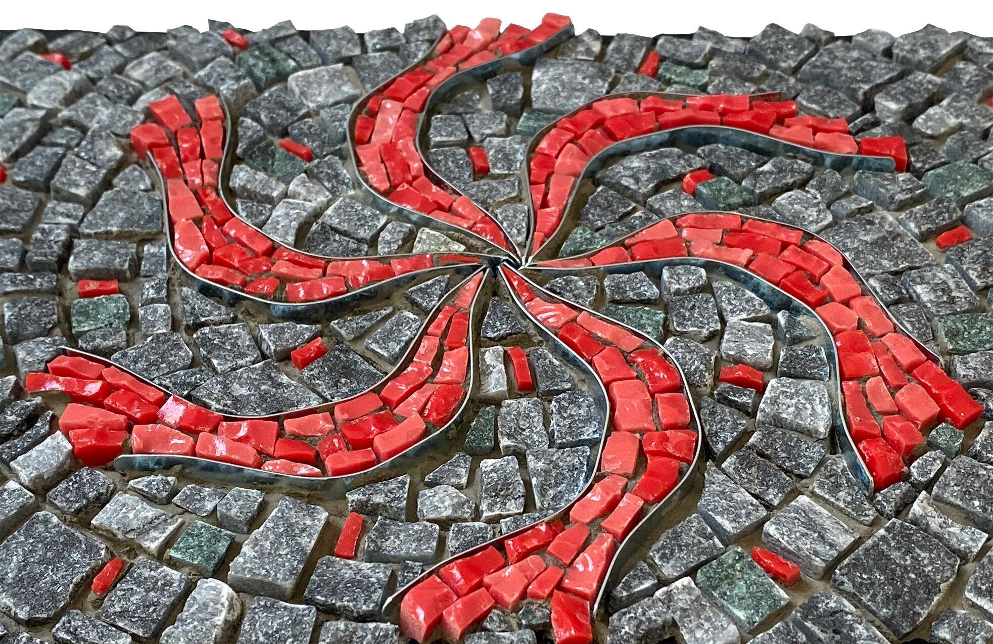
Study in Moderation № 6
Study in Moderation № 6 (2020) 7” x 9” | 18cm x 23cm. Marble, smalti, framing spring clips.
This will be the last one with spring clips. I’m going to switch gears and do something different. The plan is to make six more, continuing to work at a more relaxed execution technique.
Study in Moderation № 6, alternate lighting
I really like these colors. The smalti is Chinese, from Peace, Love and Smalti, who I believe is not in business anymore. The exact color is unique and I have not found it in Italian smalti.
The spiral was free-hand. I did not decide on the background andamento until I had already mosaicked the pinwheel. Drawing the spiral at that point was more complicated than what I want this series to be, so I thought: What the heck! Let’s see how well I can do.
Study in Moderation № 6, detail
Study in Moderation № 5
Oh my! I’ve got some serious loose going on here.
Study in Moderation № 5 (2020) 9” x 7” | 21cm x 18cm. Marble, smalti, framing spring clips.
I was talking with my musician son about my objective for these studies, and how I really feel like I am relaxing my technique as I work, but then they still look too controlled. He shared with me some advice that his college piano professor gave him when he was trying to develop a new playing technique. The advice was to really exaggerate it to the point where it feels too exaggerated, and then it would be right.
On this one, I followed that advice. What do you think?

Study in Moderation № 5, side perspective
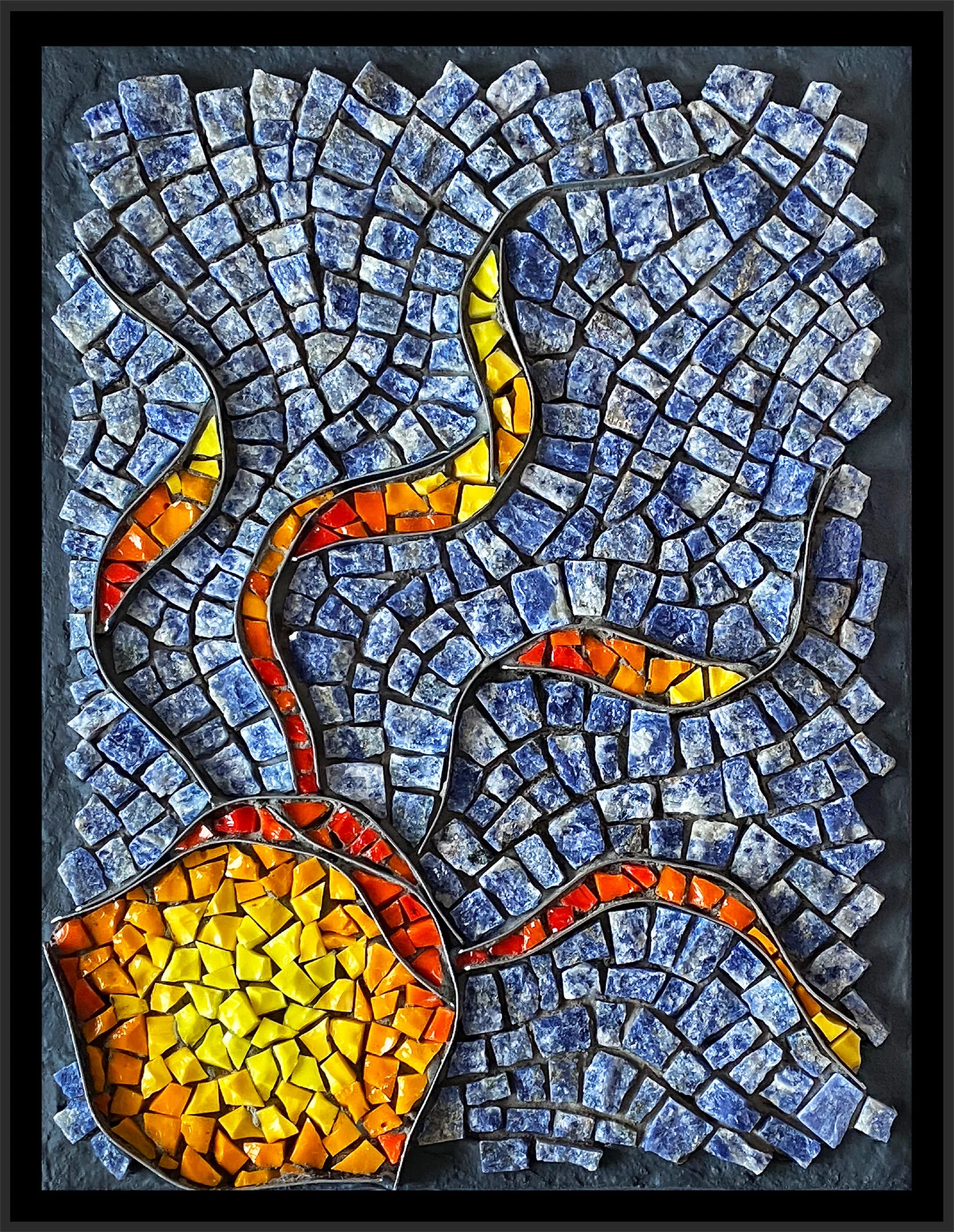
Study in Moderation № 4
After further consideration, I have concluded that the previous piece, #3, is a bit of a setback from #2 with regard to my objective of loosening up. I’m just amazed—and amused— at how challengingly this whole loosening up experiment is going.
Study in Moderation № 4 (2020) 9” x 7” | 23cm x 18cm. Granite, sodalite, smalti, framing spring clips. Indirect, exterior lighting from above.
interior lighting
I did the smalti first and almost tore out that circular, sun-like area; I thought it was TOO loose, too sloppy. I had decided to do that but forced myself to leave it be. Such discipline! 😎 I chose this andamento because I wanted to be able to compare it to #1, and I believe this comparison does show some progress. What do you think? Maybe I am just seeing what I want to see.
Study in Moderation № 4, indirect exterior lighting from above
Study in Moderation № 1
I am encouraged with this #4. It has the degree of looseness as does #2, although the cuts still look too neat, too controlled. I am confident that I have not backtracked. On to #5.
Study in Moderation № 4, side perspective
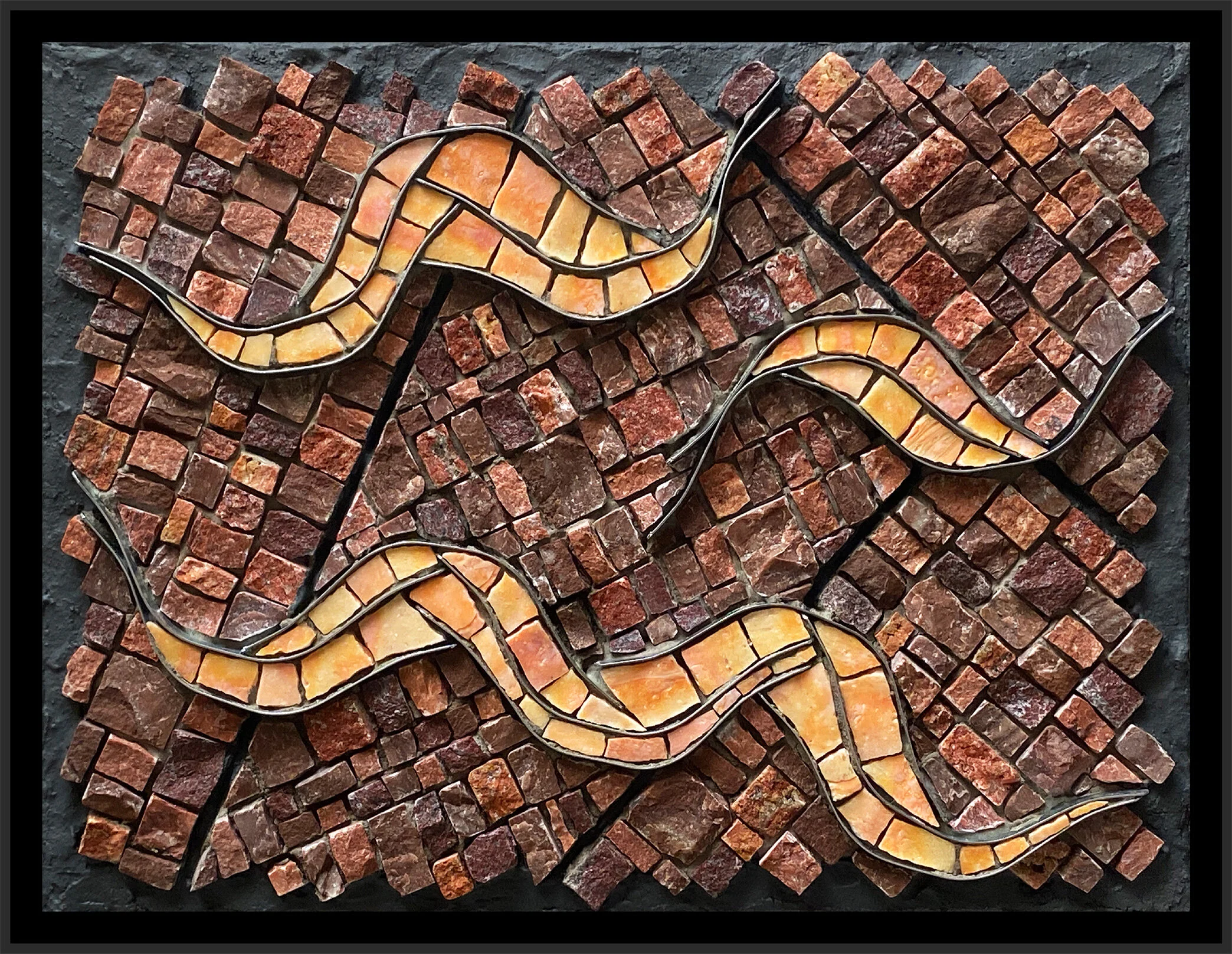
Study in Moderation № 3
Study in Moderation № 3 (2020) 9” x 7” | 23cm x 18cm. Marble, travertine, smalti, framing spring clips.
So, this one is not as loose as I had originally intended, but it is not a backtrack from #2. That is some kind of progress. I complicated things a bit with this background andamento; it is trickier than it may seem. Still, it did not take me as long as if I were working in my usual, more exacting manner. I like that.
Study in Moderation № 3, lighting from above
I absolutely love this mix of red marbles and travertine. Just love it!
On to the next one, on which I am determined to push the looseness envelope a bit further!
Study in Moderation № 3, side perspective
Study in Moderation № 2
Study in Moderation № 2 (2020) 9” x 6” | 23cm x 18cm. Marble, smalti, framing spring clips.
Study in Moderation № 2, lighting from above
This is my second attempt at relaxing my cutting and laying execution. I am a step—or a mosaic—closer to reaching my objective, but I’m not there yet. This is much looser for me in both precision of cuts and laying of the pieces. Still, I found myself lining things up too much and had redo to relax some of my background rows. And, I did not exactly end up, at the top, where I started at the bottom, did i?
Ah well, I have made a wee bit more progress. It is interesting how difficult it is change my habit of working, my sensibility of how it should be done. I’m not trying to change things permanently—there is a time and place for precision—but just to explore less precision when it is not necessary.
The spring clips make such graceful and elegant lines, so it will be fascinating to see how relaxed I can get in working around the clips. They seem to almost call for a refined approach. This one is less refined than the first one.
Study in Moderation № 2, side perspective
Since about 2012, I have flirted with trying to relax my execution style. I would do a couple of pieces with this objective, but somehow would drift back to something that I felt needed more precision.
For now, I’m tired of that kind of precision, the kind that I began to feel was in charge of me. I guess what I’m trying to do is change my relationship with precision so that it is not my standard way of working, but an approach that I may or may not choose to employ. First I’ve got to kick the habit.
I was talking with a friend and fellow mosaicist the other day and we were talking about exercising a lot of control in our mosaic execution. I was saying how I was determined to learn to relax my technique, that I was going to learn to control my precision by making it sloppy.
That seems to be the gist of it.
Study in Moderation № 1
Study in Moderation № 1 (2020) 7” x 9” | 18cm x 23cm. Marble, smalti, framing spring clips
This is the first in this experimental series so I don’t want to fuss about it too much. As I posted earlier, I fell short of my objective, for the most part. I achieved a somewhat more relaxed cutting approach, which is my primary objective, so I’m calling it a good start.
Study in Moderation № 1, lighting from top
I’m making this a subset of my Impromptu Series because the design process fits the series. The work follows from an impromptu playing with the spring clips. The resulting arrangement then drives all other design choices.
Study in Moderation № 1, side perspective
New WIP
Work in progress
Just a little glimpse of the beginning of a new series I’m working on, which is currently untitled. These will be small 6” x 8” pieces featuring framing spring clips and stone. This one has started with smalti inside the clips, but the background will be primarily stone.
I think this will be fun!
When You Left Us
When You Left Us (2020) 18” x 20” | 46cm x 51cm. Italian and Mexican smalti, framing spring clips
Previous Posts about this work here and here.
I started this somewhere around 2010. It was smaller than it is now and it was sort of an exercise in working with red. There were some emotional things going on at the time, including the passing of both of our elder dogs just a month apart, and I was pondering matters of the heart. I was also waiting on materials for a large commission and once it got going, I set this aside.
In 2014, I was revisiting this little piece and decided to continue with it. I was thinking that it could be part of my Impromptu Series, but then realized it did not fit the criteria as closely as I wanted. Then, my younger brother passed away unexpectedly. I felt that the initial start on this was rougher than I normally like—it felt sloppy. But it also felt raw and like something I could just work on without thinking too hard about it while I pondered the stuff of iife, like death. I decided to dedicate it to my brother and I called it Fragile Heart.
Again, I abandoned it. My impulse for control and precision left me very judgmental of it. I considered tossing it, but I thought it was intriguing and maybe—maybe—someday I would be able to finish it without judgement.
When You Left Us, detail
Well, it seems that time came a few weeks ago. After finishing A Little Love Story and being disappointed that I had fallen into my controlling habit—I do think it would be a more interesting mosaic if I had applied a looser technique—I was determined to work more loosely and that is just what this piece called for.
When You Left Us, detail
So I finished this 10 year-old mosaic with little fuss. I vowed to not change any of the previous work—although I did end up changing just one piece—and to not stress about the gradation or the precision of my cuts. It still looks raw to me, and I think that is appropriate. It is still dedicated to my little brother, but with the new name: When You Left Us.
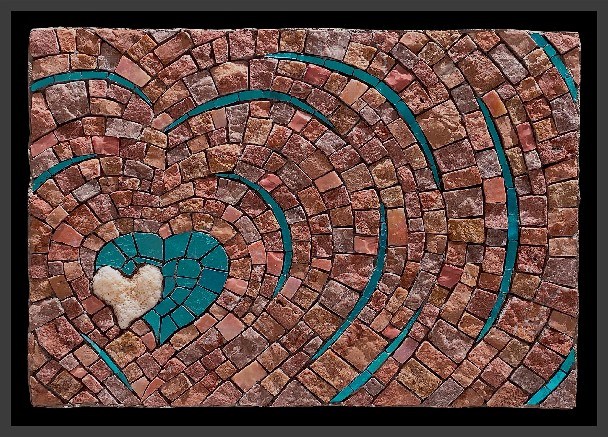
A Little Love Story
A Little Love Story (2020) 6” x 8” | 15cm x 20cm. Marble, travertine, smalti, coral, turquoise mosaic gold.
Last summer, I found the little heart-shaped coral piece on a Big Island beach. I wanted to make a little mosaic with it when I got home, but I just wasn’t feeling it, couldn’t get into it.
Last week, I got into it.
Alternate lighting
“Works of art make rules; rules do not make works of art.”


Archive
- March 2026
- November 2025
- September 2025
- July 2025
- November 2024
- October 2024
- September 2024
- August 2024
- May 2024
- February 2022
- October 2021
- August 2021
- July 2021
- April 2021
- November 2020
- October 2020
- September 2020
- August 2020
- July 2020
- June 2020
- May 2020
- April 2020
- March 2020
- February 2020
- January 2020
- November 2019
- October 2019
- September 2019
- August 2019
- July 2019
- June 2019
- May 2019
- April 2019
- March 2019
- February 2019
- November 2018
- September 2018
- August 2018
- July 2018
- June 2018
- May 2018
- April 2018
- March 2018
- February 2018
- January 2018
- December 2017
- November 2017
- October 2017
- September 2017
- August 2017
- July 2017
- June 2017
- May 2017
- April 2017
- March 2017
- February 2017
- January 2017
- December 2016
- November 2016
- October 2016
- June 2016
- May 2016
- April 2016
- February 2016
- January 2016
- December 2015
- November 2015
- June 2015
- May 2015
- April 2015
- March 2015
- February 2015
- January 2015
- November 2014
- October 2014