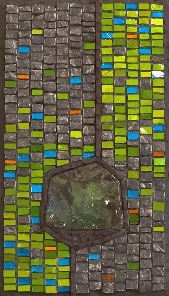
Informative

When The Past Returns

Somewhere around 2003, when I was dabbling in a lot of different types of decorative mosaic applications, I made this clock using antique china, Van Gogh glass, and vitreous glass for the edge. It is actually a pretty little piece, with soft, aged gold highlights in the china which are not evident in the photos. It seemed to catch the eye of my mother-in-law, and when we visited Egypt for the first time in 2005, I gave it to her as a gift.

It is approximately 12” diameter, and I bought the mdf base and clock mechanism from one of the mosaic suppliers. It appears that I used a mastic for adhesive. How do I know this? Because of the remnants showing where a few of the edge tiles have fallen off, as edge tiles are wont to do.

After my mother-in-law’s death, I know that the clock was moved around and stored here and there. My husband brought it back on his return from his recent visit to Cairo. It is not at all my style, but I will replace the missing tiles and then figure out what to do with it.

Generally, at this point in my mosaic career, I know better than to apply tiles to an edge like this, especially on a wood base. But I know how tempting it is.


Exhibition: Traditions Kept & Broken

Tracy Hodson has once again curated an impressive mosaic exhibition for the Bandon Library Art Gallery. This annual exhibition continues to attract a diverse representation of contemporary mosaic art. Through thoughtful essays and sensitive curation, Tracy offers a deep and informative perspective on mosaic art, which enriches the exhibition experience for all who are fortunate enough to view it.

Please enjoy this year’s essay and a photo tour of the exhibition here.

Table Panels Commission Mock-up

I’ve learned a few things on this mock-up project and thought I would share. The clients have given me permission so here goes!

I created this mock-up for husband and wife clients in Panama City, FL. They lost their house in Hurricane Michael last year. Their furniture and other belongings were hit-and-miss regarding their salvagability. Their dining room set, which consists of table, chairs, and buffet, is a family heirloom and, fortunately, salvageable.

The dining set is decorated with a carved Asian design with red/cranberry and green accents. The table had four decorated panels in it, as illustrated at right. The chairs have a variation of the Chinese Shou symbol—symbolizing longevity—on the inside backs, as shown below right.

The four decorative panels swelled badly from the water and had to be removed from the table. The table, chairs, and buffet have water spots, but the clients believe they can be removed. They contacted me for consultation on the possibility of mosaic panels to replace the wooden ones.

The panels are each 16” h x 29” wide and 5/8” thick. One of the challenges will be achieving an exact 5/8” thickness. Another challenge is that the wife wants to do as much of the work as possible, and she has never made a mosaic before. It is this second challenge that helped give me a starting point.

I immediately thought about the beautiful metallic streaky Brilliance line of vitreous tile from WitsEnd Mosaic. These tiles are elegant enough for a dining table, I think, and would be relatively easy to work with for a novice. I showed the clients the full sample range of these tiles and they liked them very much and thought they might work for this project. They chose the dark cranberry (#267) as it matched the accents on the original panels and buffet. In these images, the color may look more a brick red, but it is definitely more of a cranberry.

The client entertained the idea of repeating either the symbol or elements of the original design on the mosaic panels. I did not feel the original design was feasible. However, the idea of using the symbol was more feasible and would allow for me to do the symbols and let her fill in the rest with whole tiles. This was the basis for my mock-up.

Illustration of dining table with four decorative panels

Illustration of dining table with four decorative panels

Chair back with Chinese Shou symbol

Chair back with Chinese Shou symbol

mockup all 3 web.jpg

Above: Table Panel Mock-up, in three sections. I could not get the lighting the same on all three sections—aggravating! It was a bit drippy outside for photos so I took them in my studio. The leftmost and center panels are the same tile and natural gray grout. The rightmost panel is the same tile but a darker brown grout and the tiles are in a brick pattern, versus the grid pattern of the other two.

I decided to break the 16” x 29” into three sections for several reasons. I wanted to illustrate the two different laying patterns: grid and brick. I also wanted to try a couple of grout colors. And finally, I thought that making the middle section square would allow for some other use for that piece, outside of the mock-up. Oh, and I thought it would be easier to ship smaller sections; I’ll find out about that in a few days.

The clients did not specify a desired color for the symbol, so I chose the light metallic and also created the brown and green digital mock-ups below. Brown because I thought it might integrate with the table better, and green because green is one of the accent colors in the furniture.

Digital mock-up with brown symbol

Digital mock-up with green symbol

Digital mock-up with alternate laying pattern

As you can see from the images, I decided to maintain the grid pattern behind the symbol. This resulted in some very small and tricky cuts which are often difficult to get to sit and stay level, especially little triangles. While I do prefer the effect of maintaining the laying pattern behind the symbol, I wanted to come up with a simpler laying pattern that would avoid those tricky cuts (that would result from the brick laying pattern as well). The rightmost image above shows a digital illustration of an alternate laying pattern for the tiles around/behind the symbol. By surrounding the symbol with a circle of whole tiles, I can break from the overall laying pattern in a way that won’t cause visual confusion.

Originally, I grouted the symbol the same natural gray as the darker tile. I considered grouting it with a lighter grout and went back and forth on the idea before deciding not to.

At right is the original before I scraped out the grout and used a lighter one. This was a bit of a messy process and did not go exactly to plan, but I did manage to lighten the symbol grout—just don’t look too closely. Obviously, if the clients choose such a lighter symbol, I would get the grout right from the start.

So why did I change the grout? Although the symbol, with the natural gray grout, looks well defined and cohesively distinct at a viewing distance, I realized that it fractured too much at the kind of distance from which it would be viewed while sitting at the table. I did not anticipate this and so leaned something very useful.

Symbol with original natural gray grout.

I’m almost ready to pack the mock-ups, both mosaic and digital, and ship them to Panama City. I’m still working out a couple of ideas on getting to the 5/8” thickness that is necessary for the panels. They will be able to lay these mock-ups into one of the panel sections on the table and visualize what the table will look like with all four panels mosaicked in this way, with or without the symbol..

I’m also still working out the logistics of the potential of both she and I doing the mosaic work. I know it’s doable, but there are still decisions to be made that will impact the execution of this project, should they want to go forward with it. I do applaud the wife for wanting so passionately to do as much of the work as she can, and I hope that I can help make it happen.

Homage To Kilauea: Andamento

Someone wanted to know why I thought the andamento for my recent mosaic, Homage To Kilauea, was so difficult. I must clarify that just because it was difficult for me does not mean that it would be for everyone. I doubt that someone like Giulio Menossi, who has truly mastered a very refined andamento in his stunning portraiture work, would have been as challenged on this piece as I was. This kind of refined andamento requires, I believe, a whole lotta practice.

Looking back over my years of mosaic experience, I feel like I have only dabbled in this kind of andamento. Without years of experience doing this kind of thing, I find it is vital to draw out the andamento, piece by piece. I did not do that with this mosaic because, when I started it, I was just playing around. As I progressed on the work, my innate sense of seriousness and challenge led me to take the andamento more seriously than I had initially intended. 

So, what was so difficult about it for me? Three things:

  1. The spaces, which I'll call channels, around the large shale pieces and the small stones are very narrow. That's a quarter in the pic on the right, which is about the size of a euro. (It's cloudy today so the image at right is on the dark side—apologies.) The channels primarily range about 3/8" wide to about 1 1/4" at the widest, not counting the lower right area where the blue flares out to the edge.
  2. The average size of the smalti pieces is quite small, the majority being between 1/8" and 1/4". 
  3. It is just very tricky to express flow around sharp curves and into and out of areas of varying size—small to large/large to small—and where the flow goes in all directions.

With such small spaces in which to work, I felt like a more refined andamento would best express the flow that I wanted. My study with Menossi doing portraiture is the most refined andamento I have ever worked with, and the most difficult. Expressing the contours of the face, flowing in and out of the shadows and angles and fullness and hollows of a face, using andamento as well as color and shading, is a demanding technical skill.

I worked with this kind of refined andamento on a recent work, Storyteller, but to a much lesser degree than I attempted here. After completing this work, I've decided to do another work incorporating this kind of andamento. I'll blog about it as I go, starting with my next post in the next few days. The piece will be similar to this one and will present the same andamento challenges. Let's see how I do.