Don’t you just love a blue wall? I think my mosaics, from my In the Woods Series, look happy here. Yes, another Artrooms setting. The stone used in these mosaics, which is a shale, is from the woods behind our house.
Happy Friday!
Meandering and Trespassing, in situ (2014) Each 12" x 12" | 30 cm x 30 cm. Stone, mosaic gold, porcelain, glass. In a private collection.
Don’t you just love a blue wall? I think my mosaics, from my In the Woods Series, look happy here. Yes, another Artrooms setting. The stone used in these mosaics, which is a shale, is from the woods behind our house.
Happy Friday!
From left to right: Each 9.5" x 11.5" | 24cm x 29cm. Kismet glass, colored cement. Trans Frequency № 2, Lesbian Frequency № 3, Agender Frequency, Pride Frequency № 2, Lesbian Frequency № 1.
Here are all five of the LGBTQ+-themed frequecies I’ve just finished up, all based on LGBTQ+ flag colors.
Trans Frequency № 2 (2020) 9.5” x 11.5” | 24cm x 29cm. Kismet glass, colored cement.
This one is the last of my LBGTQ+ themed frequencies. It is quite amazing how it is not easy to keep a line straight in mosaic. I’m pretty good with line but still found it challenging to keep the ends of the lines straight—that last piece would often end up being slightly off, and I would not see it until I was in the finishing stage.
Next, I’m going to take a little time to do a few small decorative mirrors, and then I am going to focus on a group of frequency pieces that will make up a single work, each one expressing a challenging interior emotion. I want to explore my own emotional states through line and color. The single work will be 9-12 mosaics.
In the next month or so, I will stop selling this book on Amazon, which has been the most affordable way for international people to purchase the book. Unfortunately, the sales have slowed to the point where I am paying Amazon to have the book available.
This is not surprising as I knew this would happen after a couple of years or so. Still, I wish I could keep it available on Amazon.
So, I have reduced the price to $25 and will keep it there until the end of March. Then, the book will no longer be available on Amazon.
You can preview the book and read reviews, as well as purchase it from Amazon via my online store using this link.
Of course, for those within the U.S.can purchase the book, using the same link, for $22, including shipping, or the sligh,tly-less-than-perfect edition for $10, also including shipping using this link.
Continuum, in situ 12” x 51” | 30cm x 130cm.
Continuum, a four-paneled, four seasons-inspired work is my feature for this Friday. This is another one of my mosaics whose creation spanned a number of years. I started it in about 2007and had completed the Spring and Winter panels (first and fourth) and got barely started on the blue portion of the Summer panel (the second) before getting distracted. I had not quite figured out the palette for the rest of it and was not terribly passionate about the whole color-block concept. It was one of those What was I thinking? kind of things.
Continuum (2013) 25" x 49" | 64cm x 124cm (4 panels each 12" x 24" | 30cm x 61cm). Stone, smalti, porcelain, mosaic gold, minerals, broken ceramic, metal, glass, shells, coral, Swarovski crystal. A four seasons-inspired work.
Years later, when cleaning out my studio in 2013, I came upon the panels. The substrates themselves were a little pricy, being aluminum-framed hexite, and there was a lot of fine work and good materials invested so far. I had to decide what to do: Scrap the Winter and Spring panels and remove the bit of blue on Summer, giving me two empty substrates, or finish the darn thing.
Continuum: Summer, detail
Continuum: Summer, detail
Continuum: Fall, detail
Yep! I finished it. It always feels quite satisfying to go back and finish up a work that I had given up on, and then to be happy with the result. I really did enjoy making these, playing with mixing materials and textures. And I like that they can be grouped different ways.
Pride Frequency № 2 (2020) 9.5” x 11.5” | 24cm x 29cm. Kismet glass, colored cement.
This is the fourth in a group of five. The fifth will be another Trans Frequency.
Is there any perfect glass? I very much like the Kismet for this purpose. It is a good size and thickness, and it comes in a fairly good range of colors and shades. Some of the colors are quite vivid, like the red, yellow, and blue in this piece. The purple is pretty typical of the kind of purple in other lines of glass. Unfortunately, the orange was a bit muted and soft, so I went with this tangerine, which is a little brighter but not exactly orange. The green, as well, is not as bright as I would have liked, a little grayish, wouldn’t you say? Ah well, I’m sticking with the Kismet.
I’m still experimenting with the texture of the background. The challenge is to have the spaces between the lines be consistent with the rest of it. Not entirely consciously, they have gotten more textured as I have gone. So far, I do not have a favorite degree of texture, but I feel the need to settle on one before I start on the next, larger, Frequency sub-series that will take me into summer.
If I Were A Tree, in situ
This mosaic might have been the last mosaic I made before deciding to take a sabbatical from making mosaics. When I started this, I intended to work more loosely and not be a perfectionist. All went fairly well until I started the gold sky. Then, it became a miserable mosaic-making experience as I slipped into my old perfectionistic ways. I knew I had to take some time off to contemplate exactly why I was spending so much time and energy, not to mention money, doing something that was so stress-inducing.
If I Were A Tree (2014) 31" x 47" | 79cm x 119cm. Mosaic gold, shale, marble, smalti, porcelain, ammonite fossil.
My sabbatical turned into a quasi sabbatical during a renovation that included my new studio space. In organizing all my mosaic stuff and getting ready to move things around, I decided to tinker with finishing up an old mosaic. Still committed to no new work, I spent a little time each day finishing up the old work.
If I Were A Tree, detail
By the time my new studio was all set up, I was still finishing that old piece and not ready for any new work. I took care of some light, maintenance-type of work. Slowly, I felt like I had done enough interior work to get back at it, and I made a couple of small pieces. Then, I tackled finishing a huge almost 20-year old mosaic and finished it!
Since then, I have been enjoying mosaic-making more than ever. I still strive for precision, which sometimes flirts with perfectionism, but I am able to mediate it without much stress. So, this mosaic, If I Were A Tree, was the tipping point, I suppose, that ended up getting me to a better place with my art. Funny how things work out.
Agender Frequency (2020) 9.5” x 11.5” | 24cm x 29cm. Kismet glass, colored cement.
Just finished this one up. I’m still figuring out how to get a consistent background between the outer area and the small spaces between the lines. They seem to be getting more and more textured as I go.
The background is dark gray, you’re not imagining it. I had to go lighter than my usual black because of the black stripes on the ends. And I could not go too light with the gray background because of the gray stripes.
Did I mention that I have been volunteering at the Dennis R Neill Equality Center, here in Tulsa, for over a year now? They have an annual juried art exhibition that I have participated in a couple of times in the past years. I am making these, well, for fun, but also in hopes of having them in this year’s show.
Beginner’s Mind № 1-4, in situ. Each mosaic 11” x 9” | 28cm x 23cm. Smalti, vitreous, other glass, mosaic gold, stone, porcelain..
This Friday I am featuring a series that I made in preparation for a mosaic course I was giving. The theme was textural mosaics, and they would be in this predetermined palette. I wanted to prepare myself for teaching beginner students using such a variety of materials.
Beginner’s Mind № 1, with detail
With my first attempt, № 1 (above), I realized that I was not in a beginner’s state of mind and had created a mosaic too complex. № 2-3 (below) were much more successful and feasible for a beginner.
Beginner’s Mind № 2, with detail
Beginner’s Mind № 3, with detail
№ 4 (below), while being more challenging than the previous two, was not as difficult as the first one.
Beginner’s Mind № 4, with detail
Of course, none of the students wanted to attempt the more feasible ones once they saw the other two. So I learned to be more careful in what I present as possibilities.
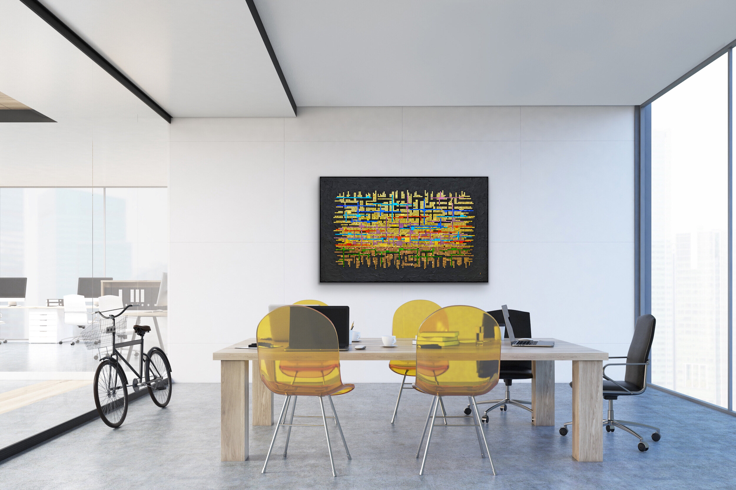
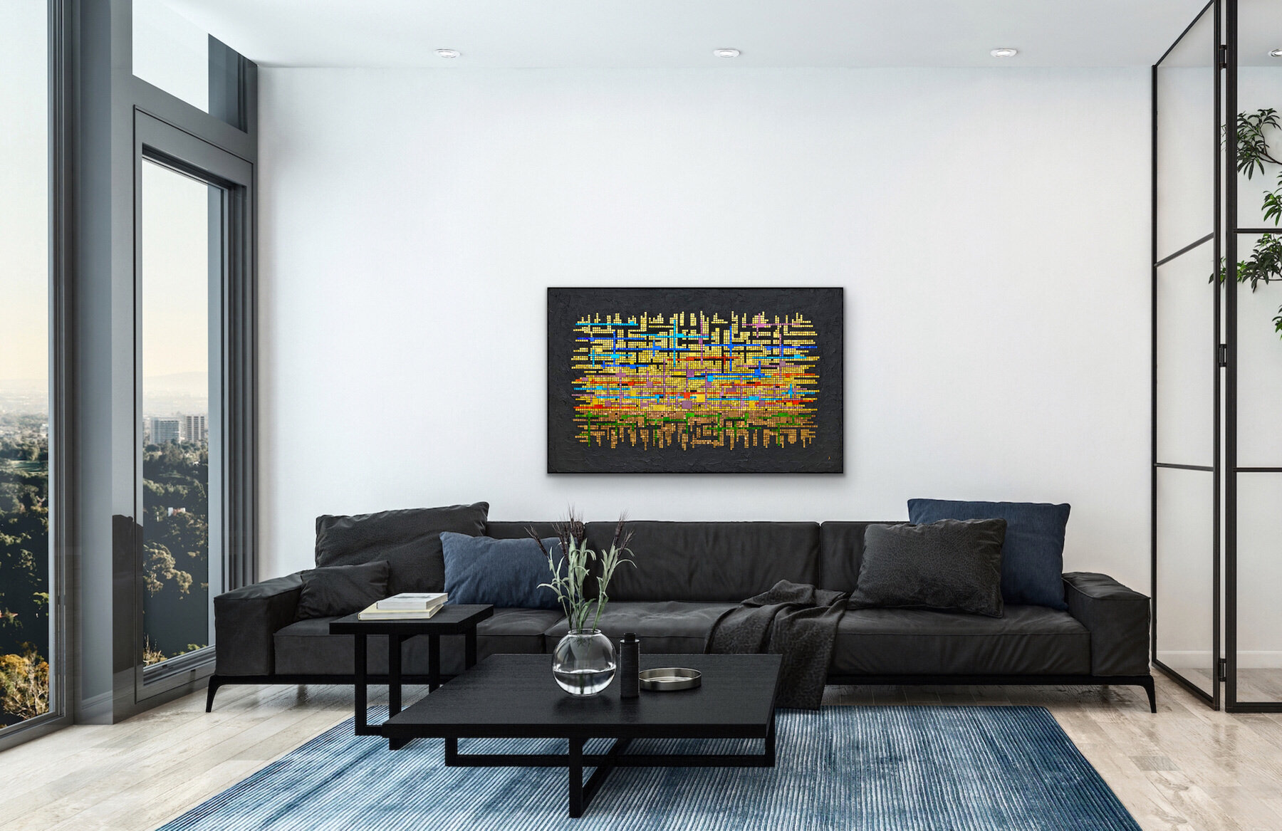
Theme and Variations: All Dreams (2020) 36” x 57” | 91cm x 145cm. Mosaic gold, colored cement.Inspired by a contemporary classical piano piece by Christopher Theofanidis, titled All Dreams Begin With The Horizon, 3rd movement.
Previous posts about Theme and Variations
Here are final photos of the large mosaic I just finished in January.
Lesbian Frequency № 3 (2020) 9.5” x 11.5” | 24cm x 29cm. Kismet glass, colored cement.
This version of the Lesbian flag—the right-most 5-stripe flag — was easier to represent with the Kismet color palette than my first Lesbian Frequency was, and I am happier with this one. So how did I get to № 3 all of sudden? Lesbian Frequency № 2 is similar smaller version of № 3 that I made for my daughter.
Image credit: Wikipedia
Lesbian Frequency № 3, alternate view
Nocturne, in situ
Nocturne is the second in my Music To My Eyes series. These works are inspired by a classical music form, and then by a particular piece of music in that form. The series’ first is an exception in that it was not inspired by a particular piece of music in an etude form, but by the general concept of an ABA etude.
This mosaic, Nocturne, was Inspired by Chopin's Nocturne in C# minor, Op. 27 No. 1.
In addition to the inspiration itself, a requirement of the series is that the primary aspect of the inspiration be expressed using mosaic gold in a grid format, aka opus regulatum.
Nocturne (2009) 17" x 25" | 43cm x 61cm. Mosaic gold in black, gray, and white, smalti, vitreous, granite. $850
Nocturne, detail
Again, I have used the Artrooms app to stage my mosaic in a room. I was lucky to find a room setting that is wonderfully suited for my mosaic.
Loner, in situ
This mosaic was made as an homage to my brother. After he died, my sister found a collection of large obsidian specimens amongst his things. He was a bit of a rock hound and especially enjoyed searching for arrowheads and other Native American remnants. Still, the obsidian collection was a surprise. Within the year following his death, I made this mosaic using one of the obsidian specimens.
Loner (2015) 22” x 38” | 56cm x 97cm. Glass, stone, obsidian, ammonite. In a private collection.
My original idea for this mosaic was inspired by a project in a mosaic book (posted here), and I actually started this mosaic before my brother passed away. Then, it went in a bit different direction and you can read more about it here and here.
As for this in situ image, it was created using the Artrooms app. I especially like the contrasting wavy patterns of the vertical furniture and the horizontal mosaic. My brother would be very happy in a room like this!
Lesbian Frequency № 1 (2020) 9.5” x 11.5” | 24cm x 29cm., unframed. Kismet glass, colored cement. Digitally created frame.
After doing this one using Kismet glass, I find that I do prefer it over the vitreous. This is my third Frequency piece. Next is another lesbian flag themed one, using different colors. It’s an older flag and is referred to as Lesbian Community Flag.
There is a vibrancy lost in the colors when comparing the Kismet glass colors to the actual flag colors. Below you can see the two flags. Of course, these digital flag images are more vibrant and saturated than the actual flags are. But you can still see quite a difference. The one on the below left is what my mosaic above is supposed to look like, but I think it’s pretty off. However, my mosaic is closer to the actual flag. Still, a bit disappointing. Although there is a brick red Kismet that I considered using for the first strip, I thought it was too dark relative to the other colors.
Image courtesy of Wikipedia.
Would I have found closer colors, especially in the pink/fuchsia/purple ranges in vitreous? Probably not. Nor in smalti. Ah well, I will carry on with the next one, based on the flag on the upper right.
Next in line are a few additions to my Frequency Series. These are small, enjoyable pieces just working with combining colors. So far, I have only concentrated on LGBTQ flag color combos, but I have in mind to do a few non-LGBTQ themes as well.
Lesbian Frequency, in progress. 8” x 10” | 20cm x 25cm. Kismet, colored cement.
This one, Lesbian Frequency, uses Kismet glass in colors as close as I could find to the Lesbian flag, or one of them, as there are a few variations. I may do one of those variations next. The first two frequencies, Pride and Trans, were made with vitreous glass. The Kismet is a little thicker, but quite uniform, and the cut surface is more akin to smalti, providing a nicer reflective quality.
The pieces are all cut and I’m ready to go!
The Clearing, in situ
Previous Feature Friday posts.
Today I’m featuring The Clearing, which was previously titled Paths Taken. I blogged the making of this piece so, if you’re interested, just use Paths Taken in the search bar at the right to read more.
The Clearing (2018) 20” x 18” | 51cm x 46cm. Smalti, shale. $850
I was not sure about the name when I started the mosaic. It was an unfinished work that I decided to rethink and complete. By the time I was finishing the mosaic, I realized that my dark to light green shade transition was driven by my daily view of a small clearing in the woods behind our house. My gaze was drawn to that open area within the woods in a sort of mystical way. That clearing made me want to go there, to be there, as though I expected something magical to be happening there. I think that clearings in the woods are like that, don’t you?. Hence, I changed the title of this piece to The Clearing.
Again, I have staged my mosaic in this room using the Artrooms app. This room was especially well-suited to show this work in situ.
Theme and Variations, detail
Previous Posts on Theme and Variations.
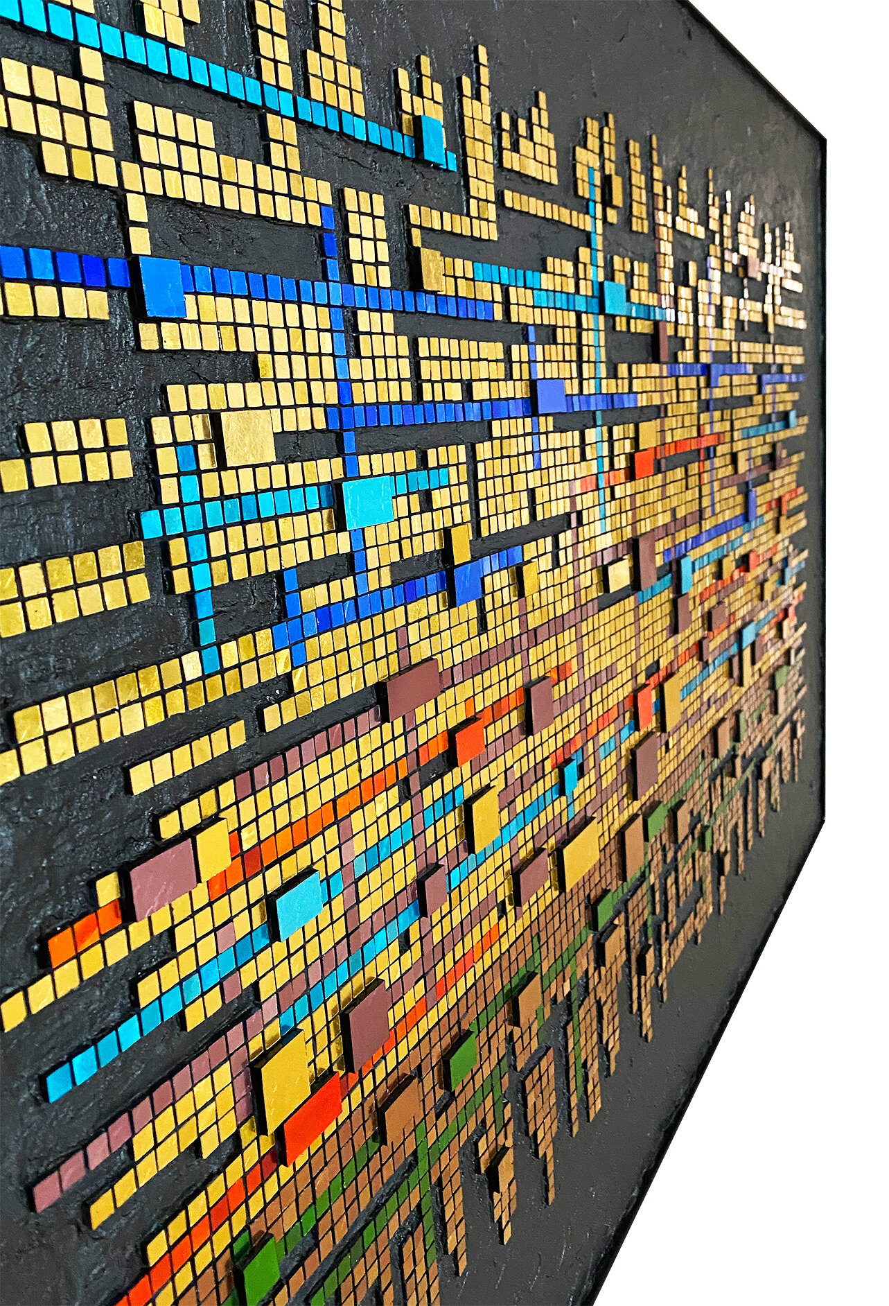
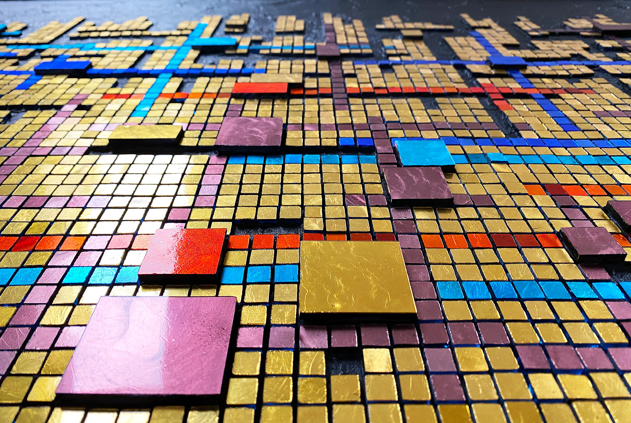
I finally finished this piece that I started back in August! I really indulged myself and just let this idea go as far as it wanted to go. This required me to ignore my usual sensibilities, such as they are, and just go for it. I have no idea what really empowered me to go take such a risk, considering all the gold and the sheer size of the work. Maybe it was over-compensation for all my years of compulsive fretting and perfectionism? No idea! But I went for it and this piece has been quite enjoyable.
Theme and Variations, prelim photo. 36” x 57” | 91cm x 145cm. Mosaic gold, black cement.
And to top it off, I indulged a curiosity about using a flat-that-was-not-at-all-flat black paint to try to achieve a consistent black background. The paint had to have been mistakenly labeled as flat because, as you can see, it is not flat. The result is either serendipitous or catastrophic. The beholder will decide.
I took quite a chance with the not-flat paint because, after applying a small amount, I was indeed curious. Of course, I knew that it would show everything, but there was an affect that I also liked. I thought, well, I am taking a risk with the entire thing anyway, so let’s just finish it out in the same vein. I thought that if I just couldn’t be satisfied with it, I could paint it over with a truly flat paint. We’ll see.
Now, how to photograph this gold beast, as a friend calls it. These photos were taken as it is still on my worktable and the lighting is quite uneven. It is very large and heavy, and with all the gold and with the not-flat background, I have little confidence that I will be able to get decent photos. But I will try before I tackle a strategy for professional photos.
Theme and Variations, detail
Labyrinth, in situ (2000) 30” x 30” | 76cm x 76cm. Smalti, unglazed porcelain, mosaic gold. In a private collection.
Previous Feature Friday posts
Today’s feature is an oldie from 2000. This is one of my early works with smalti. The labyrinth is the 7-circuit Native American labyrinth, commonly called The Man in the Maze; it was originally seen with a stick-like figure of a person inside the labyrinth.
I was drawn to this labyrinth over the more commonly seen 11-circuit, such as the the one in Chartres Cathedral, because of its angular design within the outside circle.
I used the chakra colors to symbolize a journey from the physical world—the beginning of the labyrinth—to a spiritual center. I did my best to transition between colors, but the palette was limited, as was my skill. I used the orchid pink because I either did not like the purple available to me then or there just was not a purple available to me. Sven Warner of Mountaintop Mosaics was the only smalti supplier I knew of.
I grouted the entire piece because, at the time, I did not know a lot better. The colors are still quite vibrant, but nowadays I would not grout the smalti labyrinth.
The in situ image was created with the Artrooms app that I talked about last week. It is extremely easy but has few bells and whistles. Also, most of the rooms are of a particular style—contemporary and spacious—which will not fit everyone’s needs. The lack of small wall space or tabletop easel-type options is disappointing.
Another small issue is that you can’t exactly control the dimensions of your work once it is placed on a wall. The app does seem to use the dimensions that you enter when you upload the image, but it is not reliable. I often have to resize my work and rely on my ability to visually gauge the proportions. For my own purposes, I’m okay with this, but for someone who needs it to be exact—well, this isn’t.
If I wanted to place a work on a potential customer’s wall image, I would need to get exact information from the client on their wall dimensions and require that they pay close attention to the mosaic’s dimensions. My primary goal at this time is to show how my mosaics perform in situ and this app allows me to do that.
I’ve played around with an online program called ARTPLACER which is pretty good but much more expensive. It showed me the dimensions of the mosaic as I sized it, and it also adjusted the mosaic to show it from an angle, which was pretty slick. Still, it would not reflect the textural surface of the work from an angle, but it gave a good idea of the general impact to the mosaic from a distance.
Self Portrait, in situ (2016) 32” x 32” | 81cm x 81cm. Marble, smalti, mosaic gold, Swarovski crystals.
I’m kicking off this new blog idea—Feature Friday. It seems that I have less to blog about these days because I have been slowing down, mosaically speaking. I’ve been pursuing a couple of other interests, doing a bit of volunteering, and just generally trying to more fully inhabit regular old daily life. I am certainly still working and hopefully have a number of mosaics still in me, but I’m working at a much more relaxed pace these days.
Additionally, I’ve been working on a very large mosaic since September and have not done much else in the mosaic realm. I did not even publish my quarterly newsletter for fall for lack of things to say.
In recent months, I have been interested in apps that allow me to stage my mosaics in nicely appointed settings. I have always loved being able to see work in situ as it helps me get a better idea of the work’s dimensions, as well as its presence. There are a lot of such apps out there and I found the search a little overwhelming. But my interest remained.
Then, one day, I saw a fellow artist post some lovely in situ images of her work in which I suspected she was using some kind of app. So, I asked her about it and she recommended Artrooms—shout-out here to Anne Marie Price. I purchased the app for $3.99 for the first month, but I doubt I will continue with a subscription. Working with this app has helped me to further refine my own requirements and I am working on some possible other ways of achieving them.
However, the app is pretty good and very easy to use. I felt that the available rooms/settings were a good backdrop for a lot of my works. Of course, depending on your own work, you may find the settings not suitable for your works or taste. The settings are overall fairly spacious and contemporary, which require larger works or collections of smaller works. My only real complaint is that the app does not offer any small wall space options for smaller works. I will be pursuing other options to accommodate my smaller pieces.
Still, I am pretty happy with my results and I feel it does offer another dimension to the display of my art, and to the visual assessment of mosaics in spaces. I will be—intend to be—sharing a different artwork each time in my Feature Friday blog posts. I can’t commit to every week, but I will try for that. The works I will be featuring are not necessarily new or available works, although some will be. I have enjoyed seeing my own art in these rooms and I wanted to share them with you. I feel that it is very important to show how our art can fit, can speak, in actual spaces.
The first feature, shown above, is a mosaic titled Self Portrait. I blogged about this mosaic and its history back when I was working on it, so I’ll not go into detail here. If you are interested, you can peruse my Self Portrait posts.
In my next Friday Feature, I will talk a bit about the Artrooms app itself and my experience using it. For now, I’ve blathered on long enough.
Somewhere around 2003, when I was dabbling in a lot of different types of decorative mosaic applications, I made this clock using antique china, Van Gogh glass, and vitreous glass for the edge. It is actually a pretty little piece, with soft, aged gold highlights in the china which are not evident in the photos. It seemed to catch the eye of my mother-in-law, and when we visited Egypt for the first time in 2005, I gave it to her as a gift.
It is approximately 12” diameter, and I bought the mdf base and clock mechanism from one of the mosaic suppliers. It appears that I used a mastic for adhesive. How do I know this? Because of the remnants showing where a few of the edge tiles have fallen off, as edge tiles are wont to do.
After my mother-in-law’s death, I know that the clock was moved around and stored here and there. My husband brought it back on his return from his recent visit to Cairo. It is not at all my style, but I will replace the missing tiles and then figure out what to do with it.
Generally, at this point in my mosaic career, I know better than to apply tiles to an edge like this, especially on a wood base. But I know how tempting it is.