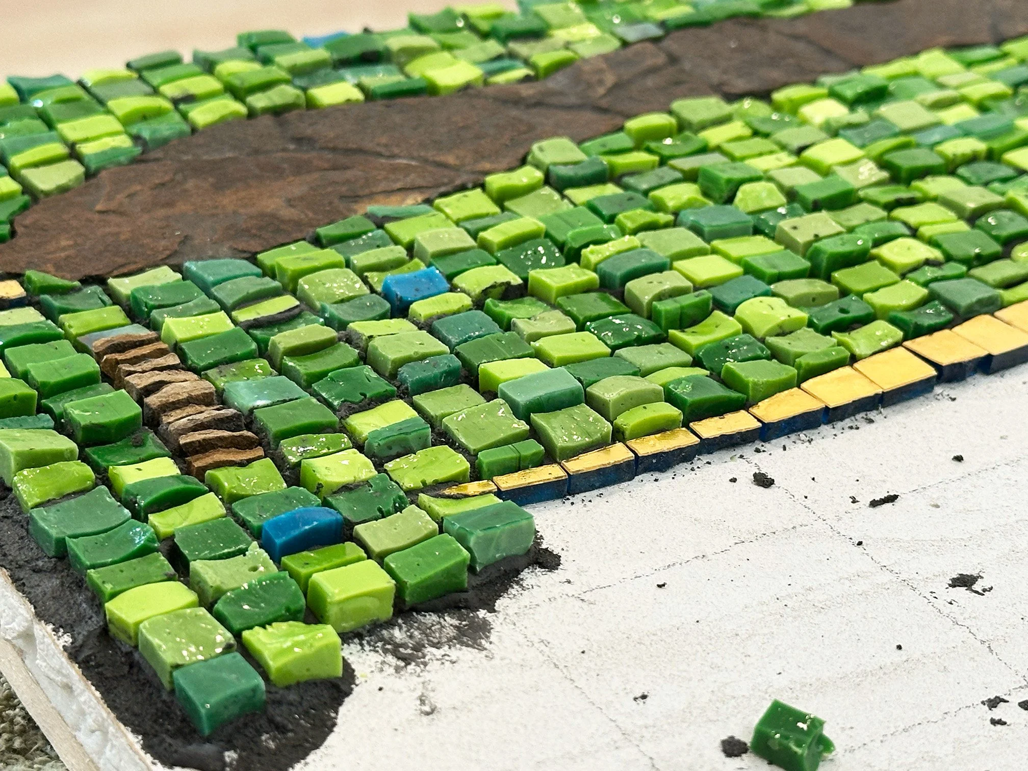
Work in progress:
I’m enjoying working loosely on this one.
D Major (The Sound of Green) 20” x 30” Shale, smalti, mosaic gold
Work in progress:
I’m enjoying working loosely on this one.
D Major (The Sound of Green) 20” x 30” Shale, smalti, mosaic gold
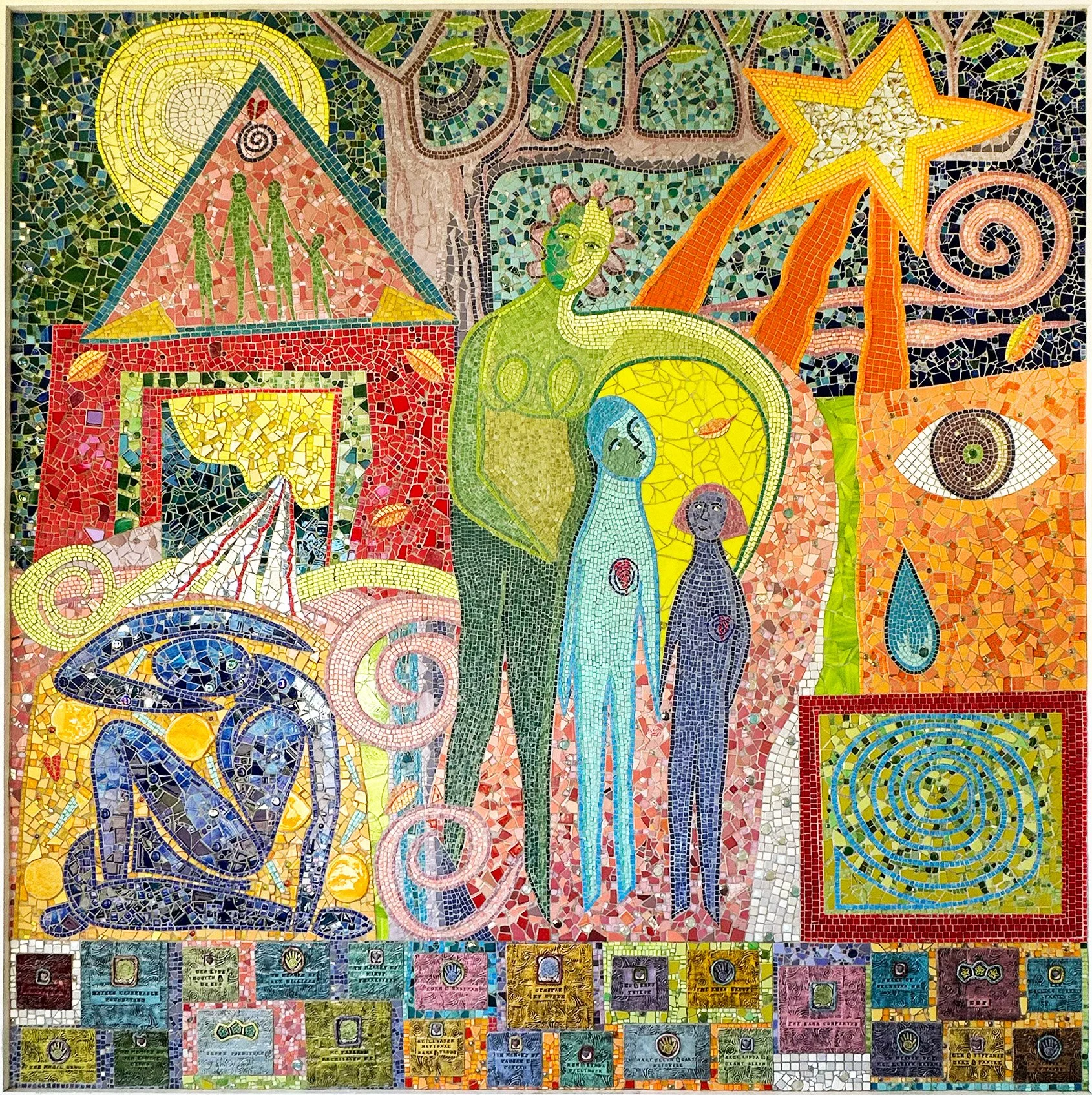
Journey from Azul by Linda Allen. Approximately 8’ x 8’. Smalti, ceramic, other glass, handmade signature/honor tiles
This mosaic was made in 2002 for the lobby of what was then Domestic Violence Intervention Services (DVIS). I just happened to see it the other day when I entered the lobby of Positive Changes, a behavioral health treatment program here in Tulsa.
I suspected it was by Linda Allen and my brief research verifies that. This large public work is full of meaning and worthy of sensitive exploration.
If anyone knows more about this or about Linda Allen, I welcome your input.


Above left: Green Fire by Jacqueline Iskander 10” x 6” Marble, mosaic gold, porcelain, ammolite speciman
Above right: A Little Joy Breaks Through by Tracy Hodson 10” x 6” Marble, mosaic gold, beads, amethyst and fluorite specimens
Tracy and I decided to each make a mosaic during her visit here. We developed a casual list of requirements to which we would each adhere:
Vertical orientation with substrate size of 10” x 6”
Use a feature subject with a field-type of background
Background of stone and/or smalti and mosaic gold
Work in a vertical andamento
The above mosaics are the result of our duel, although we weren’t really dueling at all. Just having fun!

Above: Green Fire 10” x 6” Marble, mosaic gold, porcelain, ammolite specimen
My friend Tracy Hodson is visiting for a few days and we decided to each make a small mosaic. I’m recovering from foot surgery and wanted to work casual: very relaxed and loose.
I bought a couple of ammolite specimens while in western Canada and wanted to use one of them for this mosaic. They are very sensitive to the light so very challenging to photograph. Here are some detail shots of the ammolite to give you a better idea:


About Ammolite:
“Ammolite is the coloured gemstone that comes from Canadian ammonites with a distinct, and vibrant rainbow colour. Globally, these are only found along the St. Mary River, south of Lethbridge, in Western Canada. This stunning iridescent gem, received its official gemstone status by the World Jewelry Confederation in 1981.” —Ammolite Museum Find out more.
What a wonderful trip by coach and train from Calgary to Vancouver! I thoroughly enjoyed my travels through beautiful western Canada! Here are my best pics.


My next project has been in wait for over 3 years now, waiting for me to literally fill in between the lines. Now that I’m back in my studio again, I’ve decided how to finish these out. I settled on a couple of shades of Orsoni gold: 002 and 006. Stay tuned…

Pair of tequila bottles 12" x 3"
This is a piece I started about 3 or 4 years ago. It needed a little rethinking, which I managed to conjure up a few months ago. The background andamento was a nice challenge for me, as well as the soft gradation in the middle section.

Eden’s Promise (2024) 19.5” x 15” Smalti, marble and travertine, shale, mosaic gold

Eden’s Promise, with reflection


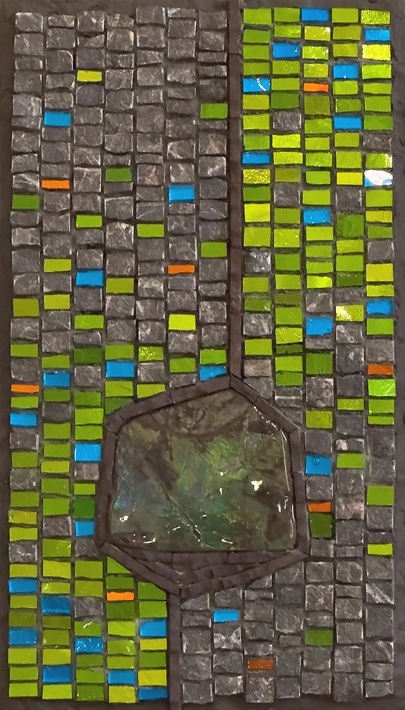
Kitchen Mosaic Miss (2024) 28” x 12” Stone, smalti, mosaic gold Equanimity (2024) 28” x 13” Stone, smalti, mosaic gold
In the words of Dr. Johnny Fever: Hello fellow babies!
Yes, it’s been more than two years since I’ve been the least bit mosaic-y. It’s been so long since I even made a blog post that the platform has changed and I don’t recognize this font. Okay, it’s fine now.
In January 2022, I discovered that I had a well-developed ascending aortic aneurysm. The only way to repair it was with open heart surgery. I was able to get into the Cleveland Clinic for said surgery in late March. I had an excellent surgeon and he repaired the aneurysm and replaced my aortic valve successfully. Although my recovery was seriously hampered by a back issue, most likely a result of positioning during surgery, and also by the temporary development of Afib three weeks after surgery, I was doing very well around five to six months post surgery.
Needless to say, I was not at all focused on getting back into the studio. I began a walking discipline that became a serious practice, starting with 8 - 10 miles a day and increased to 15 - 17 miles a day. I have since eased off and am now walking 5 - 10 miles a day, and I find myself missing working in my studio.
Earlier this year, we renovated our kitchen with new furniture, lighting, countertops and backsplashes, and painted our 25+ year old cabinets. There is a particular wall area for which I decided to make a mosaic (Kitchen Mosaic Miss, above left). Nothing artsy, just decorative to go with the kitchen. This was my first mosaic in more than two years. The green smalti is very close to the cabinet color, and the soft gold matches the new hardware pulls. I worked very loosely and really enjoyed making it. My intention was for it to be random with no pattern.
Well, it ended up too random for my taste and the marbles were not quite right. So, I made another one (Equanimity, above right). I intended for it to be similar to the first one but, as I got into it, I went a more artsy direction. It ended up not being strictly decorative. I was dealing with some challenging family stuff at the time and my kitchen mosaic became Equanimity. Again, I worked very loosely and really enjoyed making it.
During what has been my two+ year hiatus from mosaic, I often questioned whether I was just finished with mosaic. I was horrified at the idea but primarily because of all the mosaic stuff that I have acquired in the last 25+ years. Although I thought I could be finished at times, more often I genuinely felt that I wasn’t, that I would get back to it, in some way, at some time.
Now, here I am, working in my studio, on a piece I started almost three years ago. Hmm… let’s see…
A Little Love Story 6.5” x 8.5” | 17cm x 22cm. Marble, travertine, smalti, turquoise mosaic gold, coral. In a private collection.
In this mosaic, the turquoise mosaic gold heart and waves represent the connection that the coral has to the water, to its beloved. The coral is forever embraced by its beloved, and the waves of this love radiate out into infinity.
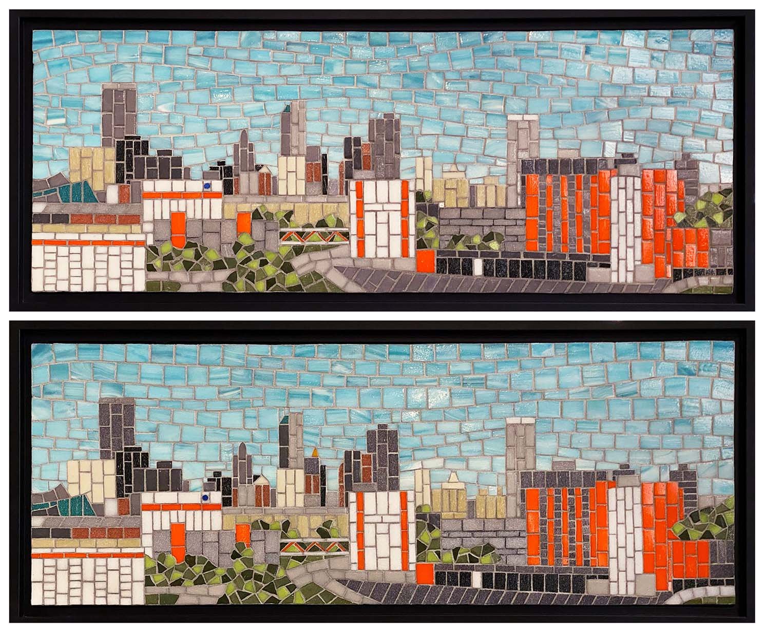
OSU № 4 and № 5 of 5. 9” x 24” | 23cm x 61cm, unframed. Vitreous glass.
Good to have this project finished! I completely forgot to take pics of № 2 and № 3, but they do all look basically the same.
I intentionally made very minor changes amongst the five in the background buildings so each one would be different. Also, the sky is a little different on each one with variations in the amount of movement. I worked the sky free form, without a pattern, and I think I enjoyed that part the most of the whole project.
So, that potential commission that I blogged about did come through after all. It was a bit of a lengthy, touch-and-go kind of process, and I actually thought it had gone and was not going to happen. But then, after another month, I heard from them and they were ready to move on it.
Oklahoma State University is developing a medical complex in downtown Tulsa. It is not complete yet, but they wanted mosaics of the skyline with the actual and future OSU buildings. It was not easy to get the right view as the complex is rather spread out. They wanted five “table top” pieces, which they defined as being as much as 24” wide. Eventually, they were able to get a couple of good Google Earth images from which I could work.
Below is the image that I used to create the to-scale drawing that follows. The Google Earth image was very small, however, and it was tricky to translate some of the buildings and/or features. In a 9” x 24” mosaic, on their time frame and within their budget, I could not get very detailed. We needed to bring out the OSU buildings and visually tie them together, even though the complex is not finished. So I honed in on the OSU orange and used it, along with more detail, to help make the OSU buildings visually prominent. So all the front buildings with the bright orange are the OSU buildings. The background buildings that look a paler orange are actually more of a terra cotta color, which you can see in the finished first mosaic.
Google Earth image
My rendering of the Goggle Earth image, created using the Procreate app. This rendering included some future construction
Initially, they wanted all five—gifts for donors—by Christmas, but I was not comfortable committing to that. So they asked for three of them by Christmas. Confident that I could do that, and with an approved budget, we signed a contract, effective Oct. 1.
I started the first one (below) before Oct. 1, as I had material on hand and really wanted to get a good idea of how much time I needed, how much detail I could manage, and generally work out any issues. I am now starting the second one.
Tulsa/OSU Skyline 9“ x 24” | 23cm x 61cm. Vitreous glass. Digitally framed.
The vitreous glass is a mix of French Opio and Italian Bisazza, and also Trend. Yes, that Bisazza is old, as well as the Opio, neither of which are available now, although Bisazza is basically Trend now, if I have that right. I priced the work for them using either vitreous or smalti and they chose the vitreous. It is less expensive, I had a good amount in inventory, and I thought it more practical for this project, considering the time issue. I knew I would be using a lot of straight cuts and thought vitreous would be a little easier—translate to faster—than smalti. Still, vitreous has its own issues, like dealing with those darned mitered edges. And the Opio is the hardest vitreous I have every worked with!
The only issue that I encountered was the grout. I was hoping to use a single color for the sky as for the non-sky, but after grouting it all in a mix of half gray thin set and half white, I thought the sky grout lines were a little too dark. However, I did not want to go any lighter for the non-sky part. I felt like it was important for the grout lines to show to help give definition for the buildings and the mid-gray works well for the buildings, whether light or dark. So I reworked the sky grout using 2-1 parts of white to gray thin set and was much happier with it.
Their initial idea was for the five smaller panels, and then a very large one to be installed in one of the buildings. I don’t think the idea for the large mosaic has been settled upon yet.
Since last November, I’ve been totally lacking in mosaic motivation. I attempted a couple of projects only to leave them lingering on my work table, destined to be abandoned. At first, I was a little concerned, but I decided to just go with it and see what happened. If, after some unidentified period of time, I still lacked mosaic mojo, so be it. I’ve just been living life without mosaicking for almost a year, and it has been a very productive time, just not mosaically.
Then, a few of weeks ago, I invested a good chunk of my weekend on a possible commission design. The potential client had been trying to work out a project for months. Each time I thought I would not hear from them anymore, I would hear from them. So, once again, they contacted me and I really did want to help them resolve things, moving ahead with or without me.
I prepared a design with which I could give good cost and time estimates and sent it to them. I highly suspected it was beyond their budget as well as time frame, but I gave it my best shot. Not having heard back from them, I am once again guessing that they have moved on without me.
Spending the time on that design was very good for me, however, and I think it helped to prod me back to mosaic. Well, time will tell about that. Anyway, I decided to mosaic a bottle while I was developing an art piece idea. And here is the bottle.
Amber, Copper, and Gold Bottle 8.5” x 4” | 22cm x 10cm. Vitreous, mirror and Van Gogh glass on Hendrick’s gin bottle.
The main shape of the bottle was easy to work with. The 1/4” squares were cut to size by Mosaics By Maria. The top, however, proved to be a little more demanding. I ended up having to wedge most of the top pieces. It’s not my favorite palette, but I the materials left over from something else.
It did actually feel good to have a project again, and I think I am ready to move on to the art piece. Perhaps my mosaic doldrums have come to an end? Let’s find out!

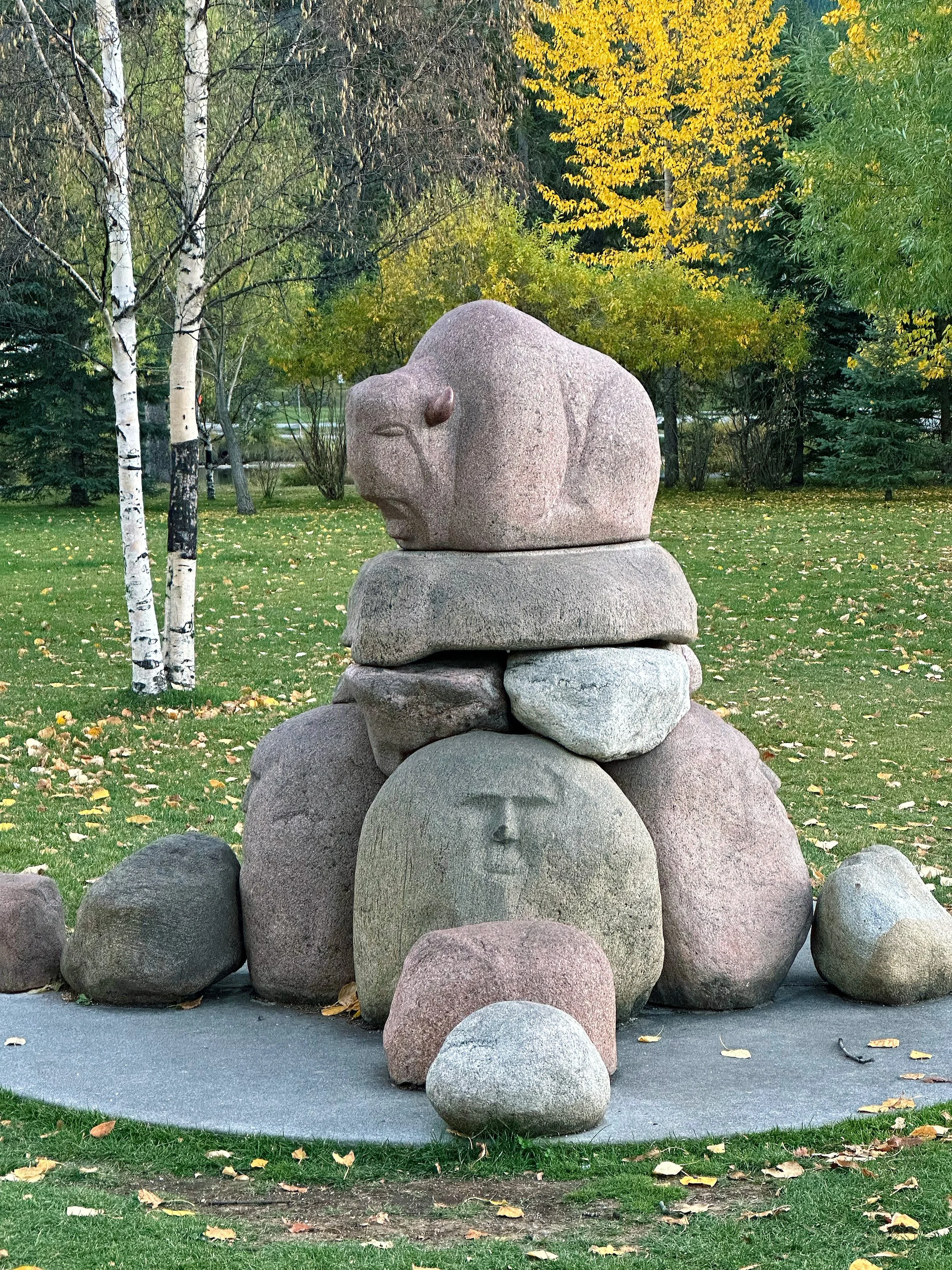
Mosaic at Entrance to Woolaroc Museum. Artist Unknown.
I visited Woolaroc Wildlife Preserve and Museum with my grandsons and their other grandma last week. It was extremely hot that day and I was thankful that the preserve is a drive-thru thing. We saw bison, zebras, immus, water buffalo, ostriches, European deer, and many more.
The museum has an impressive collection of Western and Native American art and artifacts. The mosaics at the entrance seem to be smalti and are nicely done. I could not find a single staff person around to ask about who the artist is, and my Google search did not yield the answer.
I am so pleased to have my most ardent supporter and most prolific collector add Theme and Variations: All Dreams, to their mosaic art collection. They now own three of the works from my Music To My Eyes series, along with a few other pieces.

Theme and Variations: All Dreams, in situ using Artooms app.

Theme and Variations: All Dreams (2020) 36” x 57” | 91cm x 145cm. Mosaics gold, colored cement. Inspired by a contemporary classical piano piece by Christopher Theofanidis, titled All Dreams Begin With The Horizon, 3rd movement.
I will certainly miss this one, but how thrilling it is to sell such a large work! It will be quite the chore to ship it and hang it, but it will be stunning in it’s new home.
Theme and Variations: All Dreams, from lower front
I wrote last week about how I have been in quite a creative slump, but that I was determined to finish a little, fun piece that I started at the end of last year. Well, I am out of determination. It just was not working for me. Have you ever just lost interest in a project? Silly question, right? I really hate to add another unfinished mosaic to my list but it, at least, has company.
I’m going to mosaic a pair of bottles, also started back in November before I lost interest in them. I now understand that my lack of interest was not only mosaic oriented, but more of a general malaise that spilled over into my creative drive, resulting in an existential foray into questions about life and purpose. My mind just loves that kind of stuff, and that is for both good and ill, I believe.
Time to move on! Here is a pair of interestingly-shaped tequila bottles. I don’t remember the brand. My husband brought home one bottle a few years ago. I thought the shape just called out for a mate, so I found another one. I drew the pattern on last November and then proceeded to abandon them on a work table for all these months.
I’ll be using Orsoni #10 gold for the lines, and an off-white marble for the rest (at least I think I have decided on an off-white marble). I have not decided on the andamento for the marble yet, whether I want it to be the same throughout—like vertical—or whether I will do something contrasting between the sections that will be created by the lines of gold. I’ll start with the gold and then decide. The shape of the bottles does present some challenge no matter what I decide for the marble.
So, to work!

Dream of Asturias 12” x 10” | 30cm x 25cm. Smalti, Kismet glass, stone and metal specimens from the northern coast of Spain, Oklahoma shale. Inspired by the photographs of Luis Laso Casas.
As you can see, my last blog post was in November when I finished the rooster commission. That commission is the last mosaic I completed. I’ve not been able to find the motivation to work much since then. Sure, I started something in December, only to leave it sit, and sit, and sit on my work table. I’ve been in quite a slump.
In the last month, I’ve made a bit of progress on it (above) and am determined to finish it. And I will. But I’ve never experienced such a prolonged lack of motivation to mosaic. I’ve questioned whether it is time for me to let it go and move on. To what, I don’t know.
But I am not ready to let it go. I sense there is more mosaic in me. Curious, though, as to why I might be experiencing this. As distressing as it is to lack motivation, inspiration, and a need to create, I think this is actually a good thing.
I do believe that Covid has a lot to do with it. The isolation of the last year has left me feeling unplugged, which I suppose makes sense for the state of isolation. Being unplugged, I have lost any sense of competition—or trying to prove myself—which I can now see was a contributing aspect of my creative motivation. I can see it now only due to its lack.
There has been a sense of what’s the use? And I have found that to be a very important question. Indeed, what is the use? Maybe there is no use if I’m solely motivated by a need to prove myself. I went through a few months where my mantra was I just don’t care. Again, distressing, but at the same time, liberating.
Some days, I felt like it should just be enough to get through the day—to do some laundry, go to the store, cook dinner, play some piano or chess, exercise a bit, sit outside in the sun with our dog Lucy. Why can’t that be enough? Do I need to be Jacqueline Iskander mosaic artist to be happy? To be fulfilled? To feel worthy?
No. I found I was fairly content. I just needed to give myself some time to move through this. First, I gave myself until the end of January to reassess things. Then until the end of February. Well, here we are moving through April and I’m feeling the need to do something about this stalemate.
I’m trying to finish that little piece I started back in December, and it is a bit of an effort. It is a departure for me and I’ve struggled to keep with it. It was just meant to be fun, and that seems to have taken the fun out of it for me. Again, back to what’s the use? Why can’t fun just be enough? Especially with creativity. Because of that need to prove something? To produce serious art? To prove that I am an artist?
So, the inner struggle to understand who I might be if I am not trying to prove something continues. I have a few ideas for future work, but they are all just bouncing around in my head and nothing yet bubbling up to the surface. I’m trying to be okay with this and give it more time. Trying to resist thoughts like: If I quit, what would I do with all this stuff? What would I do with the rest of my life? And I find myself in a place I’ve found myself a few times before in my life, that of breaking free of an identity.
Thank you Covid!
Gaglio Rooster Commission 17” x 17” | 43cm x 43cm. Smalti, vitreous, iridescent glass.
This rooster is heavily inspired by a photo provided by the client. They did not want the rooster to be in a natural environment and requested something more plain.
I really enjoyed this project as I don’t usually work with so much color. However, working those tail feathers in that andamento was a challenge.
At left is a photo taken from a perspective slightly below and looking a bit upward. I was trying to capture more iridescence. Tricky. But I like the way you can see a little dimensionality in the rooster feet. The vitreous is thinner than the smalti so he does pop a bit from the background.
As for the edges, the clients were not sure if they wanted to frame it and wanted the edges to be done in a way as to be acceptable without a frame. I did not want to take the vitreous all the way to the edge because that kind of edge is vulnerable to chipping and tiles coming loose over time. I handled it in a manner that I thought was interesting on its own but that could also be covered up with a frame.
The background colors were chosen to coordinate with the countertop, at right.

What a great little surprise yesterday, a day otherwise known at our house as election-day-from-hell. 😎Several of my things sold at Sky Gallery, here in Tulsa on Route 66, in the last weeks. My two art pieces, No Such Thing As Time and Out! were two of the sales. Also sold were a few magnets and a notecard. Isn’t that nice!
No Such Thing As Time (2012) 8” x 22” Each panel 4” x 4” Marble, porcelain, mosaic gold, broken china, sodalite, turquoise, malachite, onyx. A 'four seasons-inspired' group. Each panel 4" x 4". Framed in a black wood floater frame.
Out! (2018) 7” x 5” Smalti.
Of course, sales are great! But some are a bit sad too. It’s really hard to part with No Such Thing As Time, as it is one of my favorites.
This pretty boy is coming along. The tail feathers on the rooster used for inspiration are so pretty in shades of blue and teal, with iridized highlights. I was actually excited to tackle the feathers and was absurdly confident. So I decided to use this kind of feather/leaf andamento with relatively thin strips, so I could try for shading and color gradations, mixed with iridescent highlights.
After the first two feathers—the topmost ones, not including the darker interior of them— I was asking myself that old familiar question: What the heck was I thinking? But, no matter, it was just a momentary panic. I recovered quickly and embraced the just keep going mantra.
At this point, I’m happy with it and am sure it will be so worth the effort. I think he’s going to be gorgeous!