General

Decorative Mosaic Book: Update


Two bits of news: 1)There will be a book and 2) The deadline is approaching! 

Based upon the submissions received thus far, I will be going ahead with a book featuring decorative mosaics!! However, I am still hoping for more submissions!

Do you need more time? Should I extend the deadline to September 1? If I hear from you that another month would help, I will be happy to extend the deadline. If I don't hear from you, the deadline remains August 1.

The book title, dimensions, number pages, and price are yet-to-be-determined. These decisions mostly depend upon the number of pages, which is primarily based upon the number of mosaics to be featured. More good news is that I will be able to sell it on my new storefront site, J MOSAIC, which will allow me to keep the price very reasonable for a softcover digital print book.

Keep those submissions coming!!


Other People's Work

Last week, I put the final touches on my studio wing and finished placing pieces of my very small collection of other people's mosaics. Take a look!

Entering my studio, you can see my Brooks Tower and Irit Levy flanking the entry on right and left, respectively, and the little yellow Ilona Fried on the near right.

I Gave You Latham, by Brooks Tower.

This Irit Levy piece may have a title but it is not on the back of it, and I don't remember as I acquired this several years ago. It may be called Nude or something like that. 

This Irit Levy piece may have a title but it is not on the back of it, and I don't remember as I acquired this several years ago. It may be called Nude or something like that. 

This little yellow cutie is by Ilona Fried, and is also without title.

My Sophie Drouin, the work on the right, is titled Red Tide.

And here is a small grouping: Upper right is by Wendy Raven and is without title; lower right is Pam Givens' Bloom Where You Are #5; lower left is Jeannot Leenan's pretty blue pansy, also without title; upper left are by Heidi Easton-Pichler (in the back) and the little J mosaic is by Kathy Thaden.

A Look Back

A dear friend of mine sent me a photo this morning, a photo which took me back in time.

So many years ago, Carole wanted me to make an elephant mosaic for a triptych frame that she had bought. This had to be over 15 years ago—certainly in my early mosaic days. 

The first pic shows the 3 small panels in the frame. The other pic, which my friend just sent me this morning, shows the panels, minus the frame, as they hang in her new place in Houston. As I recall, I mosaicked the original masonite backing panels that came with the frame.

It's interesting to look at old work.

Before I Was An Artist, #11

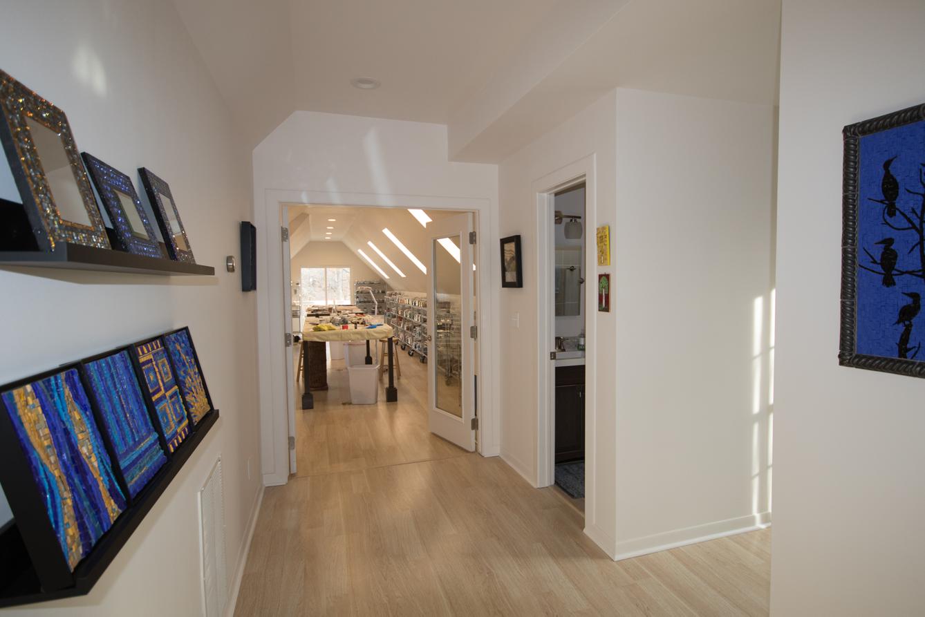
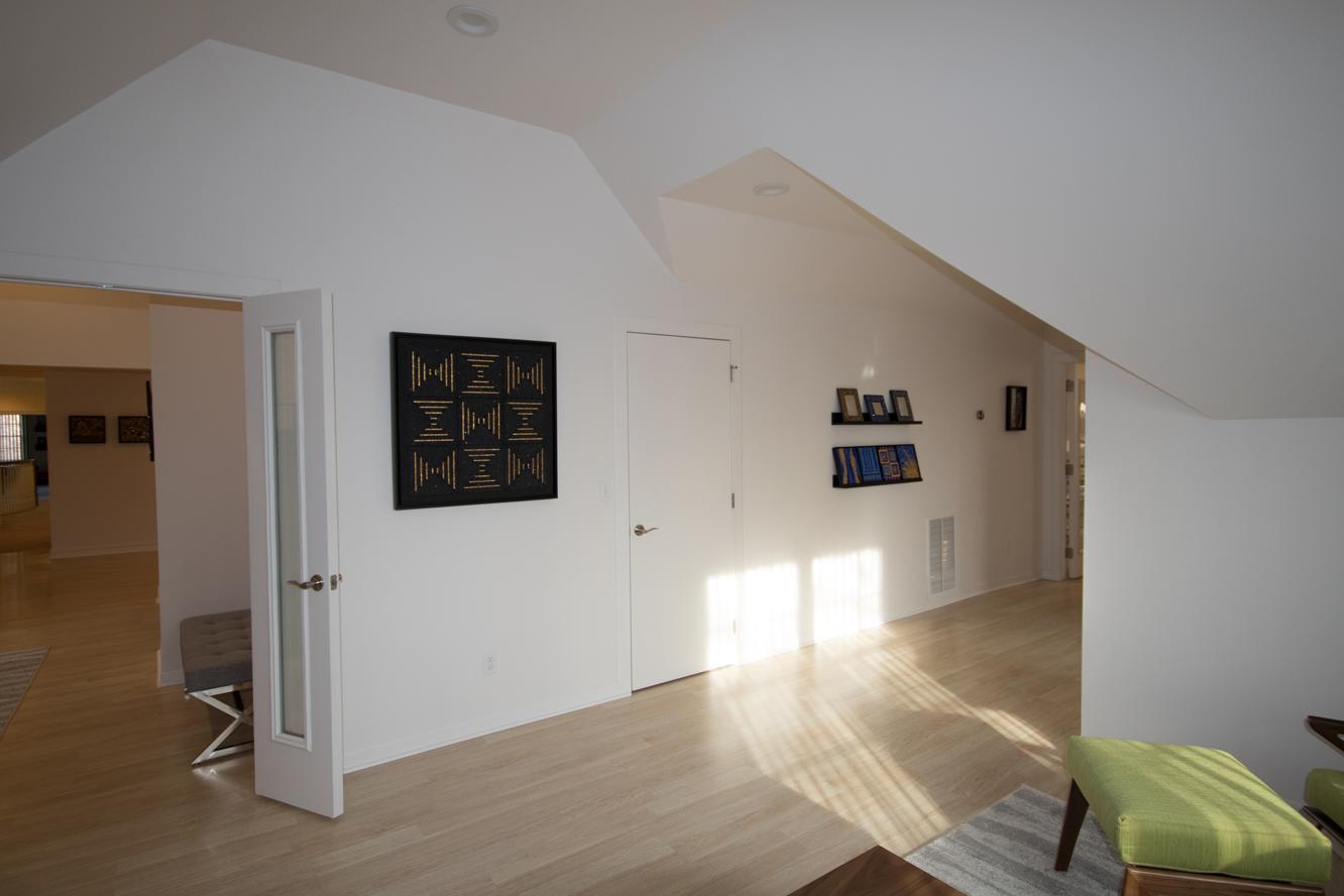
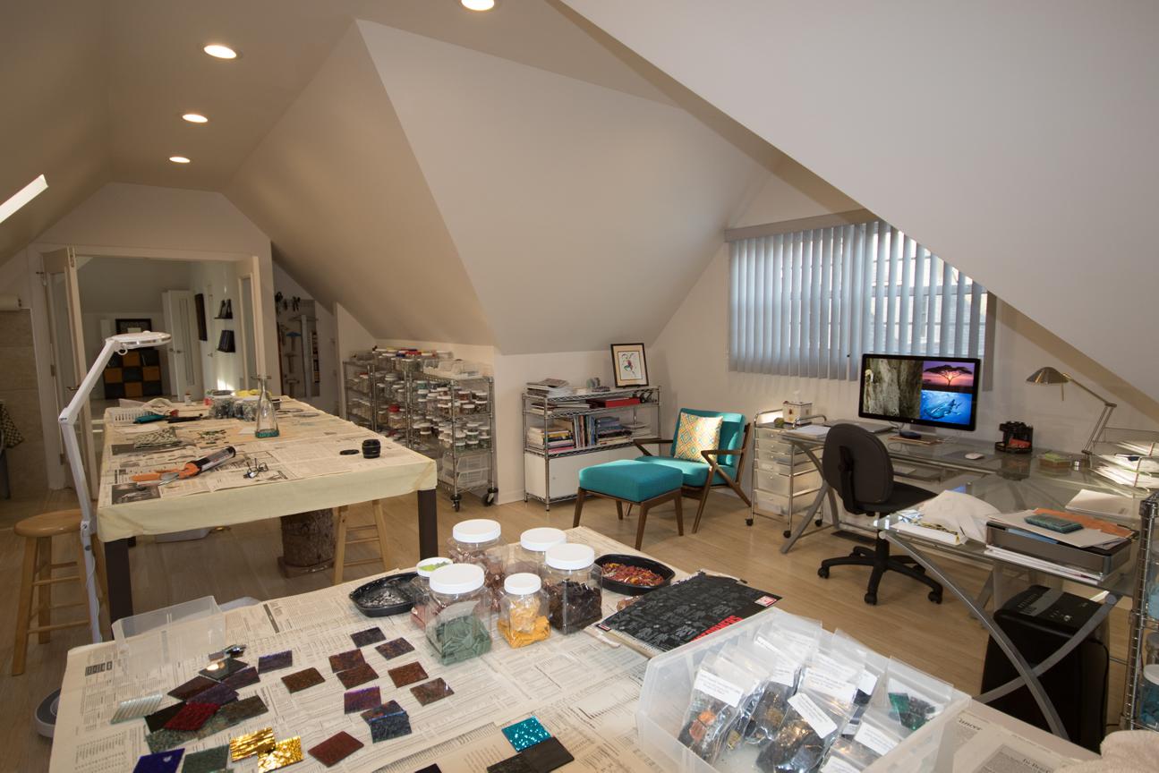
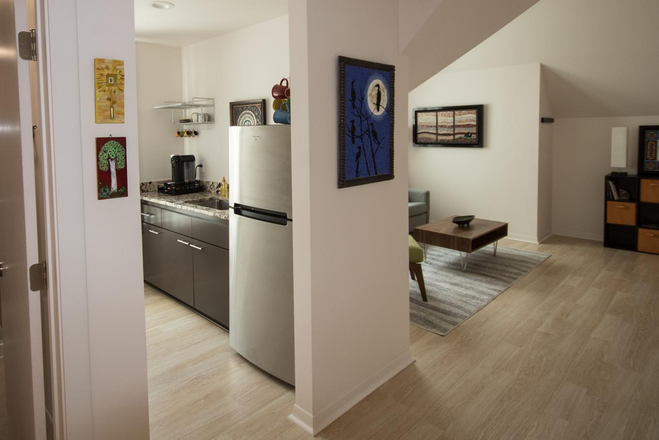
With summer travels and home renovation, things have been incredibly busy the past few months. But the renovation is mostly finished and my new studio is operational. If you would like to see my new space, check out this blog post

After a few very small mosaic tasks, I'm almost ready to rejoin the mosaic world and focus on finishing a couple of works. My sabbatical turned quasi-sabbatical and then back to full sabbatical during the renovation has been very good for me. This blog series, as well, has been helpful, and I feel it will be even more helpful if I continue it.

So, we left off in about 2006 with the idea of essential mosaic, or work that is uniquely mosaic. My first introduction to the concept was by Gary Drostle, who described it as work that would not be as successful in any other medium. I'm pondering a tighter qualification, that being work that can only be successful in mosaic. What do you think?

As the riddle of essential mosaic nagged at me, I attempted to chase it and began creating abstract mosaics and working with a variety of materials. I came to realize that I love line. And simplicity of design. And minimal color palette. And precision.

Simplicity of design and minimal color palette gave me a sense of space. Precision gave me a sense of ease, which actually sounds nonsensical as precision is not at all easy. But precision made things make sense, made the pieces make sense to each other—to meet on equal terms, made silence instead of noise. I still feel the same way today, although I now understand how precision is vulnerable to perfectionism. 

In this time period, I was paying more attention to texture and was experimenting with dimension. I also began thinking in terms of works in series. Music To My Eyes was the first series, based on classical music forms and particular compositions in the form, as well as the use of mosaic gold to express movement.

Below are the first two in the series, Etude and Nocturne, 2007 and 2009, respectively

Mosaic gold is quite unique and extremely responsive to light. The texture and shadow inherent in hand-cut glass and stone are also unique to mosaic. But, are these essentially mosaic? Would they be as successful in any other medium? 

Another series was called Vertical, but it is now called Lines. I was inspired by Brit Hammer's textural mosaics which were worked in lines, or as she referred to them, stripes. She worked mostly in glass and with a lot of color, and in a more relaxed style. Of course, I loved the idea of working linearly, but I did not want to copy her; I had to make it my own. 

Below are two early pieces from the Lines series:

At left is the first piece in the series, Pulse, 2008I was experimenting with a much wider range of materials and also with beads.

It was mostly easy to work monochromatically, in black, gray, and white, but combining the matte marble/stone vs the more highly saturated glass was a challenge that I would increasingly face as I tried to work with more color later on. 

Also, I did not want it to look like stripes, which presented the biggest challenge, both technically and compositionally, in changing materials—going from smalti-sized tess to very small beads.

In retrospect, I think that the best thing about this series was that I worked with so many different materials and learned a lot about how they work together, and sometimes how they didn't.


At right is another in the Lines series from 2008, Rhythms: September. For this Rhythms sub-series, I made an 8" x 8" mosaic for each month of 2008 in this Lines style

What do you think? Did I make my own lines, distinctive from Brit Hammer's? And is this essentially mosaic? Would these pieces work in anything but mosaic? 

During this time period of 2007 - 2009, I was working a lot and consciously trying to make art. I guess you could say that I was being an artist

Over time, as I was being an artist, I was increasingly taking myself more seriously, which just might be at the heart of my struggle with being an artist.  Part of the reason for this, I have come to realize, had to do with my increased awareness of and interaction with the—thanks to the internet— quickly expanding mosaic world. 

That's enough for this post. I'll continue with around 2010 in the next post. Thank you for following!

Studio Wing, WIP (cont.) — PLEASE HELP!

I'm starting to think of organization for my materials in my new studio. I'll have shelves that line the long sides of the studio, probably enough shelving for my smalti (both Mexican and Italian), and vitreous, as well as all my stone, ceramic, other glass, etc. I'll be using clear jars for the tess. In my old studio, I organized colors within material, with only the most-used materials in the immediate studio area. I've got plenty of room in the new studio to have it all—or at least most of it—on the shelves along the walls, so I'm considering how I should group things.

Question: Group materials by color within material, or by material within color?

Color within material: For example, I would have the vitreous grouped together I'm one area, the Mexican smalti together, the Italian smalti together, etc., with each material then grouped by individual shade and value. 

Material within color: For example, material within color being all the blue vitreous along with all the blue Mexican smalti along with all the blue Italian smalti, and possibly any other blue material like ceramic, C3, etc. So, all similar shades and values of blues in the same area, regardless of material. Of course, they would then be grouped by shade and value within the color. 

Which makes more sense to you? How is your studio organized? I welcome your thoughts!